Brand Design, Marketing
Scwha Soaps
Client Schwa Soaps
Involvement Creative Direction (copy & art), Brand Development, Photography Research
Year 2021
Contributors Founder: Jeannine Stupka
High-End & Handmade Soap With a Conscience

As an accomplished language pathologist, the founder christened her soap company after the vowel sound schwa /ə/, colloquially known as the median vowel sound in the world of phonology and phonetics. The essence of the brand was to symbolize a clean, handmade aesthetic while simultaneously upholding a striking and bold persona.

In order to effectively narrate the story of these meticulously handcrafted, organic soaps, an immersive photography research was undertaken. This endeavor aimed to secure a comprehensive visual representation, not only of the products amidst their natural backdrops, but also the process that culminates in their creation. 

The founder, who holds an inherent passion for natural exploration, finds herself in the heart of nature, searching for unique ingredients and enchanting fragrances. Once she has achieved the perfect blend, the focus shifts to a pristine setting. Here, the curing process unravels and the soaps are delicately sliced, preparing them for their journey to their final destinations. This visual exploration endeavors to solidify the brand's tone and resonate with the visual style of photography that the brand stands for.

Moodboard, Lo-fi Sketches, and Research

Vibrant hues of nature blend seamlessly with the purity of handcrafted soap-making, reflecting the passion and dedication behind the brand. Close-ups of soap curing and slicing symbolize meticulous craftsmanship. The board is punctuated with pops of bold colors that encapsulate the striking presence of the brand. Altogether, the moodboard paints a vivid picture of a brand that combines the organic essence of nature with a clean, handmade aesthetic, a clear testament to the founder's vision.

Suds & Elegance: Building a Premium Soap Brand

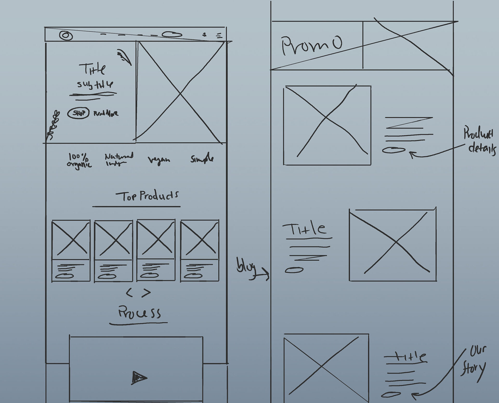
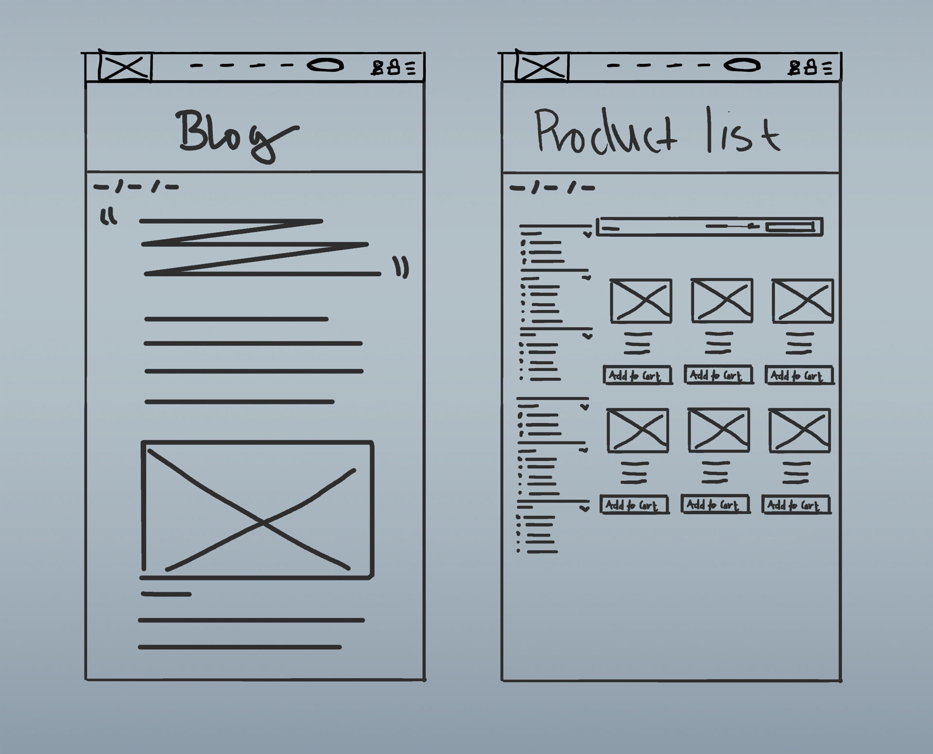
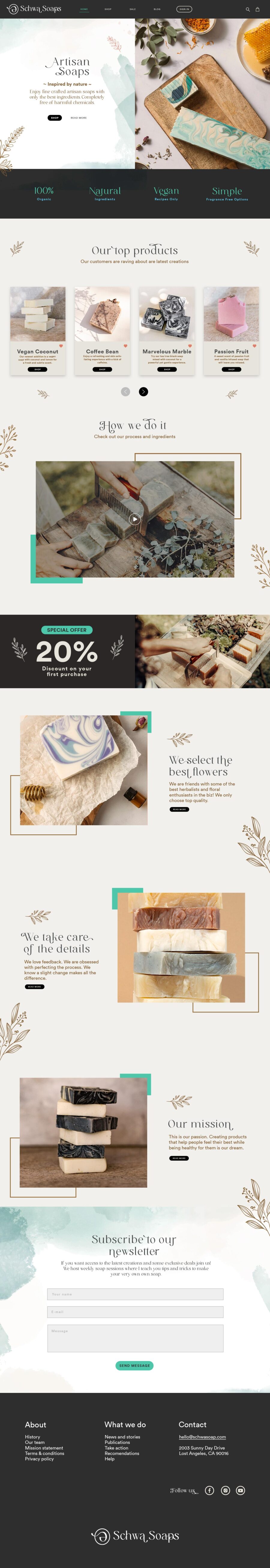
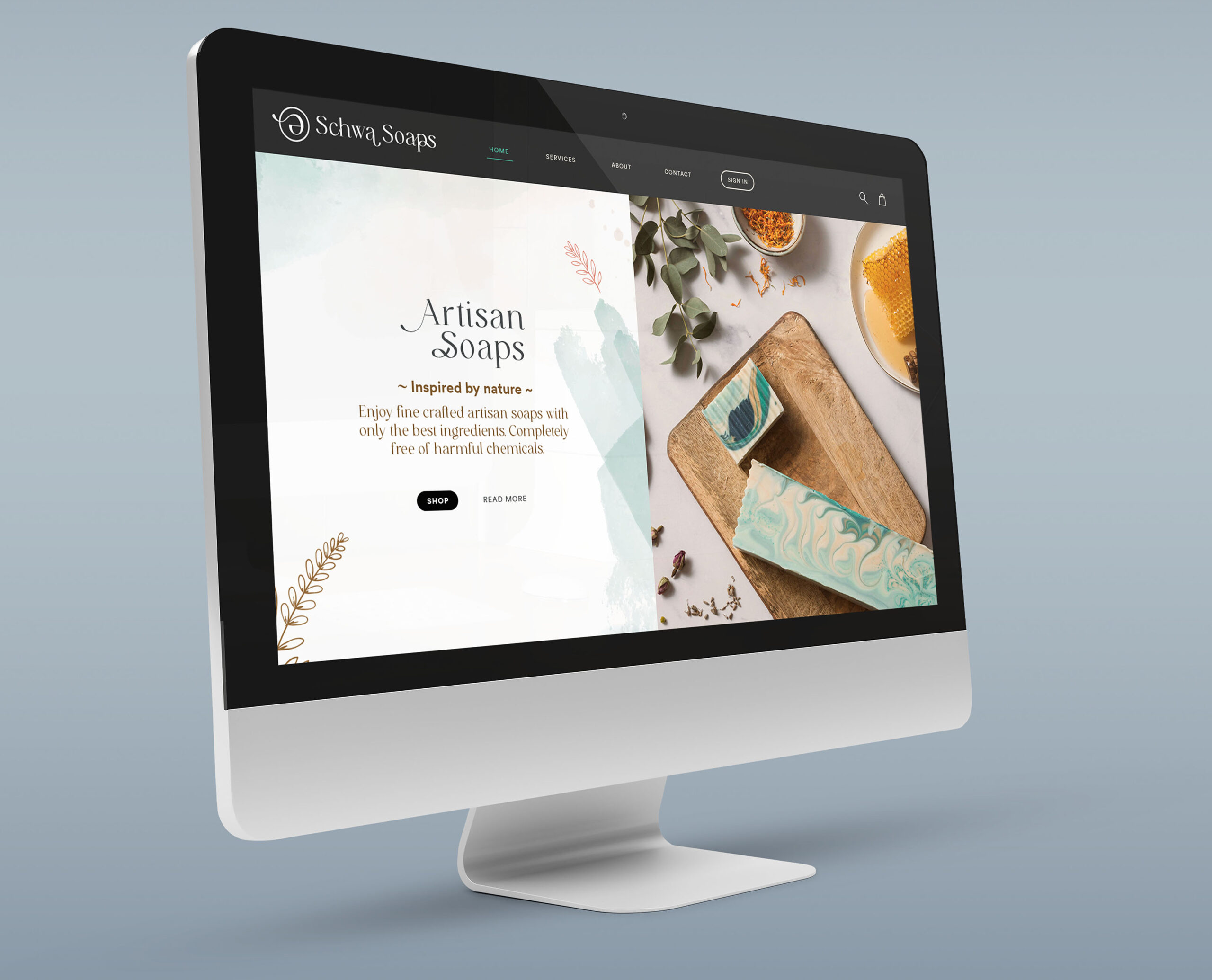
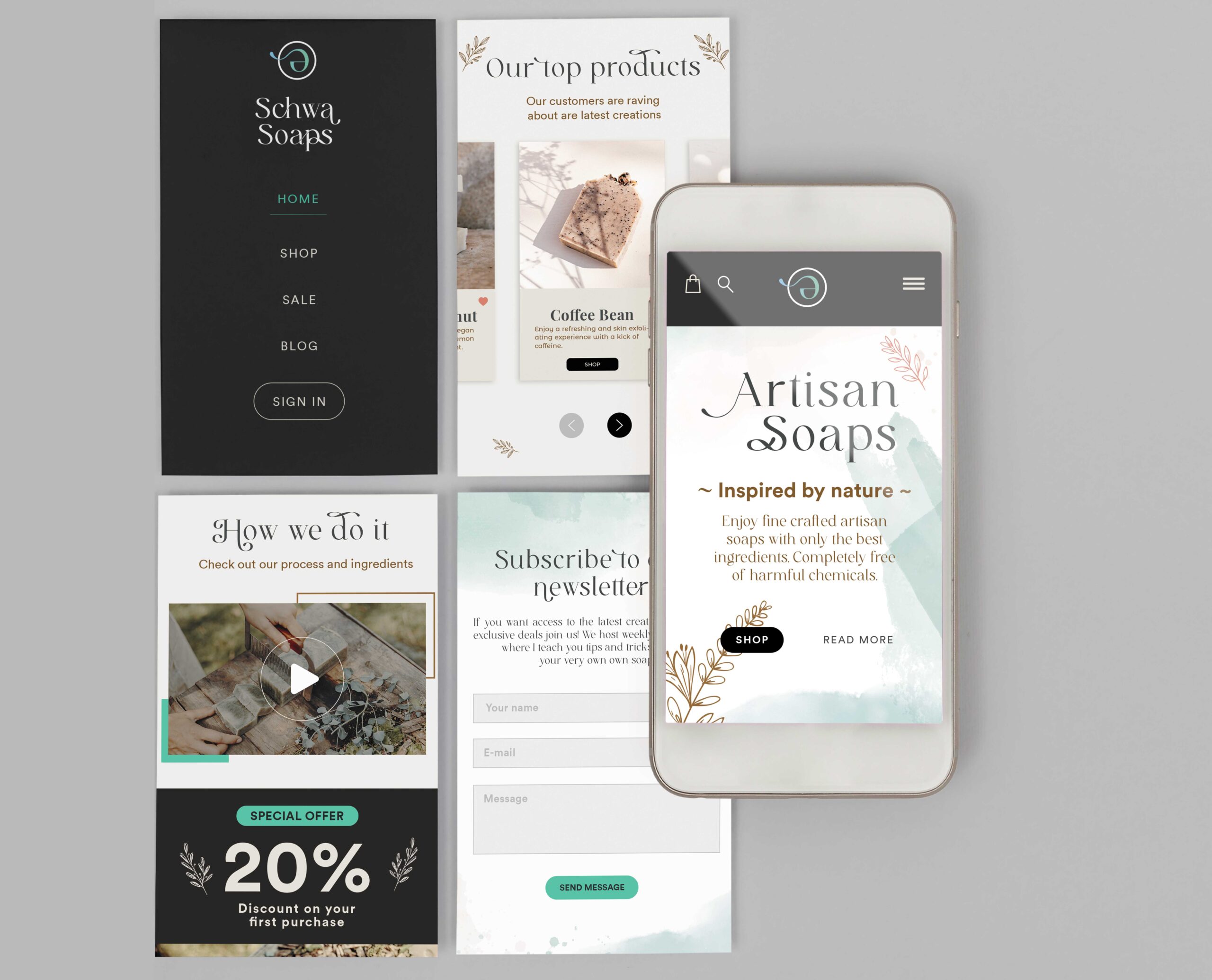
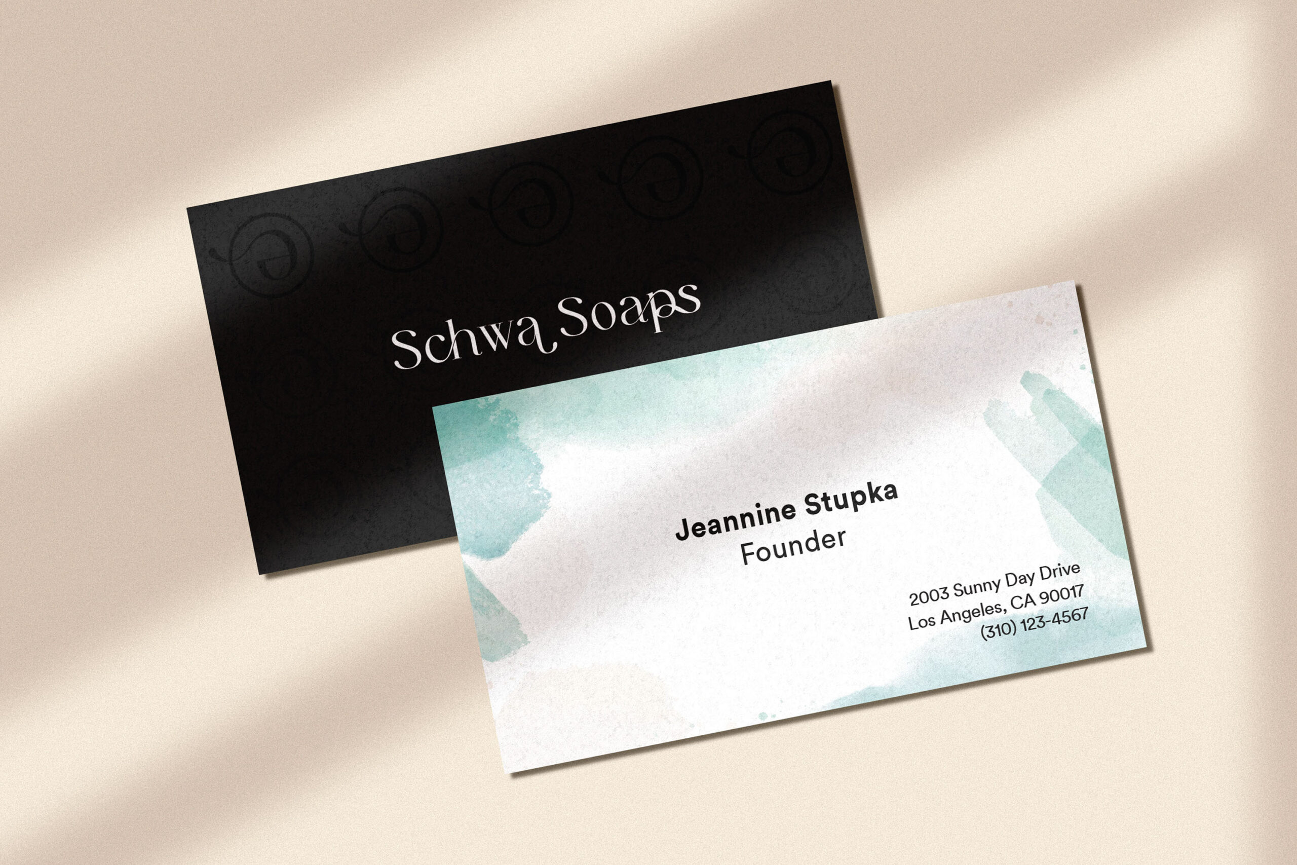
Striking the perfect balance between soft gradients, high moody contrast, and gentle watercolors, we established a captivating look, tone, and feel for the brand. Coupled with comprehensive market research, we crafted a wireframe that reflected the brand's unique identity.

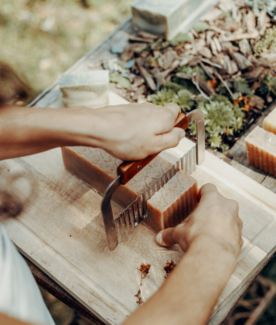
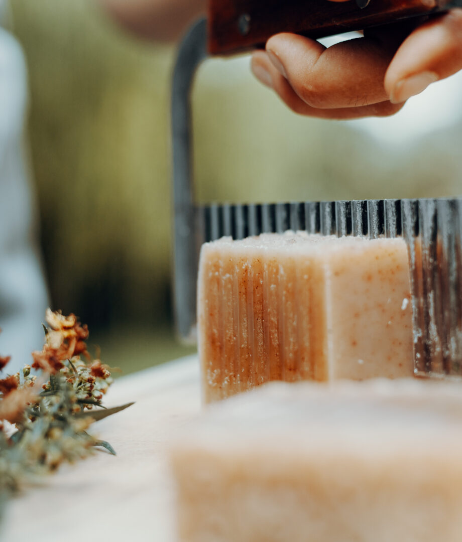
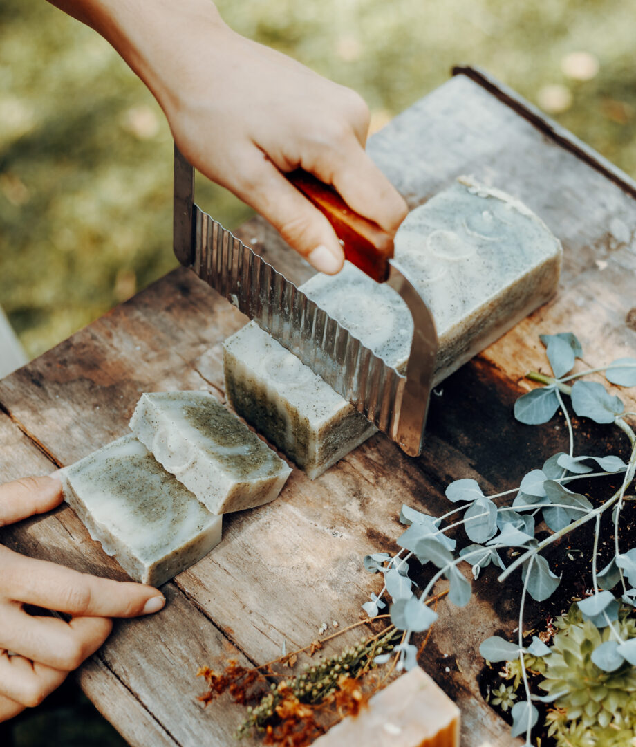
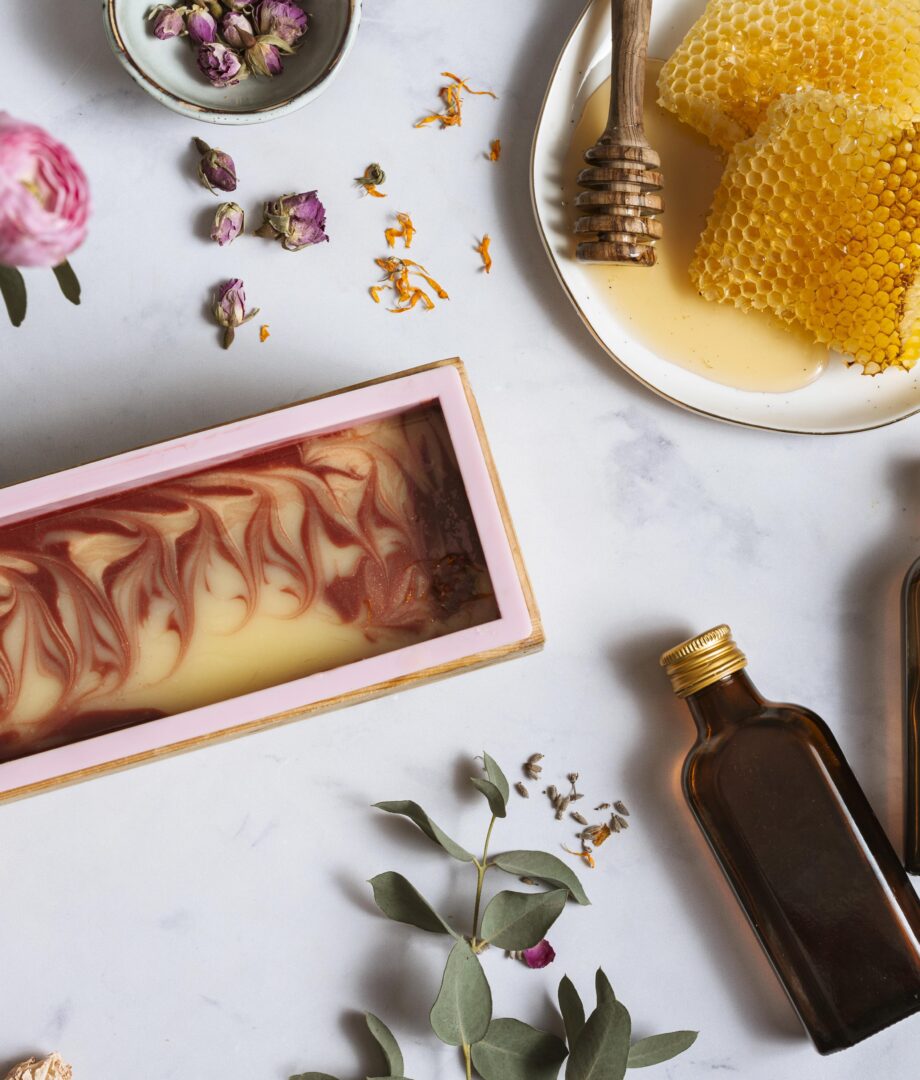
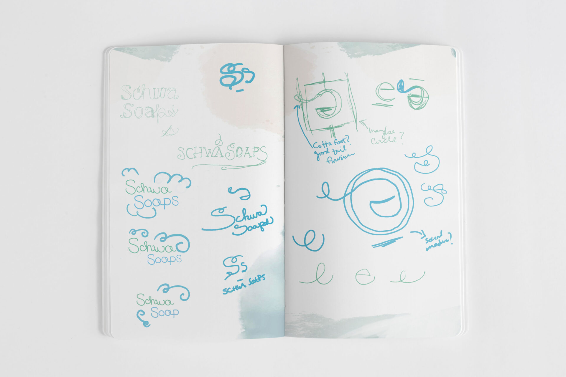
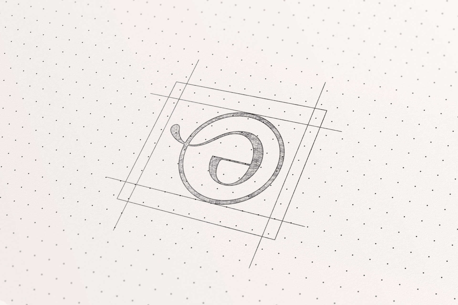
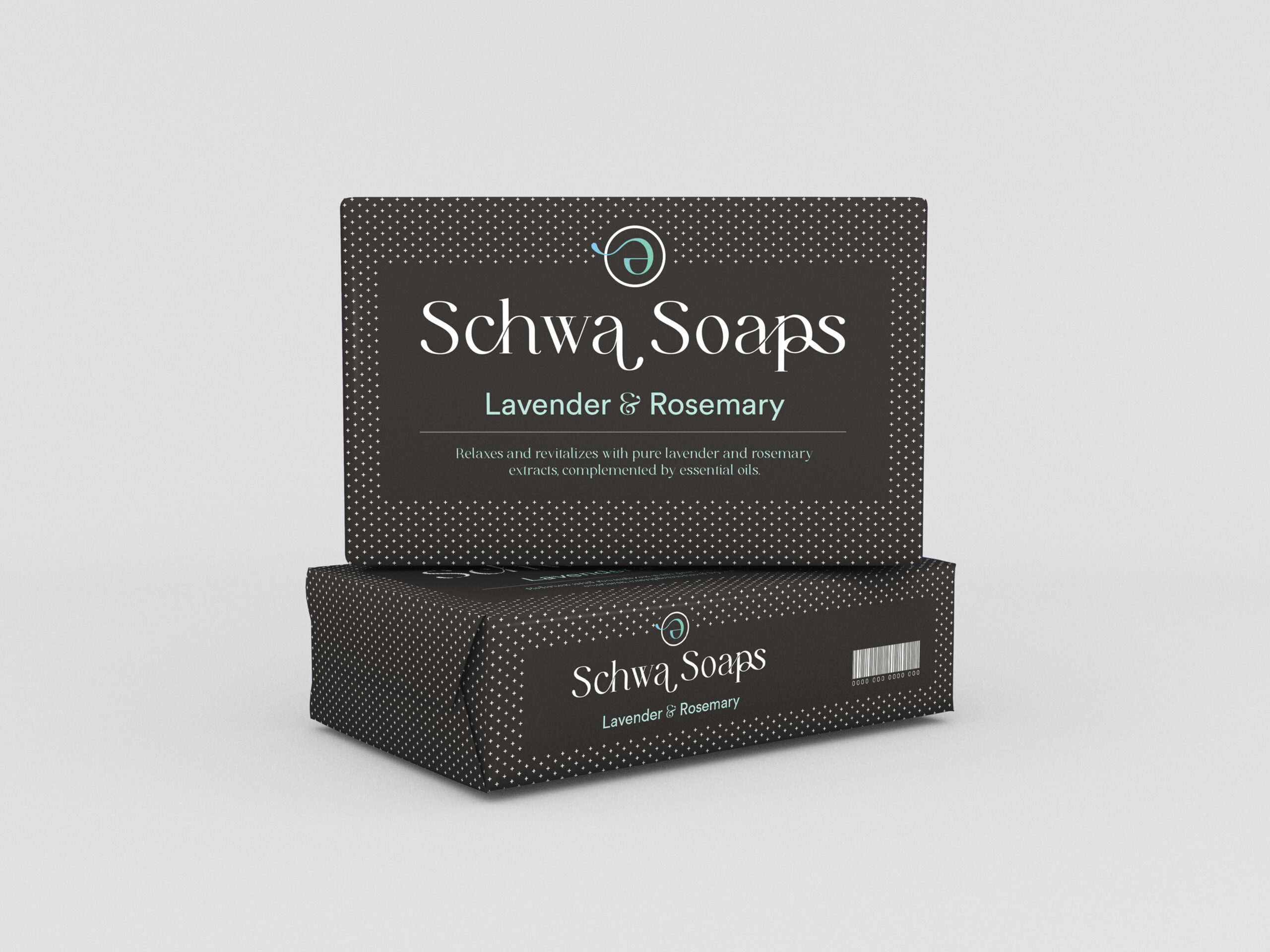
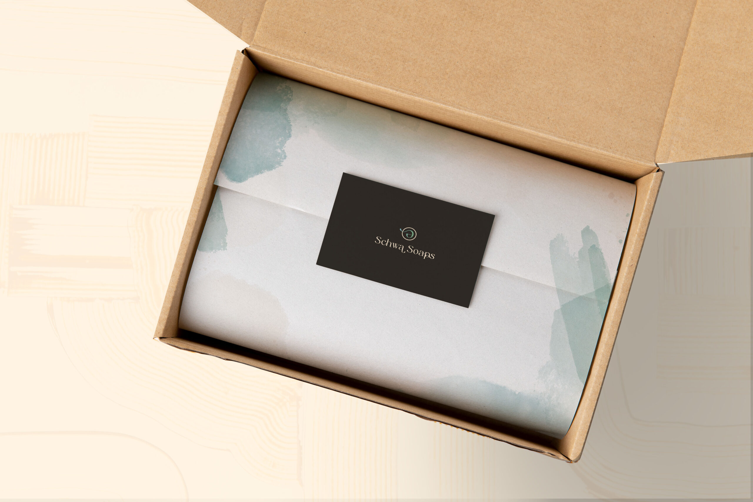
A key objective in developing the brand was to resonate with a niche target audience. So, what drives people to invest in luxurious artisanal soaps? Based on our research, it's the exceptional quality of ingredients. Many store-bought soaps are synthetic detergents, which can irritate the skin or trigger airborne allergies. In contrast, artisan soaps typically feature natural ingredients, occasionally using fragrance oils. Schwa Soaps offers customization, including fragrance-free options, making their products allergy-friendly and suitable for various mild-to-moderate skin conditions. Moreover, these artisan soaps can serve as handheld works of art, either beautifying and scenting bathrooms or being used directly.

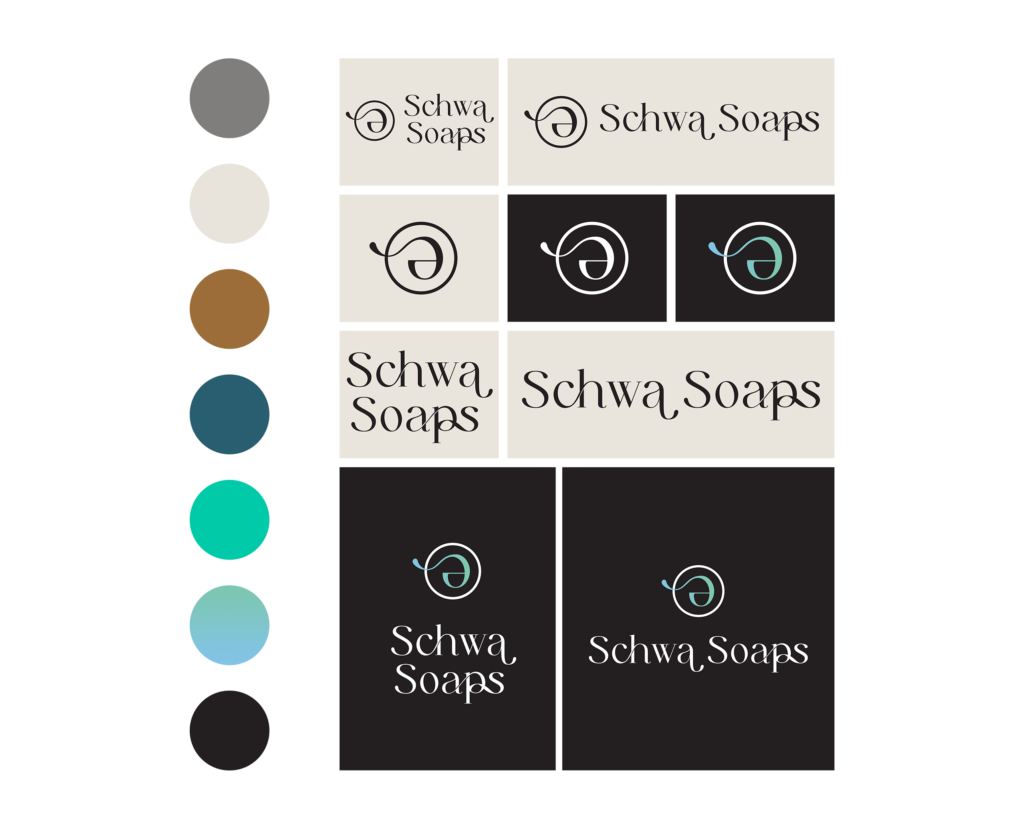
Leveraging the research data, we designed wireframes that accentuated the high-quality ingredients and embodied the essence of artisan craftsmanship. We also finalized our color palette to ensure there was enough contrast to improve readability without eye strain. For accessibility purposes, we aimed for a 4.5:1 ratio between the foreground color (e.g. text, links, etc.) and the background color. This way we ensured people with moderately low vision can tell the colors apart and see the content. 

As an ongoing client, this case study will be updated to reflect the evolution of the brand. We forsee some CTA button clean up and promotional integrations built into the final website.