
THE CHALLENGE
Zeus, a lifestyle magazine for Chicago’s LGBTQ+ community, needed more than layouts – it needed a cohesive voice. The magazine covered fashion, activism, food, nightlife, and history, but risked feeling scattered without a unifying design system. The challenge: create editorial design flexible enough to handle vastly different content types while maintaining consistent identity and authentic community voice.
THE SOLUTION
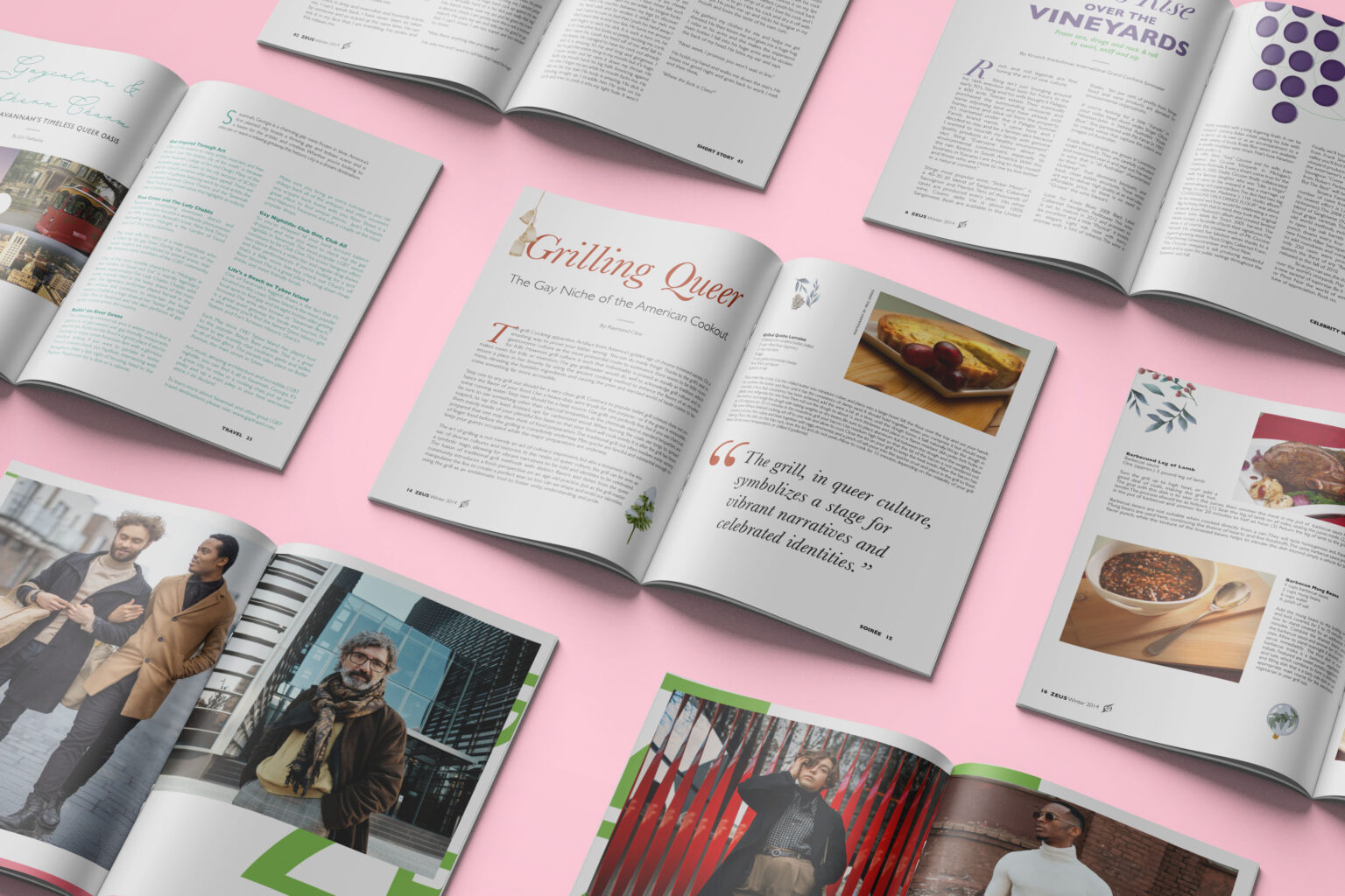
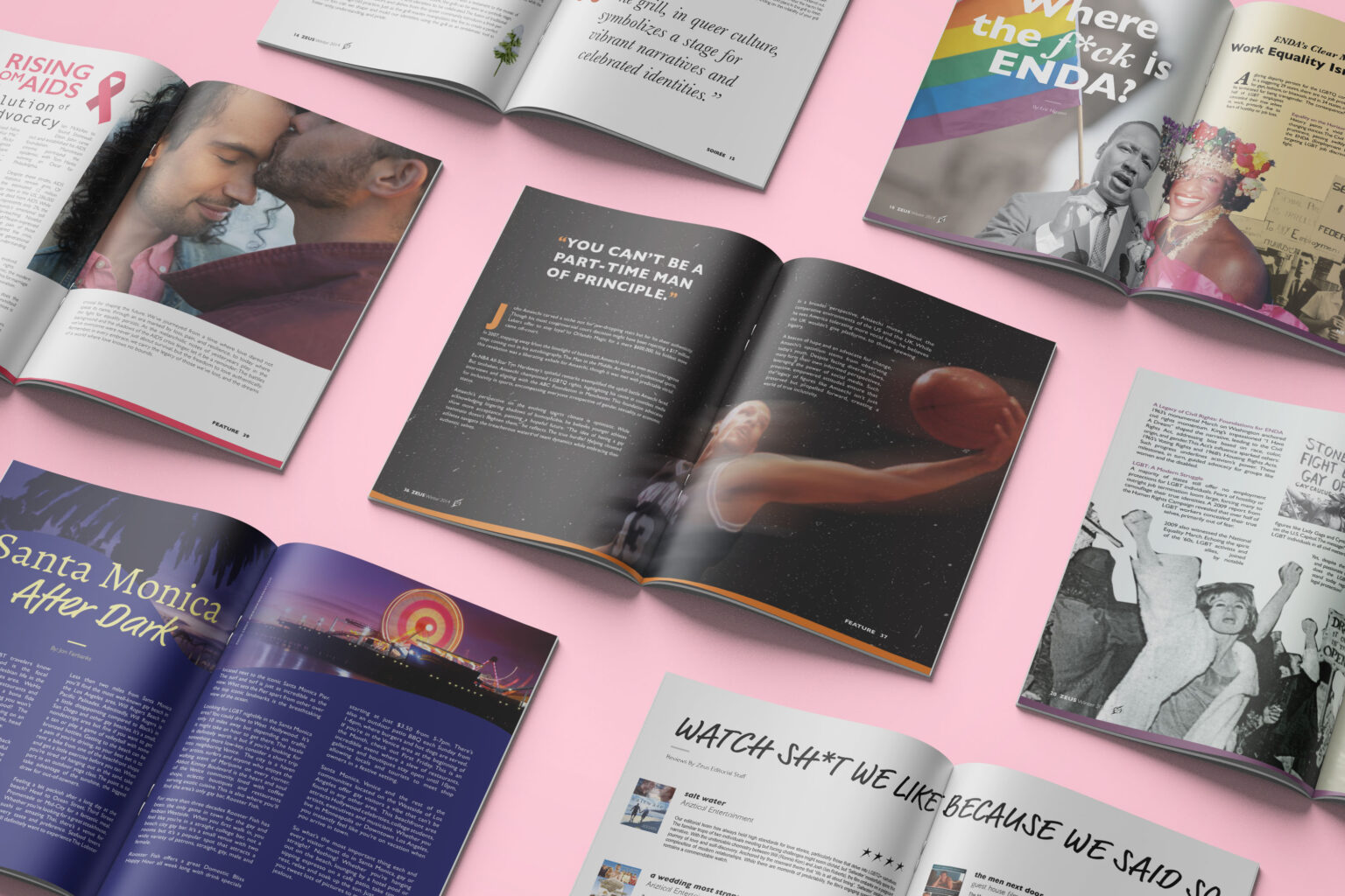
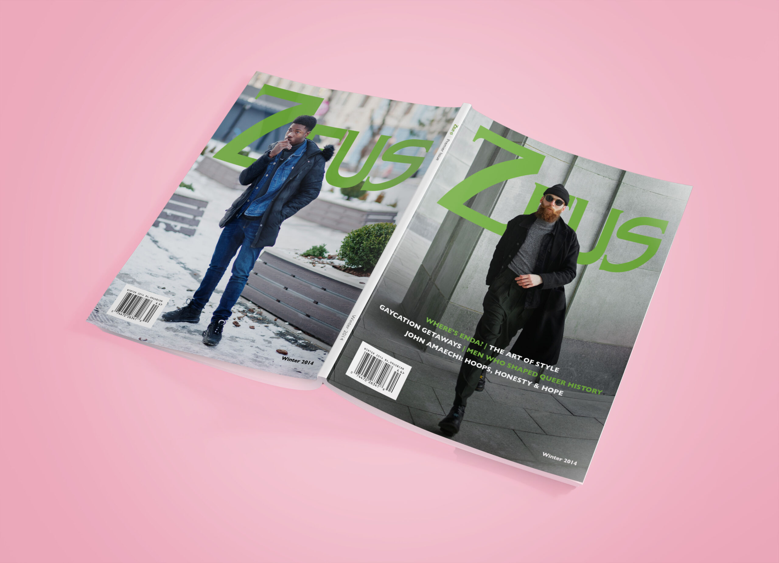
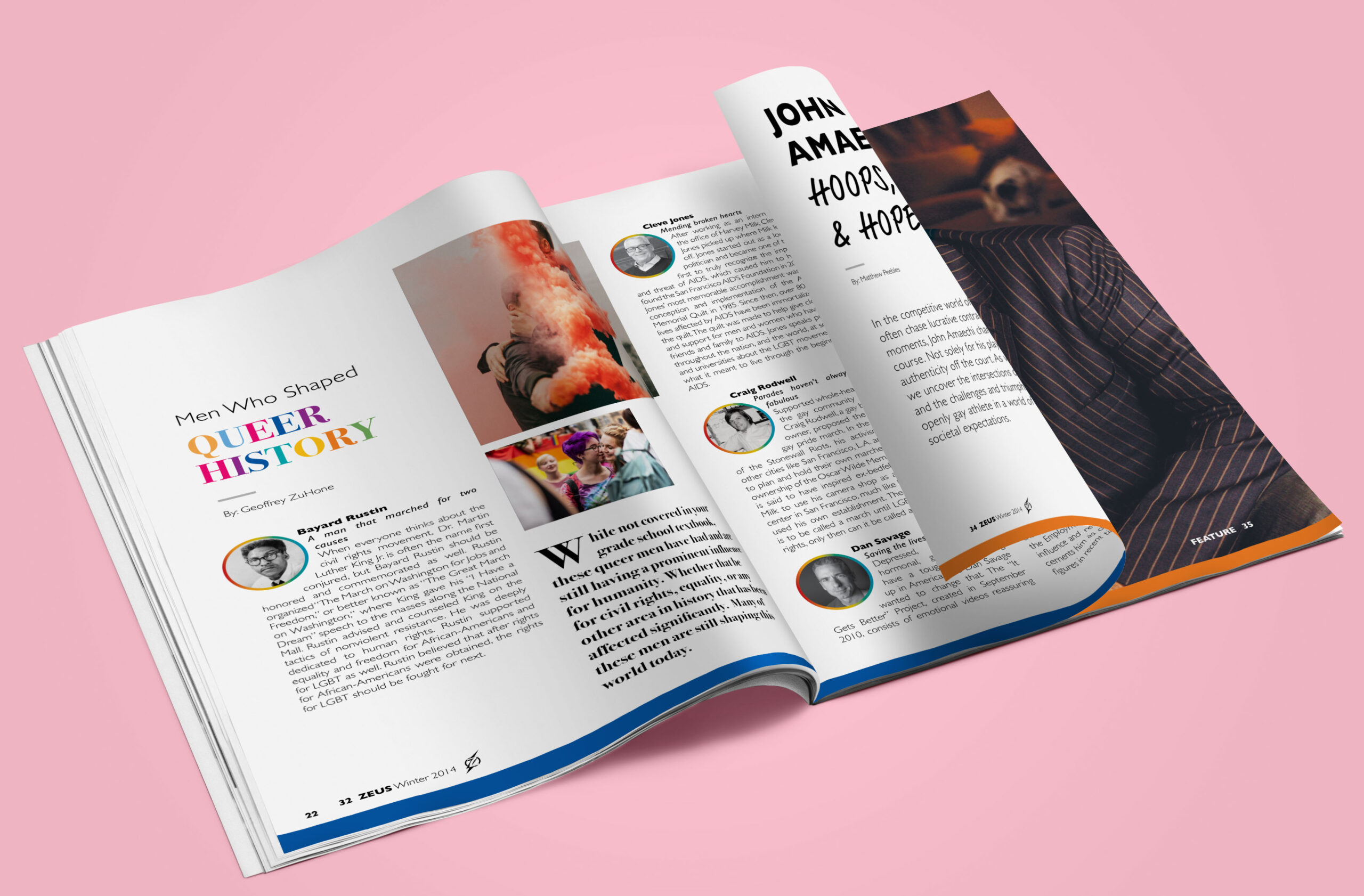
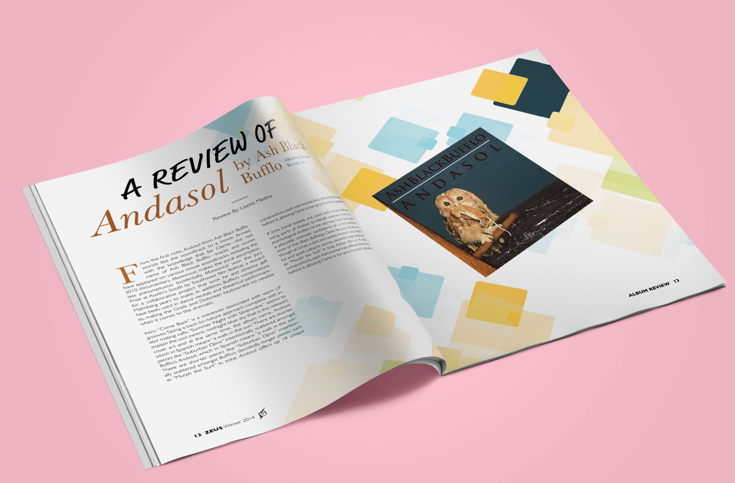
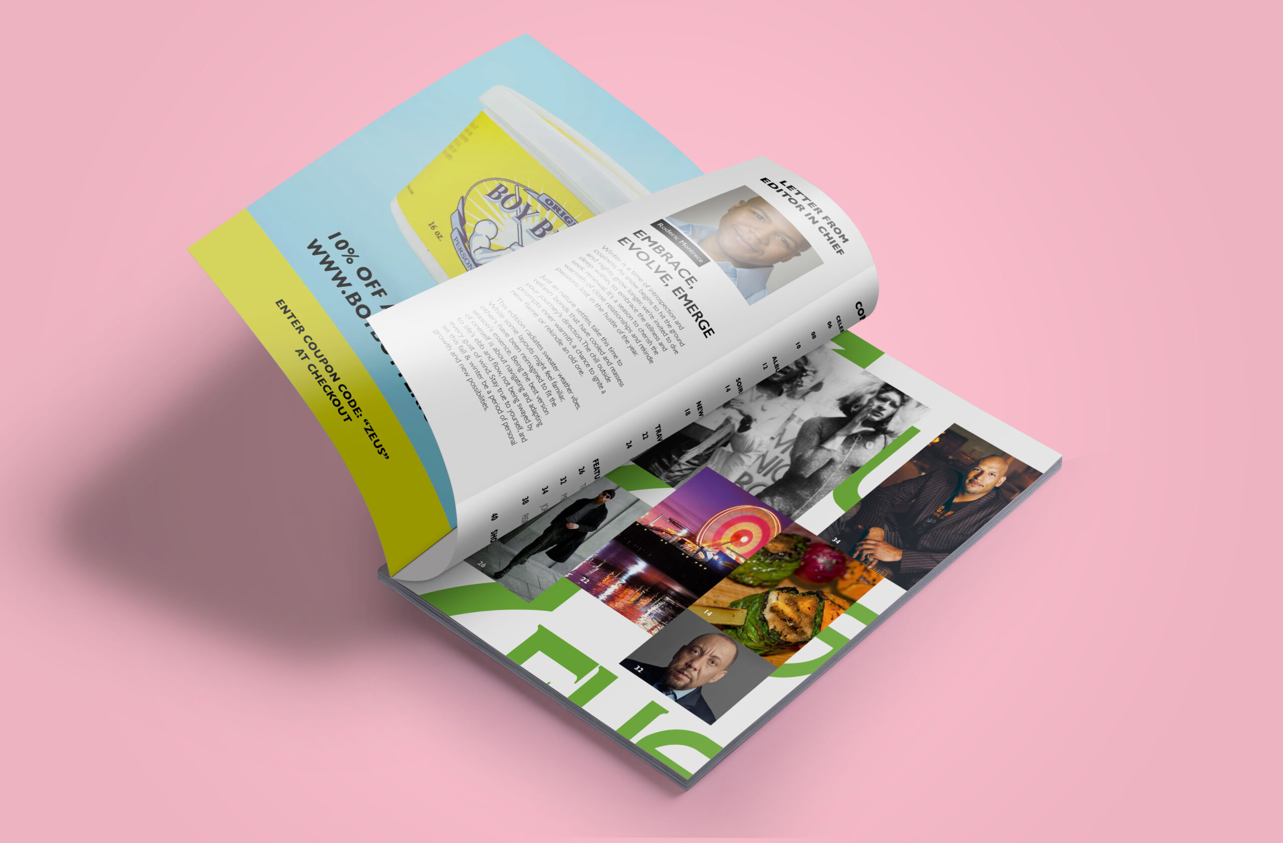
We built a flexible editorial system letting each story breathe while keeping the magazine cohesive. Bold green typography anchors the identity – dominating covers, framing photography, accenting interior spreads. Dynamic layouts adapt to content: intimate profiles get space and softness, activism pieces get urgency and historical imagery, lifestyle features get vibrant color and energy. The tone stays consistent across all content: direct, unapologetic, real. Typography hierarchy guides readers through dense content without feeling academic. Strategic use of white space balances information-heavy spreads.
MY ROLE
As Editorial Designer and Copywriter:
✔ Developed visual storytelling framework and green typography system across multiple issues
✔ Designed layouts for diverse content: activism features, fashion editorials, food coverage, nightlife guides, LGBTQ+ history pieces
✔ Created flexible design system balancing consistency with content-specific expression
✔ Wrote and edited copy maintaining authentic community voice across all sections
✔ Ensured magazine spoke directly to LGBTQ+ audience without pandering or performing
THE IMPACT
Community Platform: Zeus became more than a magazine – it established itself as an authentic voice and visibility platform for Chicago’s LGBTQ+ community. The flexible design system enabled coverage of vastly different topics (queer history, activism, fashion, nightlife) without feeling disjointed or tokenizing any single aspect of LGBTQ+ life.
Editorial Credibility: By balancing serious activism content (ENDA legislation, AIDS awareness, civil rights history) with lifestyle coverage (fashion, food, nightlife), the magazine positioned itself as both substantive and accessible. Readers engaged because the design and tone felt like conversation, not lecture.
Design System Success: The bold green typography and flexible layout system created strong brand recognition while allowing individual stories to have distinct visual identities. The system worked across all content types without feeling formulaic, proving editorial design can be both systematic and expressive.