THE CHALLENGE
Software engineer by day, DJ by night, COMPIL3R had a growing fanbase but no visual identity to match. His brand wasn’t connecting, wasn’t recognizable, and wasn’t moving merch. He needed something that could live in both worlds: developer culture and electronic music.
THE SOLUTION
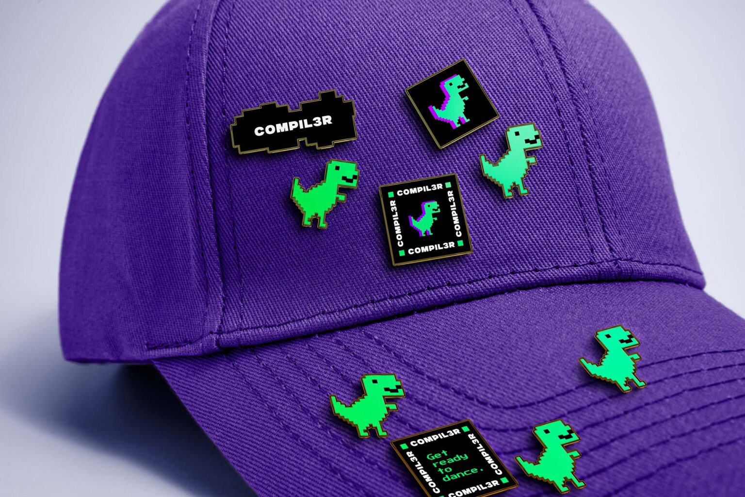
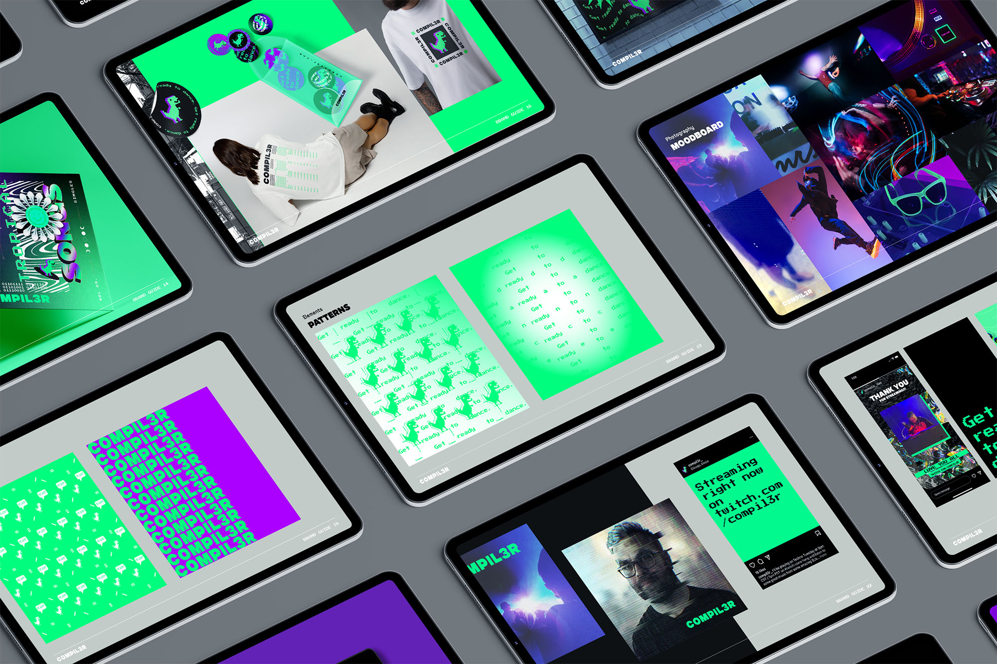
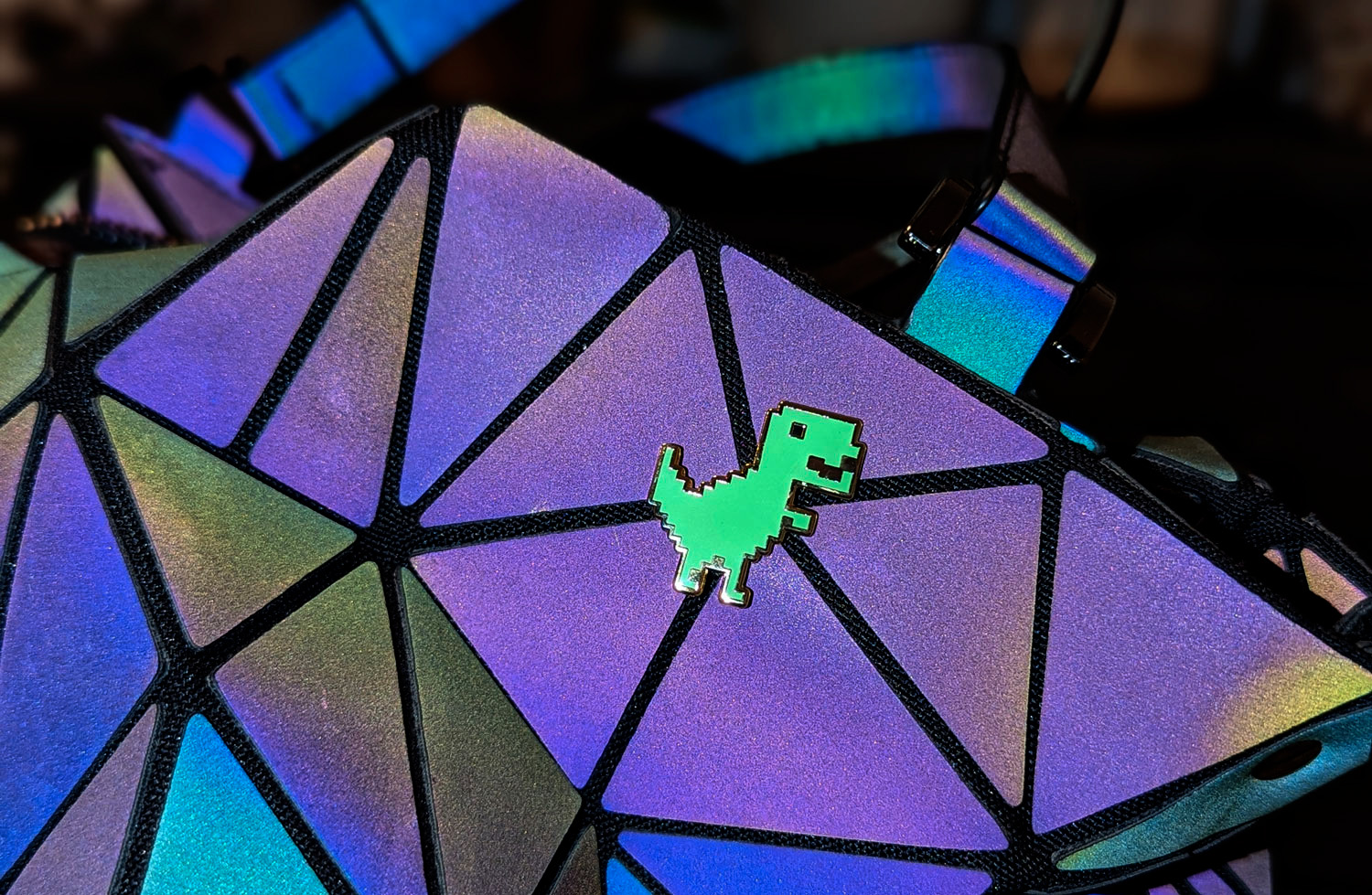
We didn’t design a logo. We hijacked an icon.
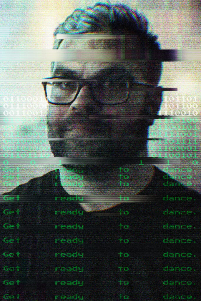
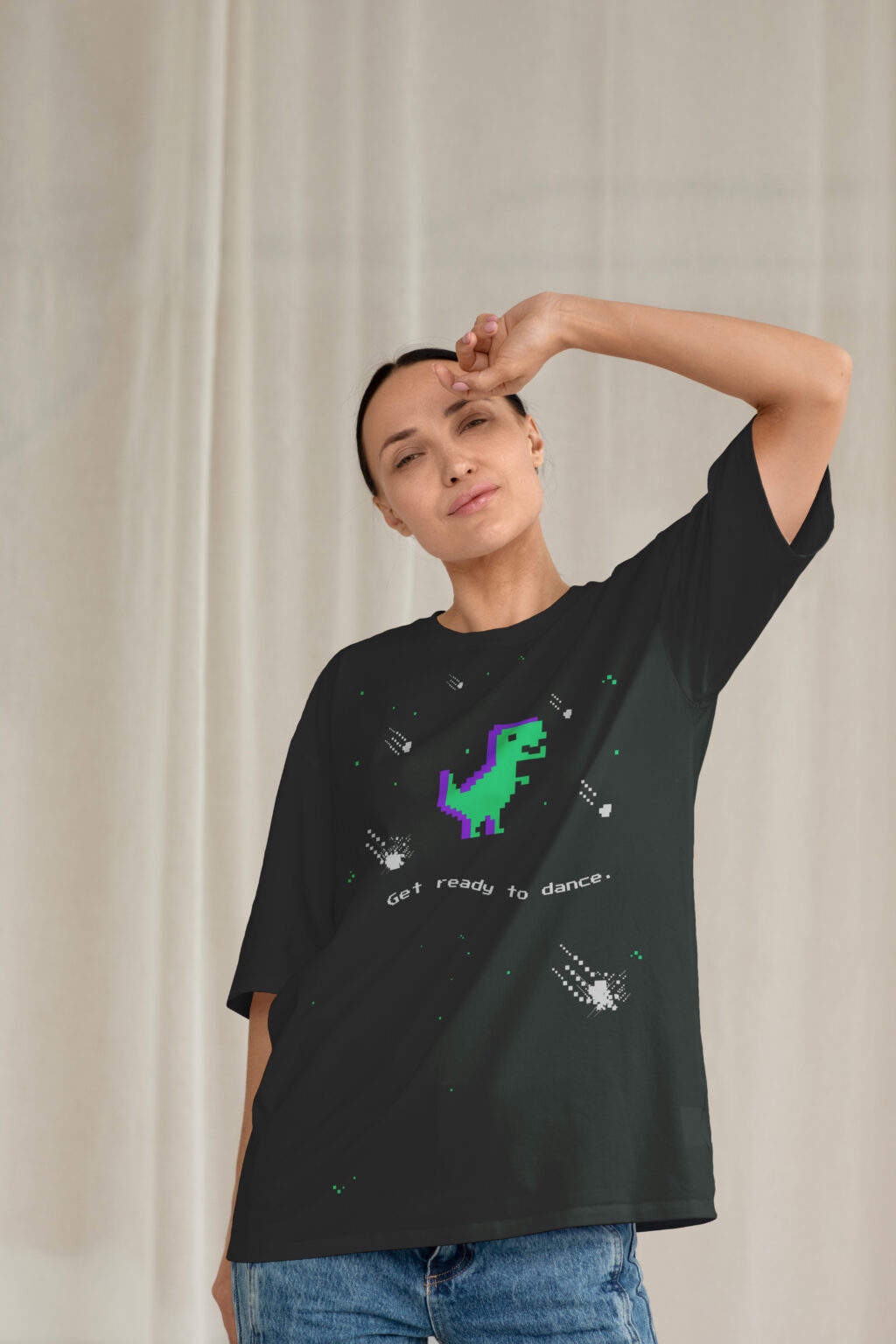
The Chrome dino is what every developer stares at when their connection drops. We subverted it, brought it into a completely different world, and made it the face of COMPIL3R. The tension is the concept: the dino is the mascot of broken connections. A DJ’s job is to maintain the connection. No signal becomes all vibe.
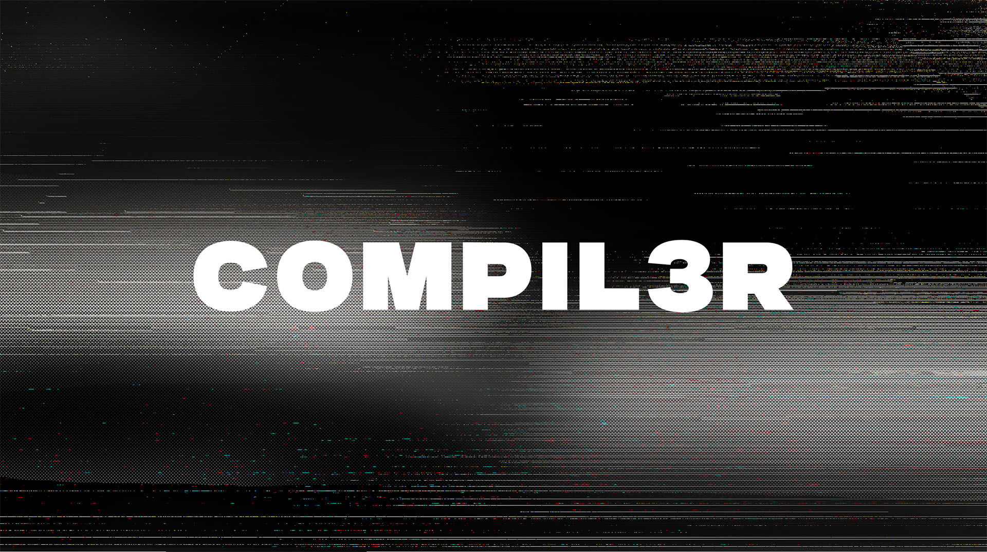
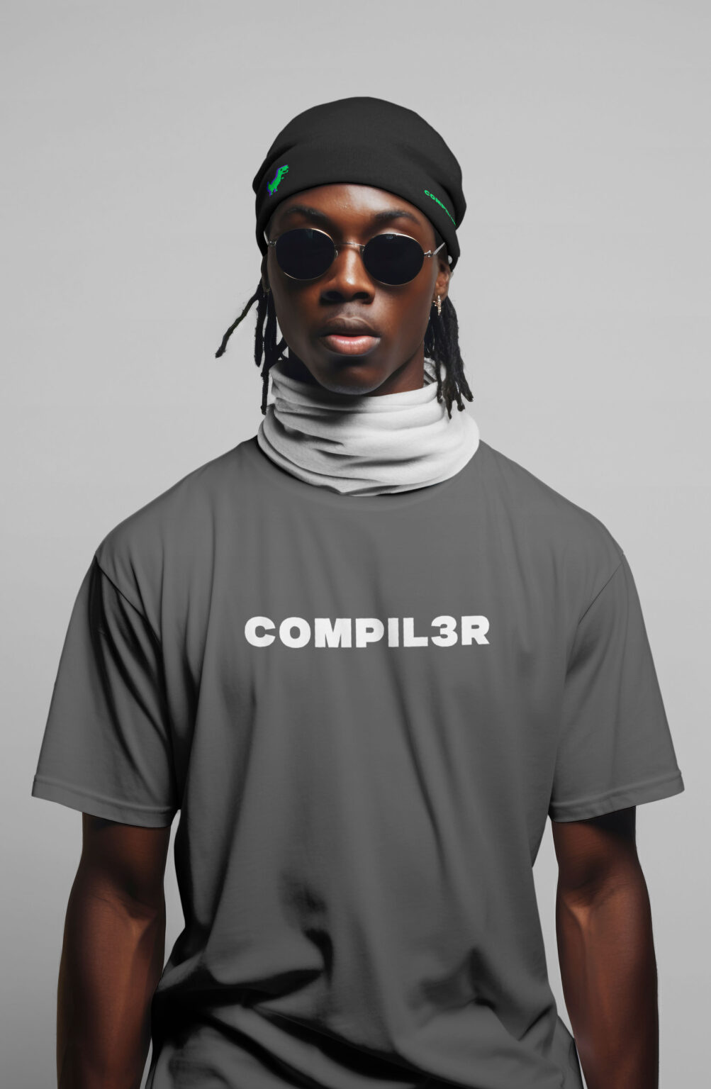
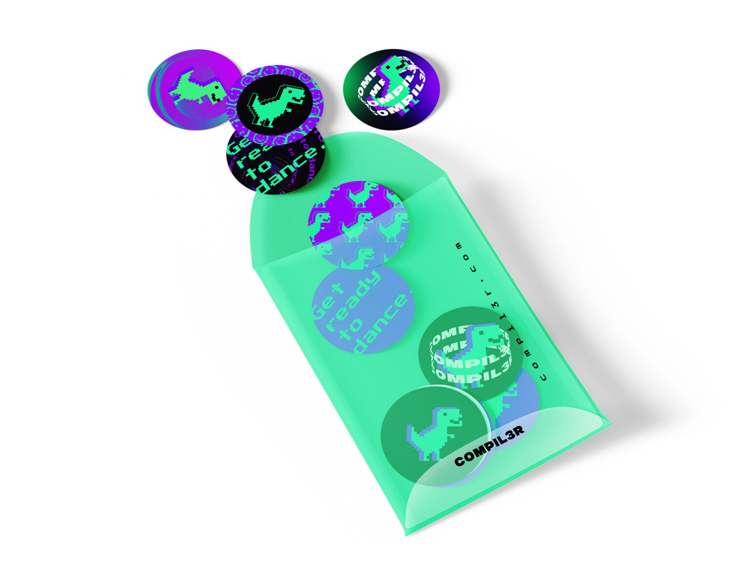
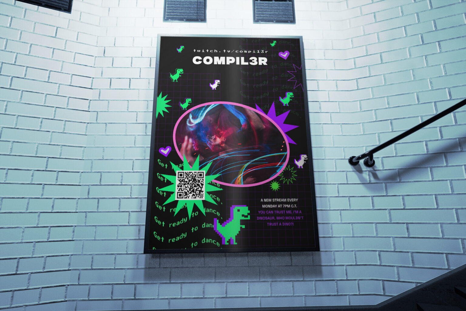
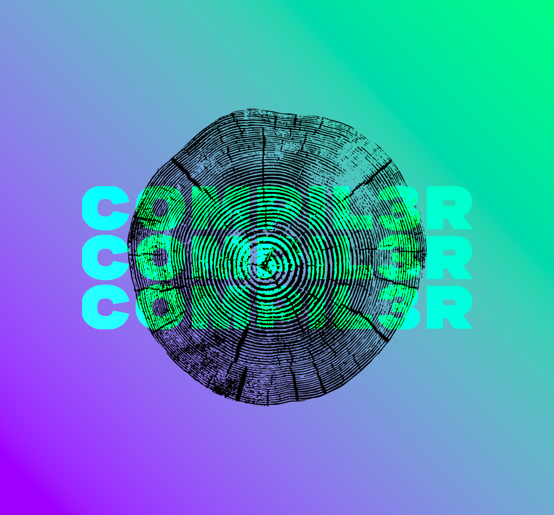
Everything else followed. A compiler transforms raw code into something executable. A DJ compiles tracks into a dancefloor experience. The name was never just a name. The leet-speak “3” nods to dev culture without spelling it out. The tagline “Get ready to dance.” reads like terminal output. The identity was built to flex, logomark, logotype, or both, instantly recognizable every time.
MY ROLE
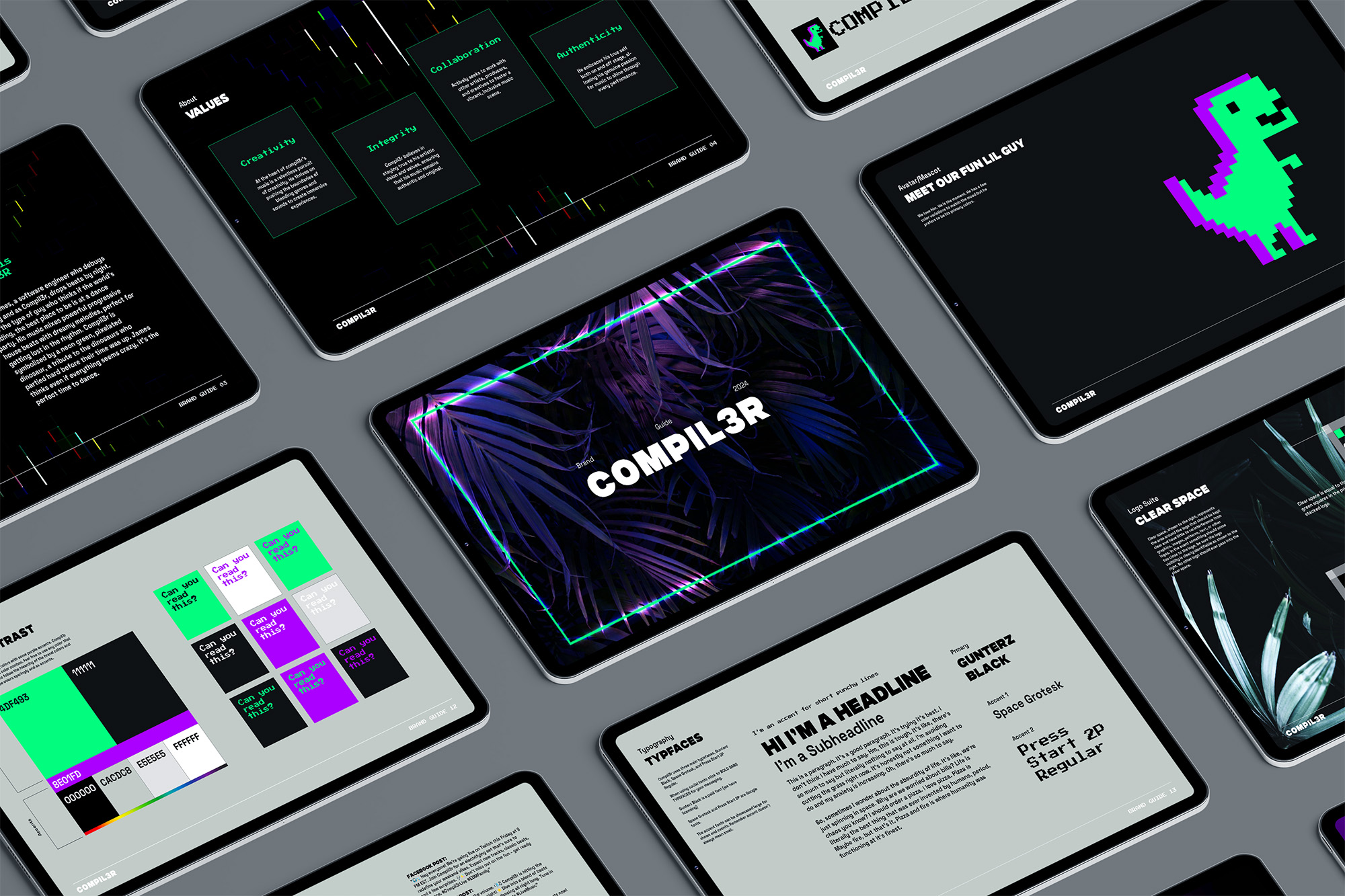
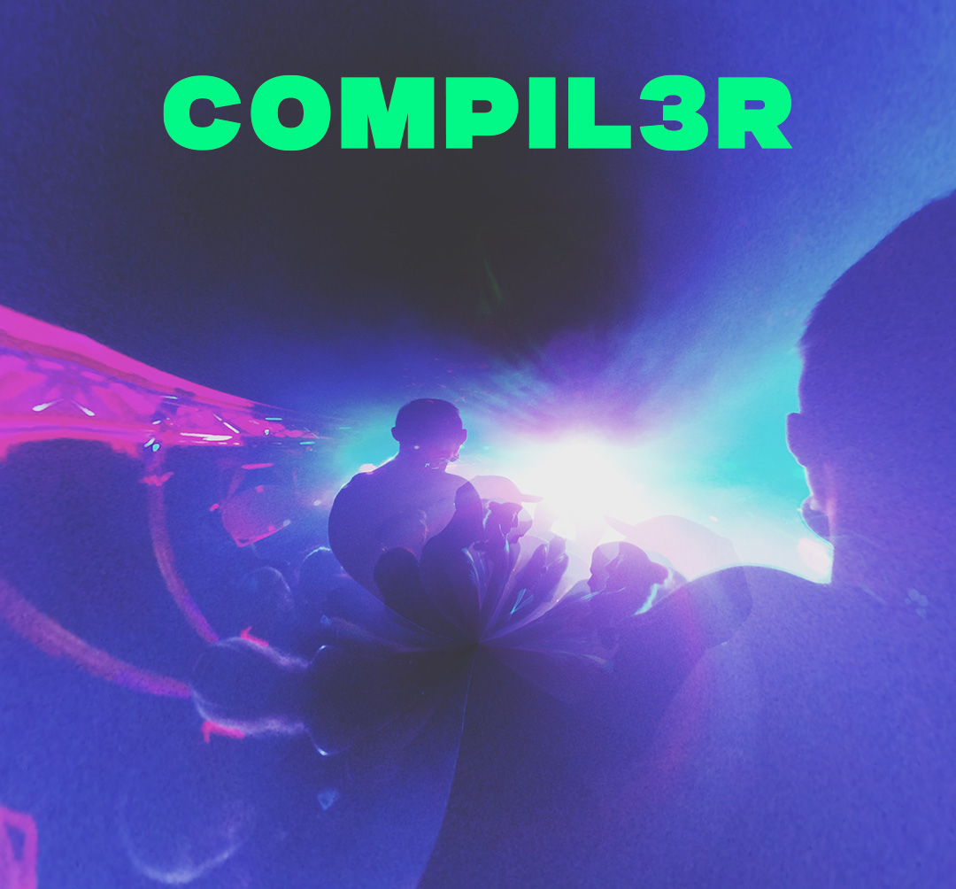
Creative Director. Full brand development: visual identity system, logomark variations, custom logotype, 4-color palette, brand guidelines, merchandise line, and digital presence across Twitch, social, and event assets.
✔ Created full visual identity system: logomark variation, custom logotype, 4-color palette, typography hierarchy, pattern system,
✔ Developed brand guidelines documenting logo usage, color applications, typography rules, brand voice, visual language across all touchpoints
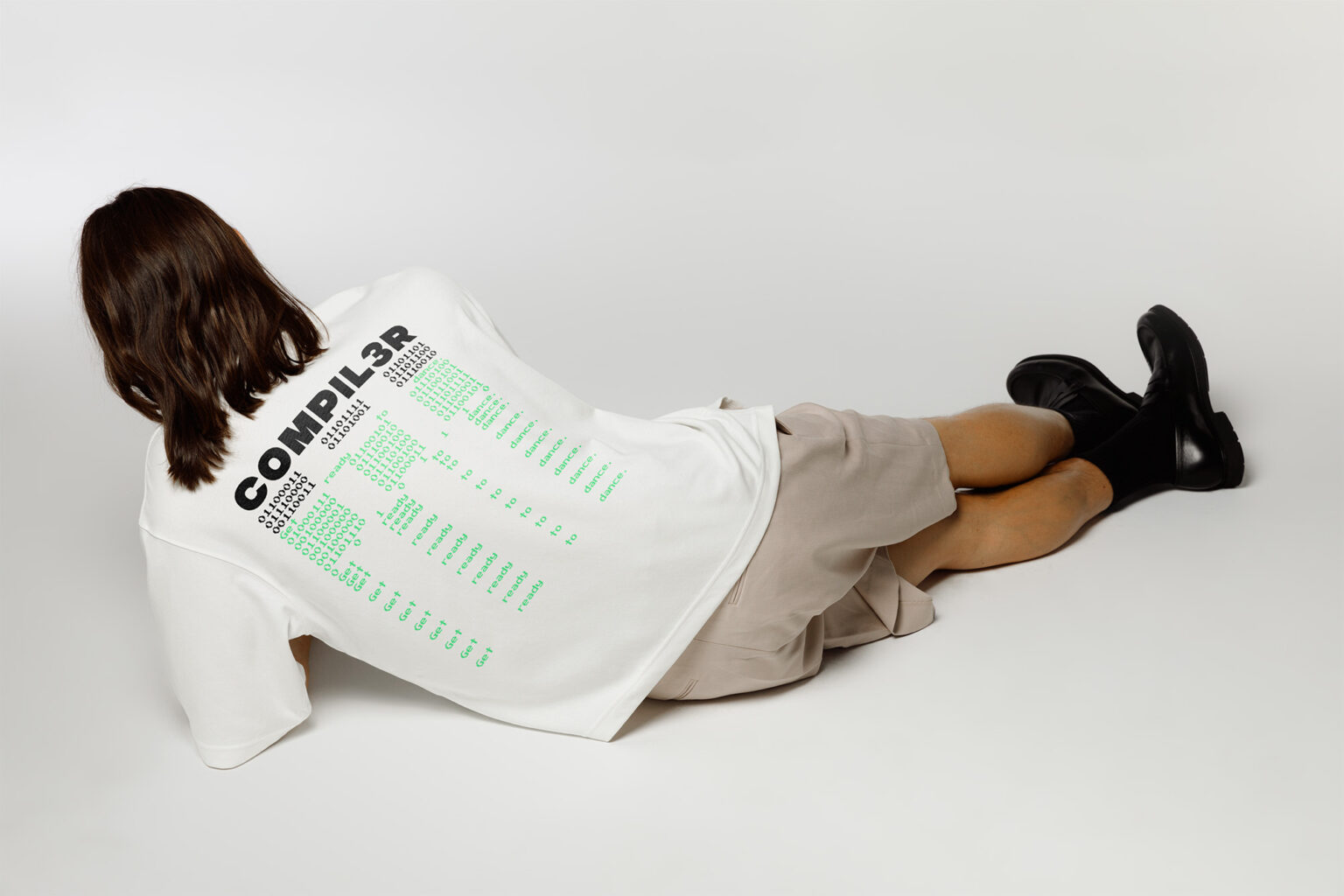
✔ Designed merchandise line including assets set up for IP legal review
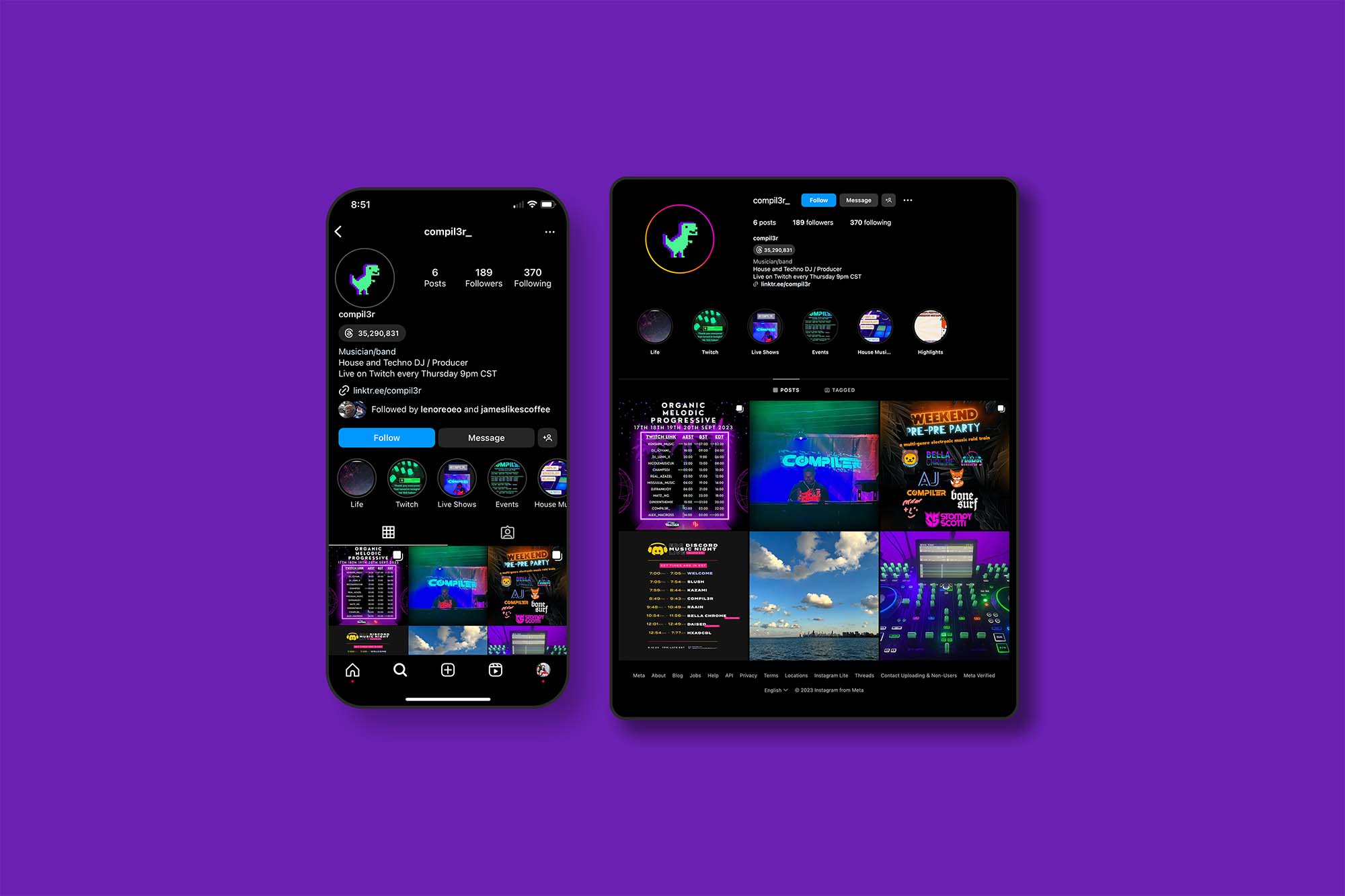
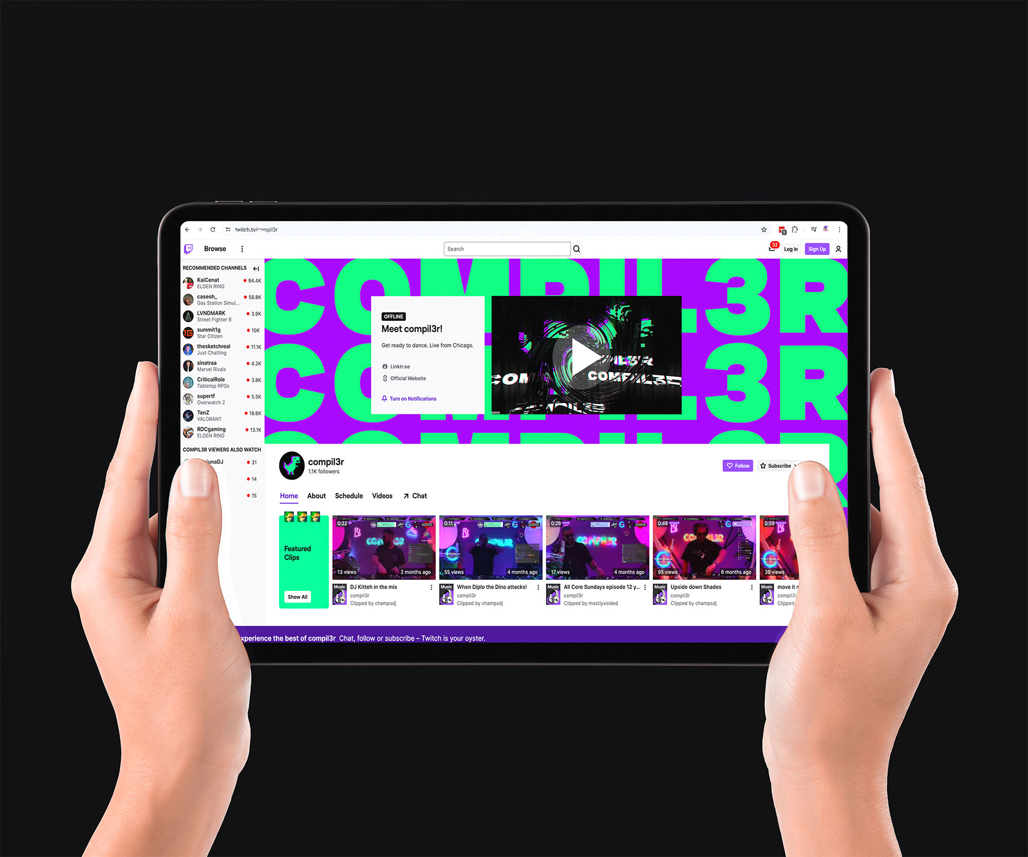
✔ Directed digital presence across Twitch channel graphics, social media templates, event promotion assets maintaining consistent aesthetic
✔ Established brand values connecting developer and music communities through shared cultural references
THE IMPACT
Immediate Market Response: Merch sold out. Fans made original fan art. The neon dino became a recognizable emblem in the electronic music community. COMPIL3R went from visually inconsistent to instantly recognizable, and the brand became a rallying point for a community that didn’t have one before. Built brand lore and emotional connection through subculture and ‘rule-breaking’.