Don’t Hate On System Fonts

[ February 5, 2025 ]

“But fancy fonts make a brand feel premium.”

I hear this all the time. And sure, a well-chosen font can give a brand polish. But the real difference between something that looks intentional and something that looks cheap isn’t about how rare or exclusive the font is—it’s about how it’s used.

The truth? You don’t need fancy fonts to have a great brand. Some of the most recognizable brands in the world rely on system fonts—the ones that come pre-installed on Mac and Windows. No need to pay for expensive type licenses or send clients scrambling to install missing fonts.

Let’s break down why system fonts work (if you use them right) and how to make them look just as sharp, strategic, and elevated as any custom typeface.

It’s Not About the Font, But How You Use It

Here’s a designer-approved list of system fonts that look polished, work across platforms, and won’t make your brand feel like a default PowerPoint template.

Serif Fonts (Classic & Professional)

🔹 Georgia – A clean, highly readable serif. Great for body text.


🔹 Times New Roman – Feels formal and structured. Best for editorial brands.

🔹 Palatino Linotype – Elegant and easy to read.


Sans-Serif Fonts (Modern & Versatile)

🔹 Arial – Simple, functional, and widely used. A good Helvetica alternative.


🔹 Helvetica – A design-world favorite for clean branding.


🔹 Verdana – Optimized for screens, making it great for web design.


🔹 Trebuchet MS – A more humanist sans-serif with character.


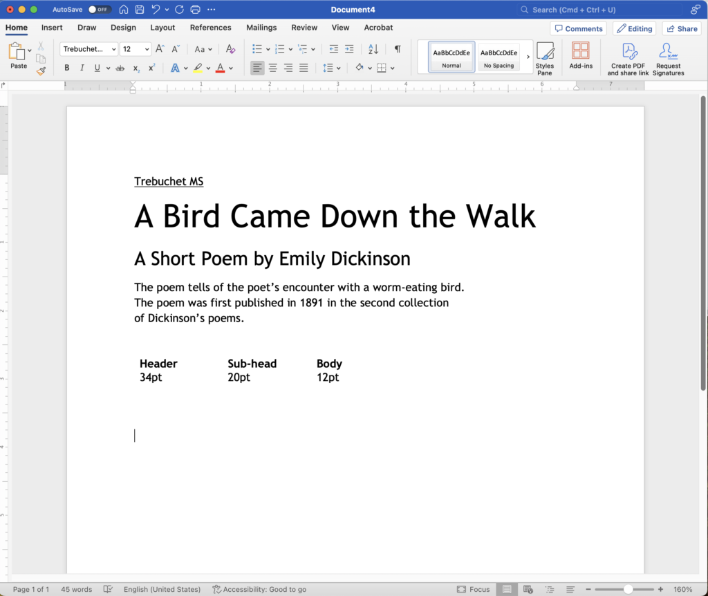
🔹 Tahoma – A compact sans-serif that works well in UI.


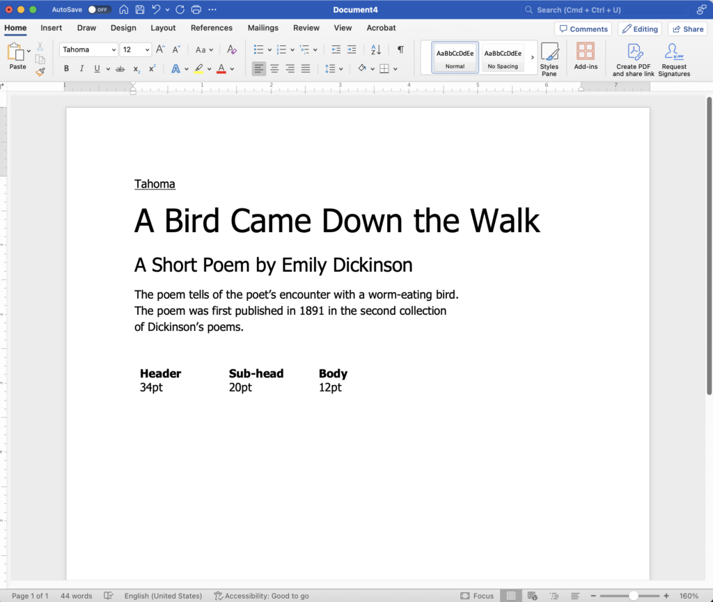
Monospace Fonts (Tech & Functional)

🔹 Courier New – A go-to for code and editorial layouts.


🔹 Lucida Console – Clean and readable for functional designs.


Other Useful Fonts

🔹 Lucida Sans Unicode / Lucida Grande – Simple, clean, and works well for body text.


🔹 Impact – Best for bold, eye-catching headlines.


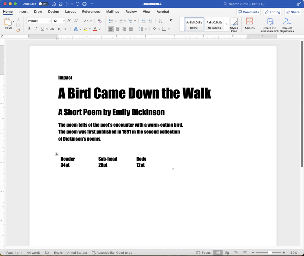
🔹 Century Gothic – A geometric sans-serif that feels fresh and modern.

Palatino Linotype font

So before hunting for the next trendy typeface, try this: Limit yourself to one of the fonts above. Set a clear font hierarchy. Focus on spacing, contrast, and alignment.

Why Pick System Fonts?

They’re Universal. No missing fonts, no compatibility issues, no weird formatting surprises when you send a file.

They’re Easy to Read. Most system fonts were designed for legibility, making them ideal for branding, UI, and marketing.

They Keep Things Simple. Fancy fonts can be a pain—especially for non-designers trying to keep branding consistent. System fonts are reliable and easy to work with.

They Force You to Think About Design. When you strip away the “fancy,” you’re left with the real work: hierarchy, spacing, contrast, and layout. Those things matter way more than the font itself.

Related posts