THE CHALLENGE
Forma, architecture and design firm, needed brand identity as sharp and intentional as structures they build. Goal: craft visual language feeling premium without cold. Elevated, modern, rooted in discipline of form itself. In saturated market of slick sameness, identity had to cut through with clarity and confidence while reflecting architectural precision and human-centered design approach.
THE SOLUTION
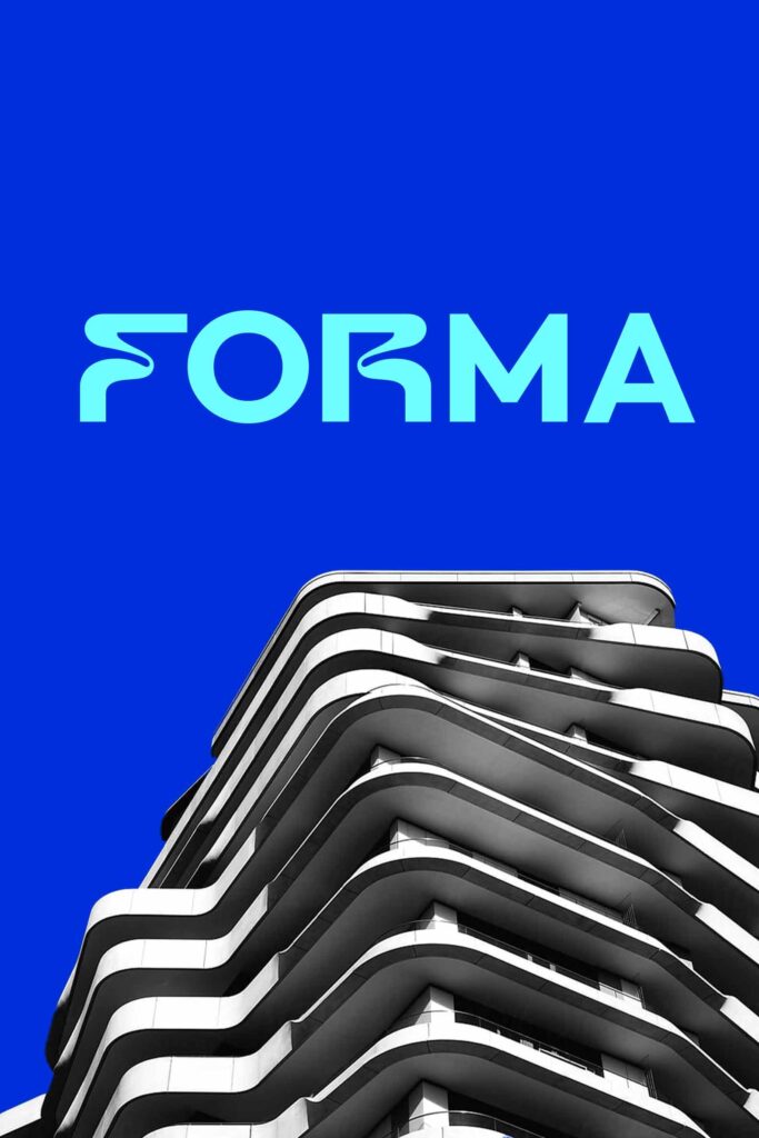
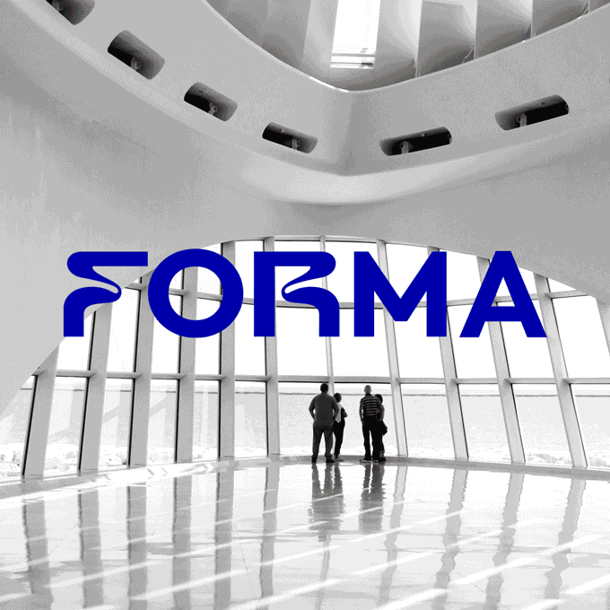
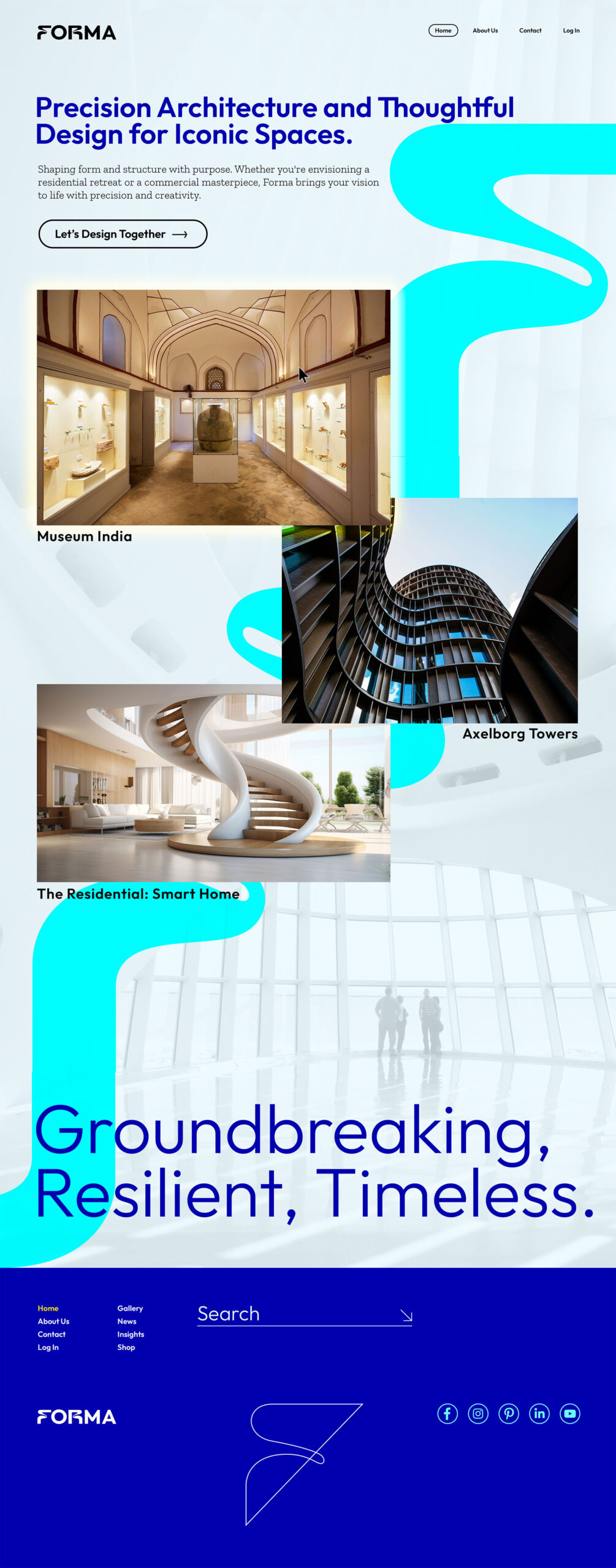
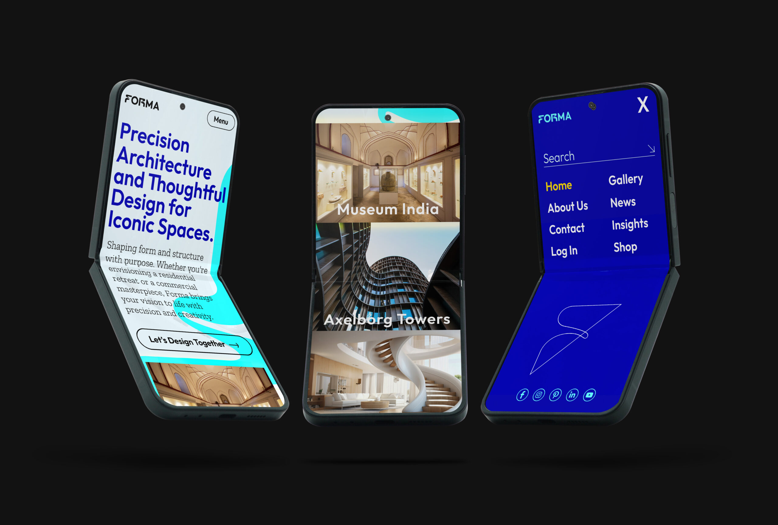
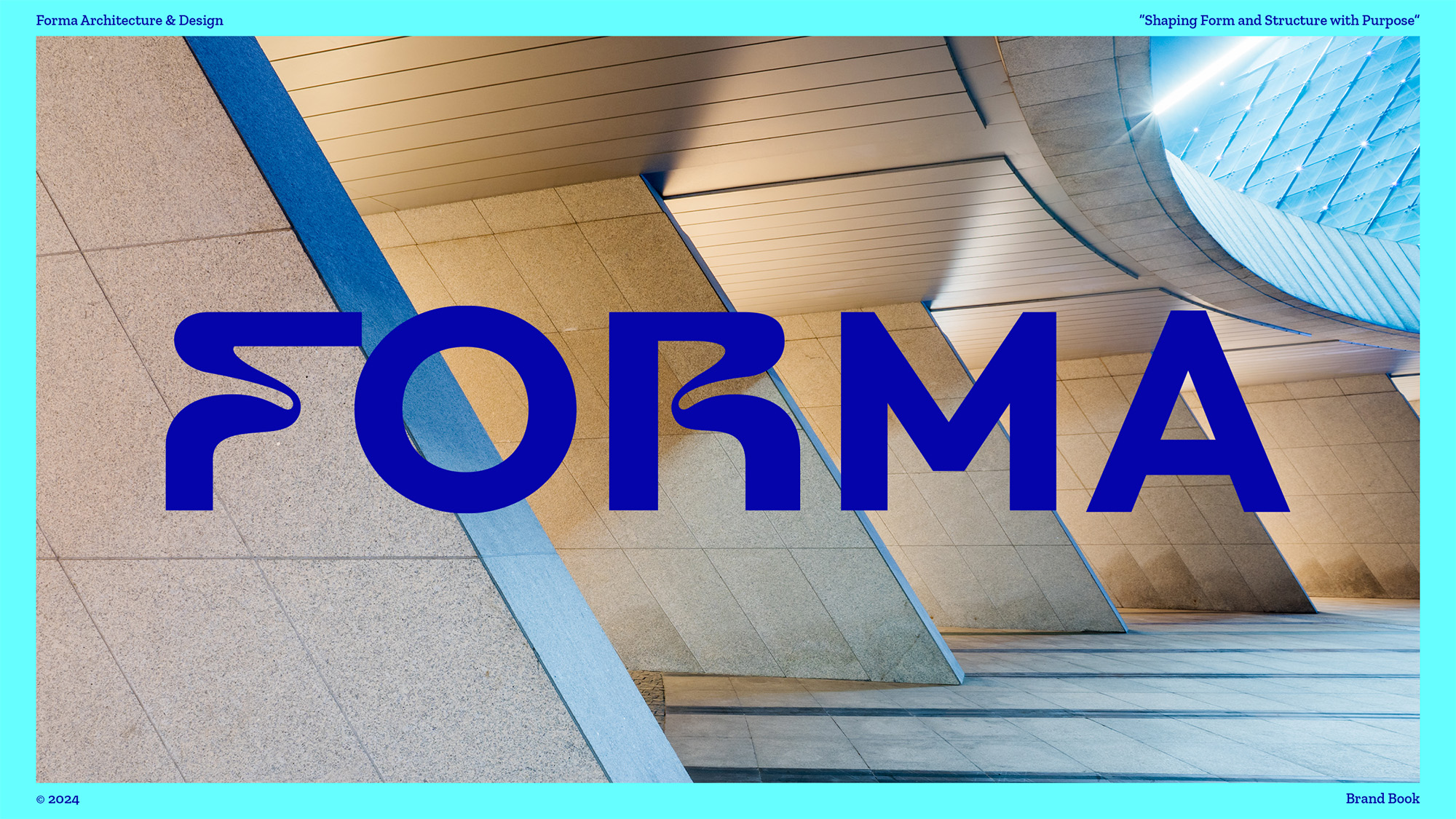
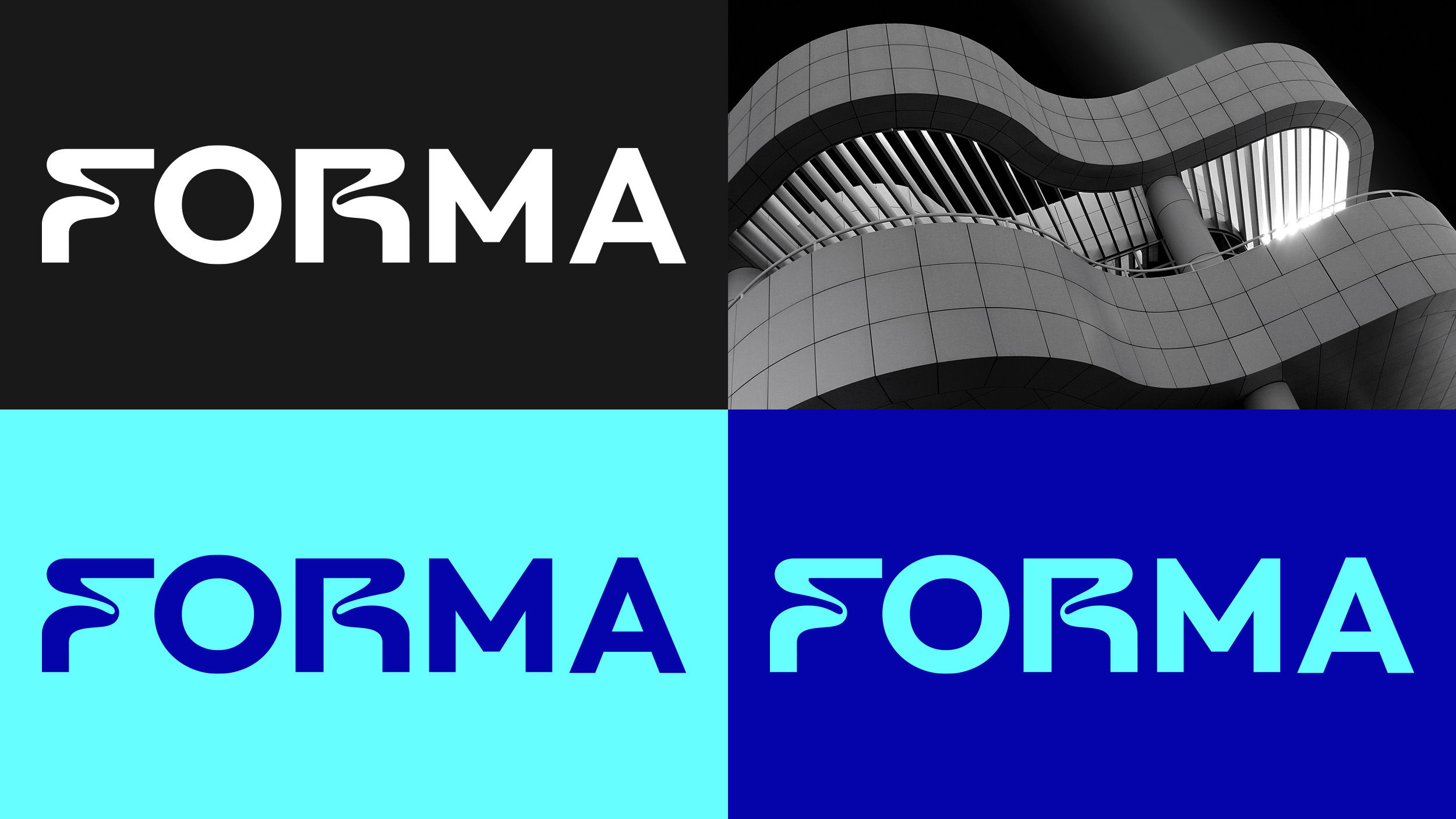
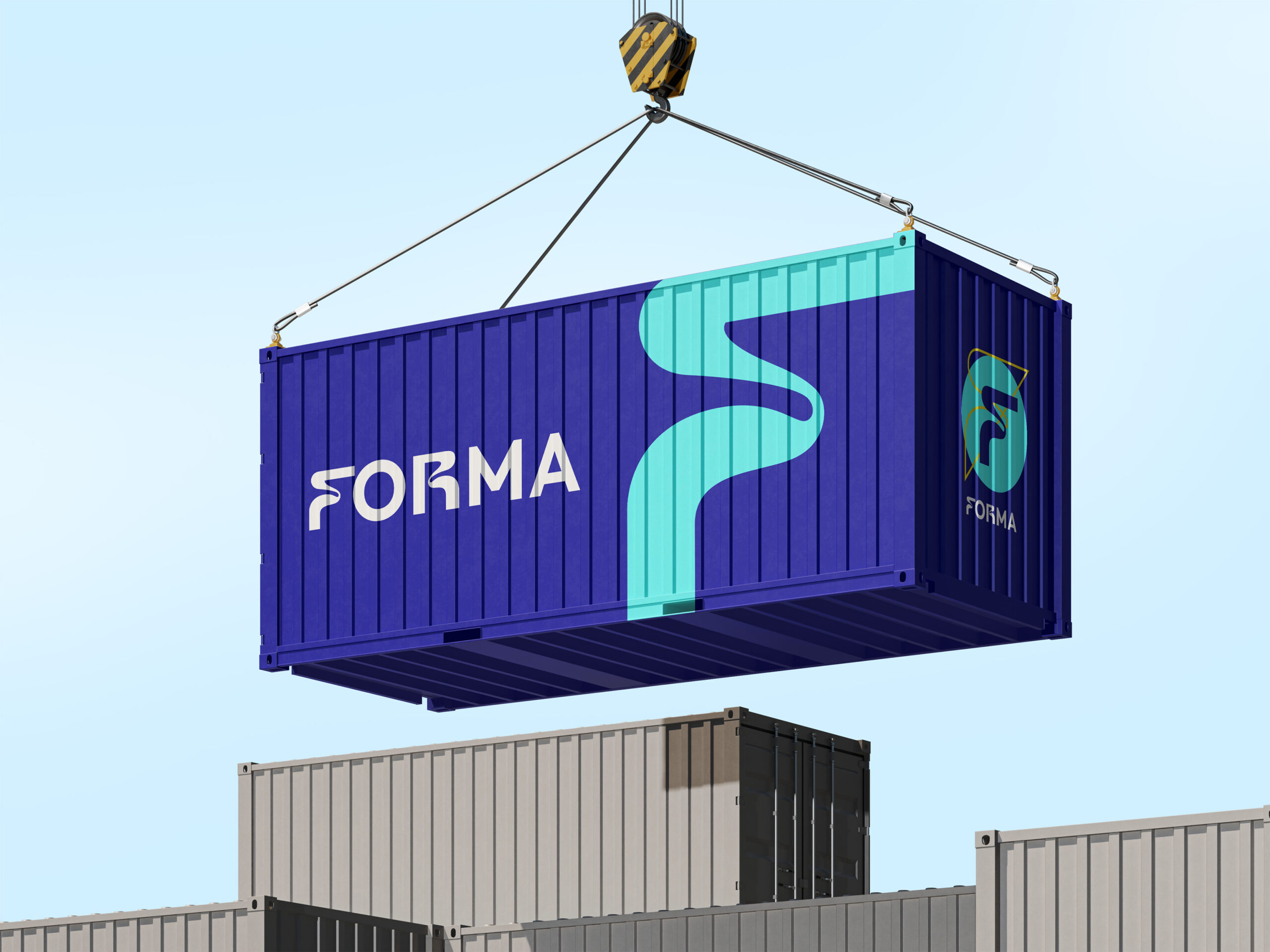
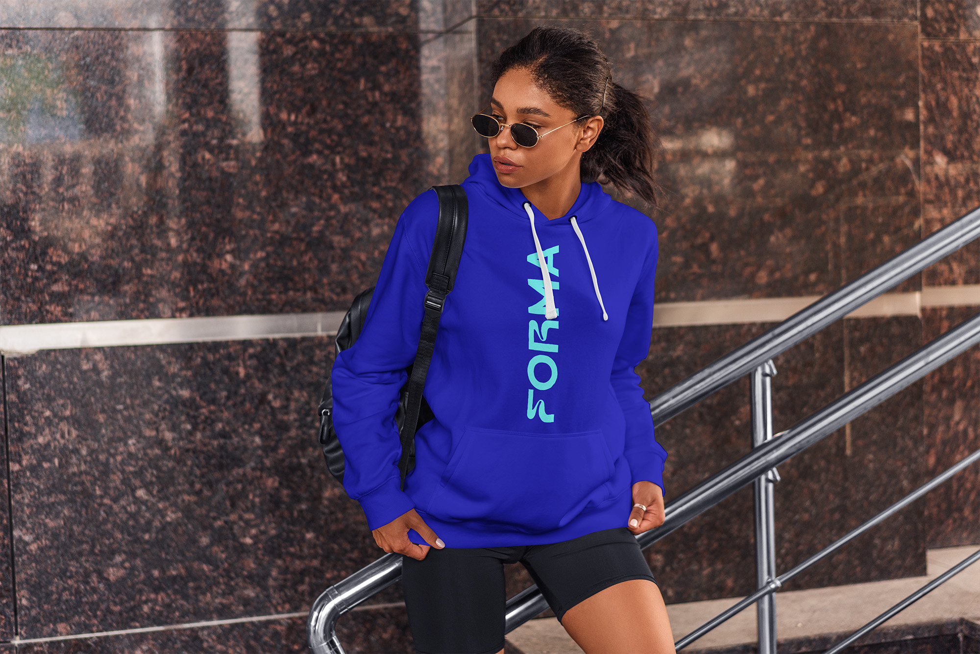
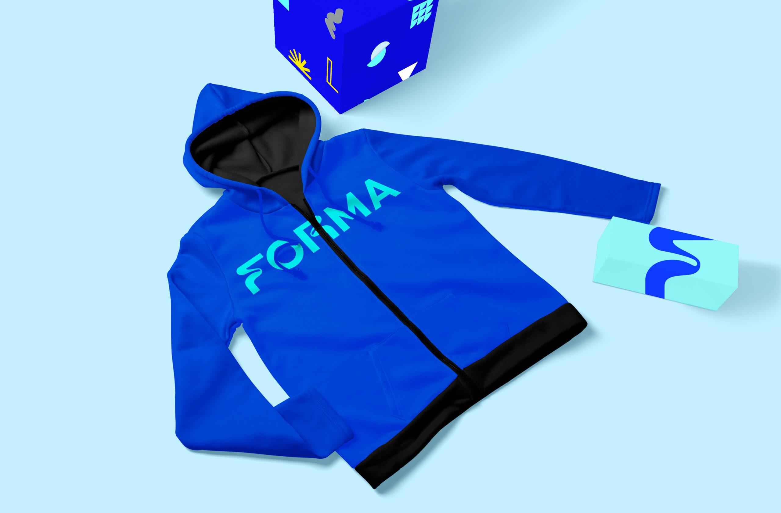
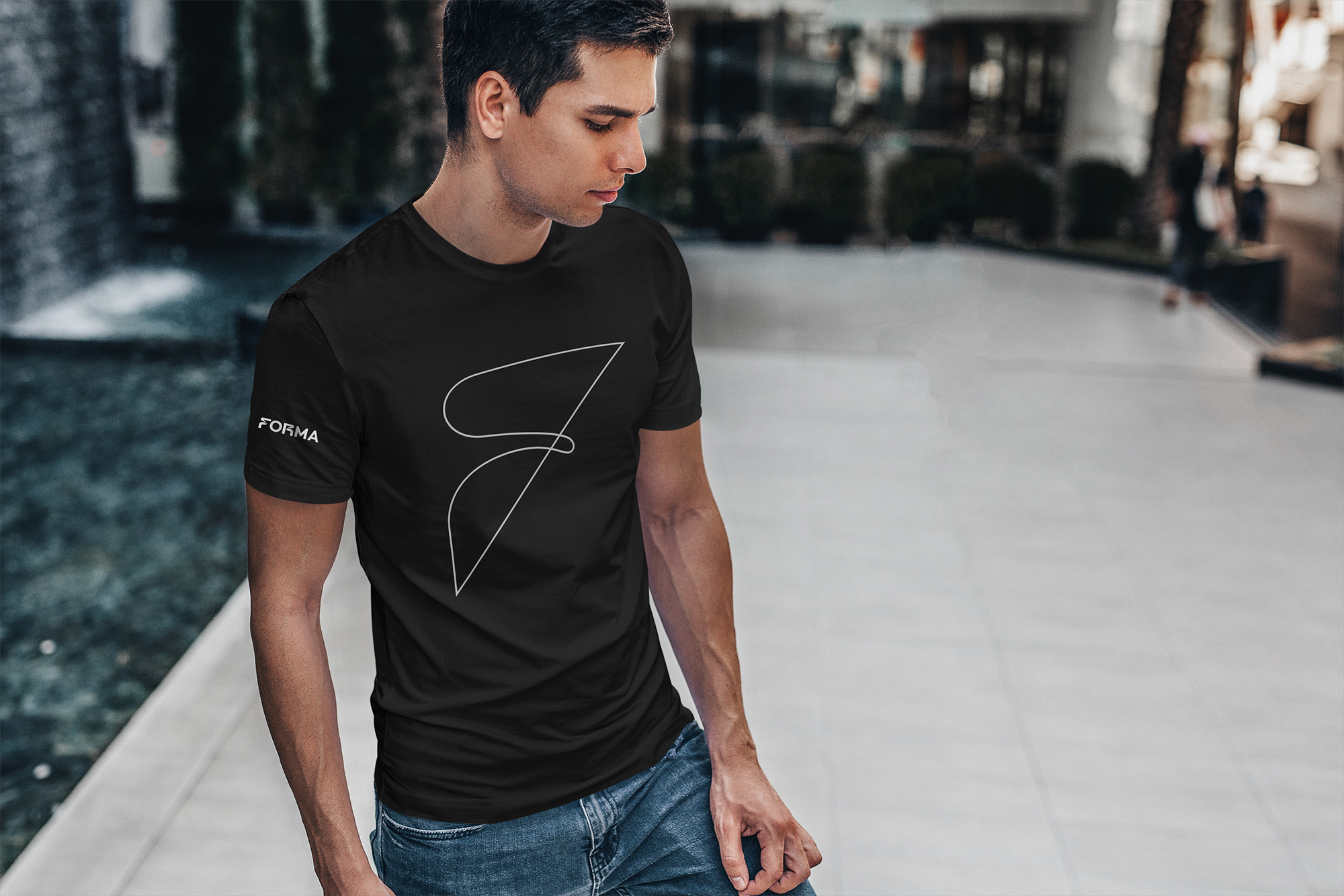
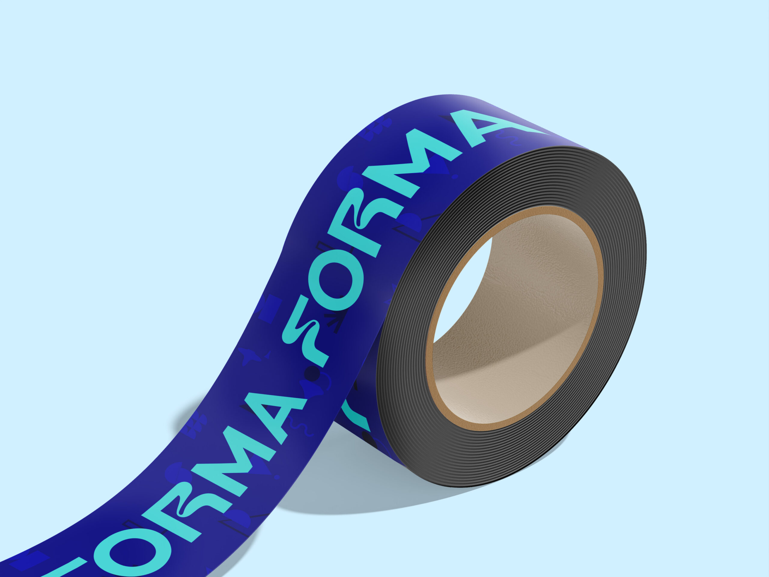
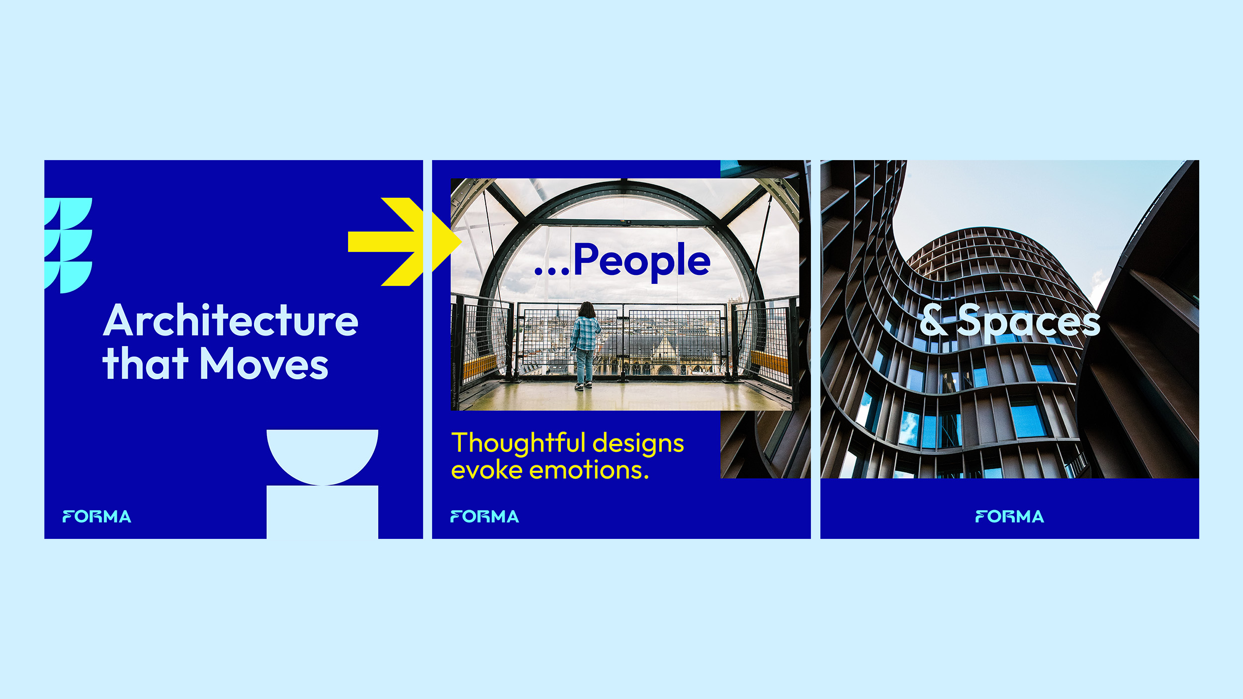
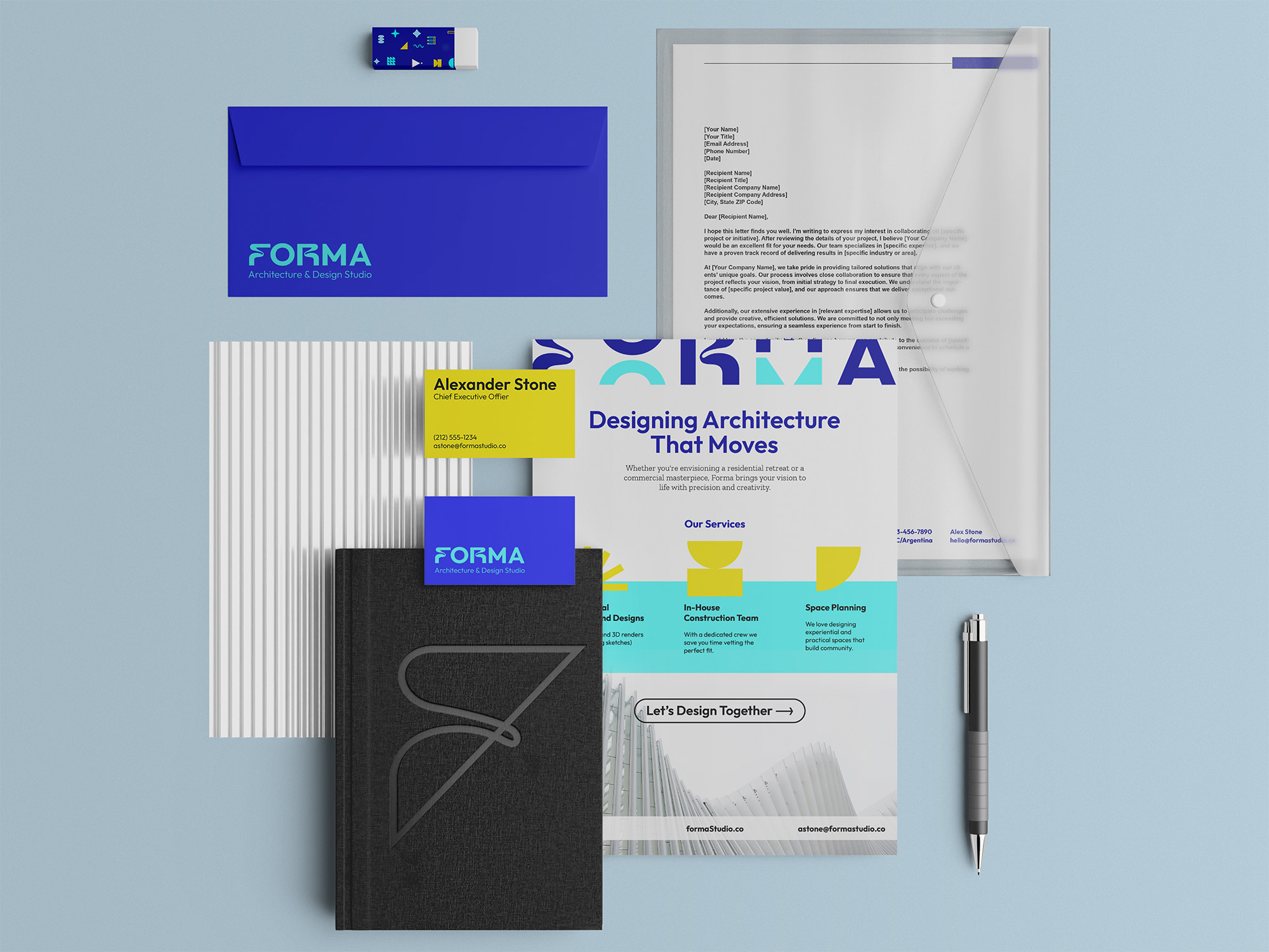
Brand system built like blueprint: structural, clean, deceptively simple. Used negative space, modular typography, energetic minimalist color palette echoing architectural precision. Fluid “F” logomark represents form in motion, architectural flow, spaces shaped for people. Electric blue + aqua color system signals innovation over traditional architecture gray. Geometric pattern library abstracting architectural elements (curves, angles, repetition) creating flexible visual language. Subtle type tweaks add personality without compromising professionalism. Flexible grid ties everything together, giving Forma ability to stay cohesive while adapting across platforms: pitch decks, signage, web, construction sites, merchandise.
MY ROLE
Led complete brand development as Creative Strategist, building identity system from foundation.
✔ Developed brand identity from ground up embodying Forma’s ethos: precision architecture shaped by human experience, spaces designed for emotion and function
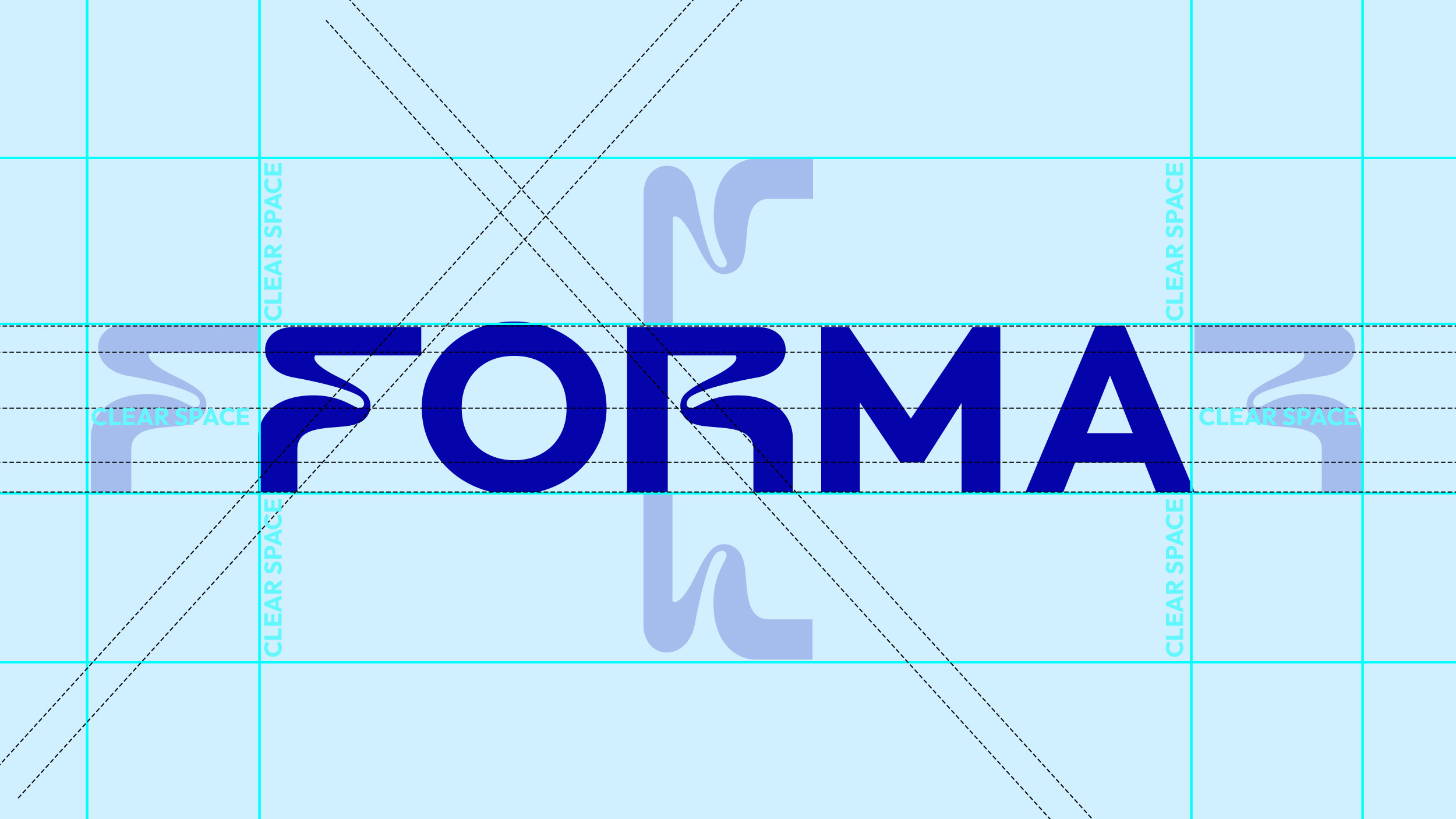
✔ Designed complete logo system: fluid “F” logomark (outline + solid variations), FORMA wordmark with custom letter modifications, lockup configurations for different applications
✔ Created 7-color palette: Dark Blue (primary), Aqua (accent), Aureolin yellow (energy), Cadet Gray, Columbia Blue, Black, White – strategic departure from architecture industry’s typical grays
✔ Developed geometric pattern library: 30+ abstract shapes derived from architectural elements (curves, semicircles, triangles, repetition, rhythm) functioning as flexible visual language across applications
✔ Established typography system: Outfit Family (headlines, solid modern presence) + Zilla Slab Family (body copy, tactile consistency) balancing geometric structure with personal touch
✔ Designed complete application system: website, LinkedIn presence, pitch materials, construction site signage, museum banners, merchandise (hoodies, apparel), hard hats, environmental graphics
✔ Built brand guidelines documenting logo usage, clear space requirements, color applications, pattern deployment, photography direction, typography hierarchy maintaining consistency while enabling growth
THE IMPACT
Market Positioning: Rebrand gave Forma credibility and visual presence competing with larger, established firms. Clean, energetic identity system made them instantly recognizable in pitch meetings and industry events, positioning them as both innovative and trustworthy. Differentiated through electric blue + aqua color strategy versus industry-standard grays.
System Scalability: Flexible brand system scaled seamlessly as they grew, maintaining consistency across every touchpoint without feeling rigid or formulaic. Pattern library provided endless combinations while staying on-brand. Went from generic architecture firm to one looking and feeling like future of design: structured, confident, built to evolve.
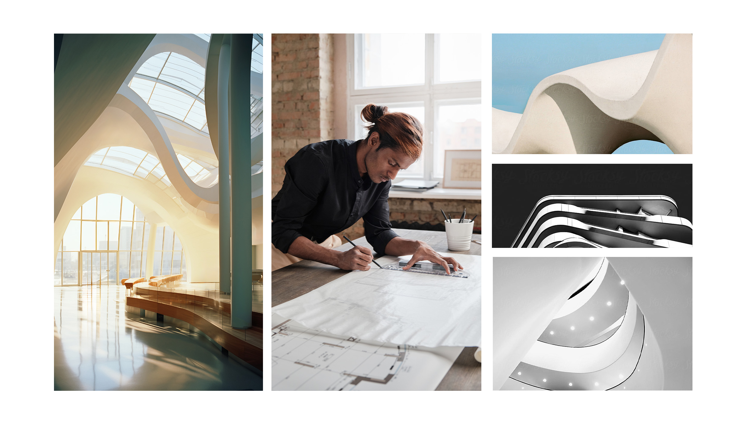
Human-Centered Architecture: Brand reflects Forma’s philosophy that architecture isn’t just building structures, it’s shaping form with purpose, creating iconic spaces where people live and work. Visual language captures both technical precision and human warmth, differentiating in industry often focused only on structures rather than experience.