THE CHALLENGE
A publishing client needed a contemporary reprint of Baudelaire’s The Flowers of Evil that could reach modern readers without losing its dark, provocative edge. Existing editions were either too academic or relied on gothic clichés..
THE SOLUTION
Designed two covers. Two entry points into Baudelaire’s world.
Cover 1: Vintage Maximalism
Vintage rose artwork layered over deep teal with bold condensed typography and hot pink dripping accent. Inspired by Pierre-Joseph Redouté’s botanical illustrations and the decadent visual culture of Baudelaire’s Paris. Rich, ornamental, romantic.
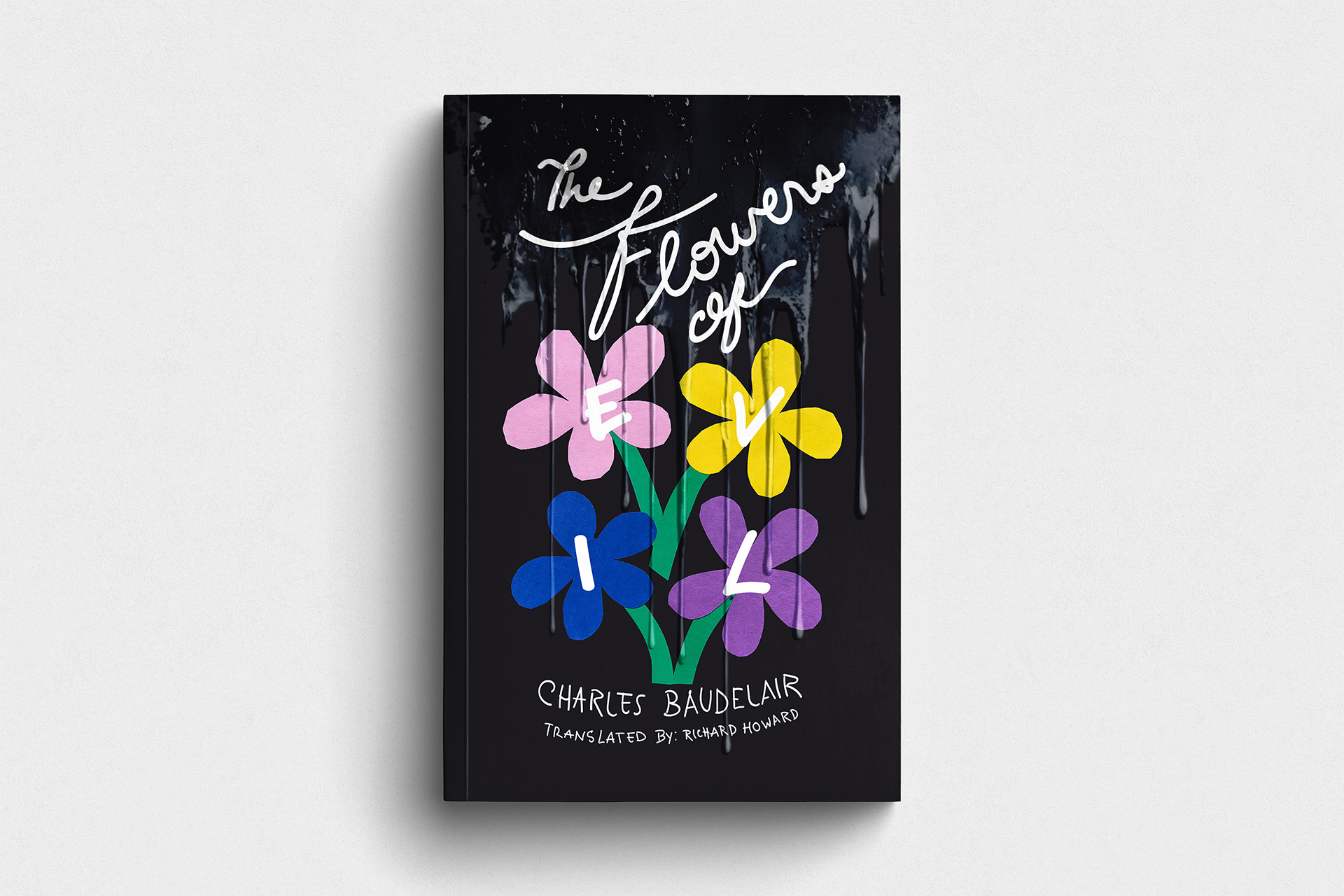
Cover 2: Minimalist Modernism
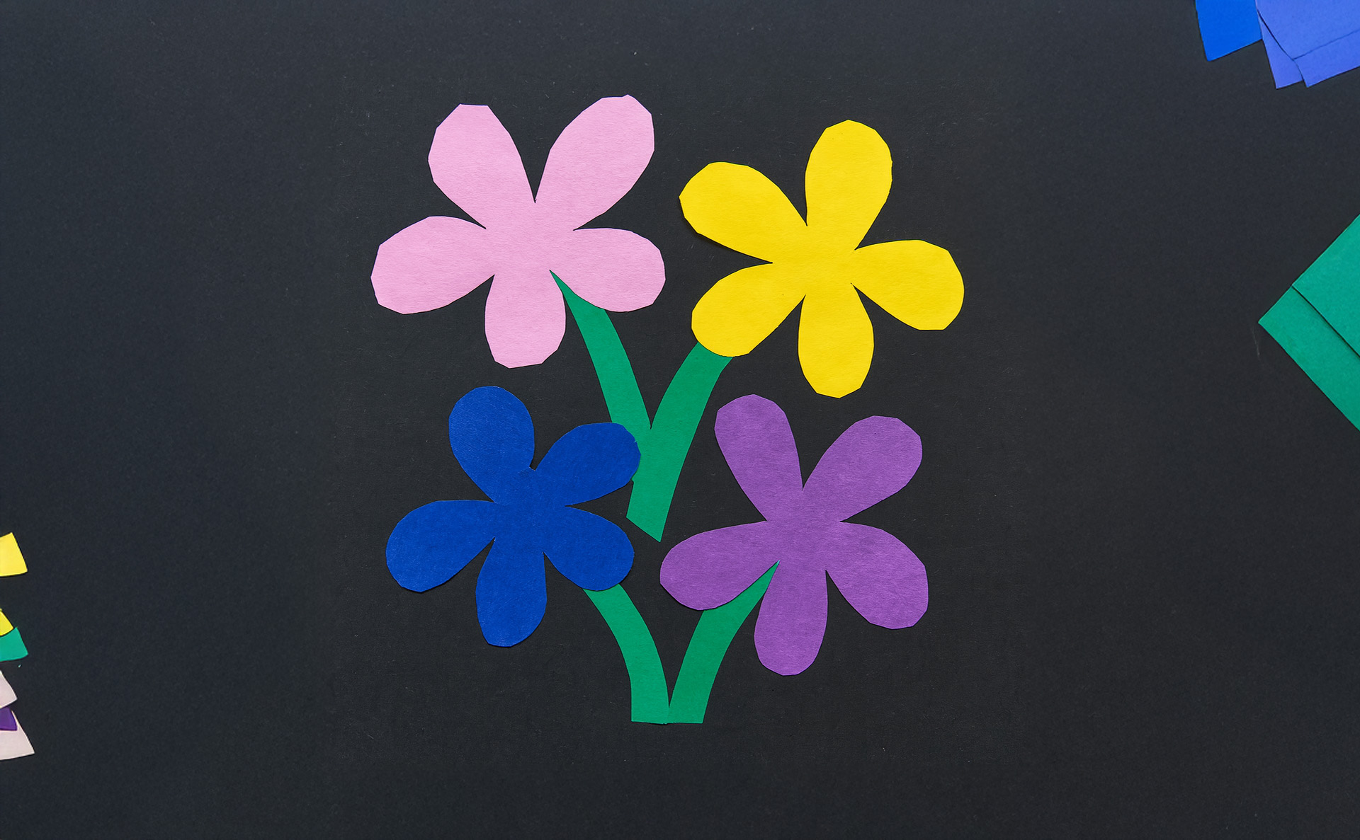
Bauhaus-inspired mixed media: hand-lettered script with hand-cut paper flowers, each marked with digital brush letters spelling “EVIL.” Black background, spot gloss liquid spill. For readers who engage with contemporary verse but dismiss traditional classics.
The client chose the minimalist design. It repositioned The Flowers of Evil as living poetry, captured Baudelaire’s provocateur spirit without clichés, and created merchandisable IP with revenue potential beyond the book.
All historical artwork sourced from public domain collections.
MY ROLE
As Creative Director and Designer:
✔ Developed two design approaches balancing historical context with modern accessibility
✔ Created custom hand-lettered typography and mixed media artwork (hand-cut paper + digital brush lettering)
✔ Partnered with print vendor on spot gloss application
✔ Sourced public domain imagery from 19th-century collections
✔ Developed scalable graphic system for merchandising
THE IMPACT
Strategic Positioning: Repositioned classic literature as contemporary poetry, creating a fresh entry point for modern readers.
Retail Performance: Hand-lettered intimacy appeals to indie bookstores, bold contrast photographs well online, spot gloss justifies premium pricing.
Merchandising Potential: Extends beyond the book to mugs, tote bags, apparel; turning the book into a lifestyle brand with additional revenue streams.