THE CHALLENGE
Windy City Harvest, an initiative of the Chicago Botanic Garden, needed a cohesive brand to scale its impact. The goal was to move from a niche movement to essential city infrastructure while providing a “plug-and-play” system for non-designers to use across dozens of touchpoints.
THE STRATEGY
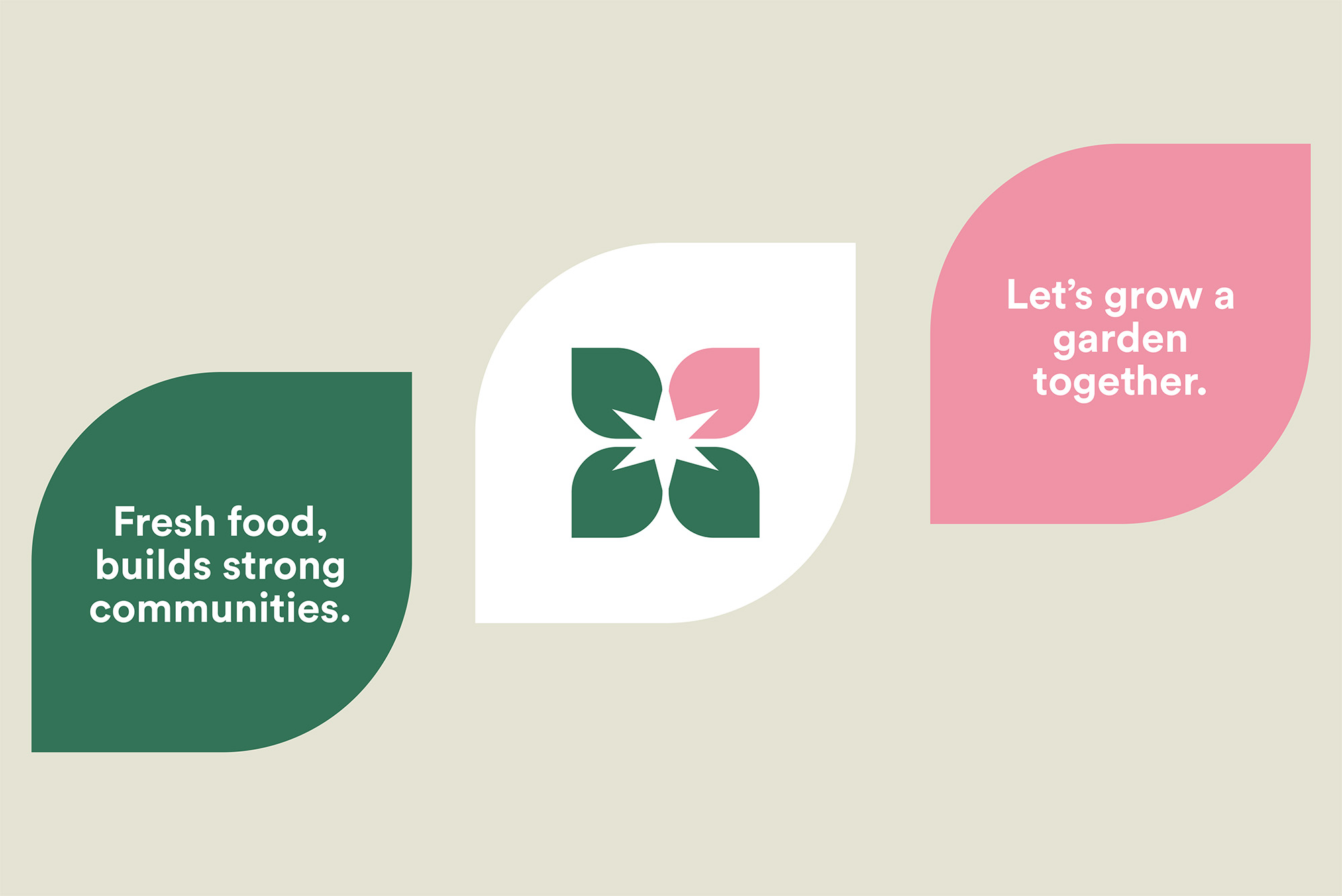
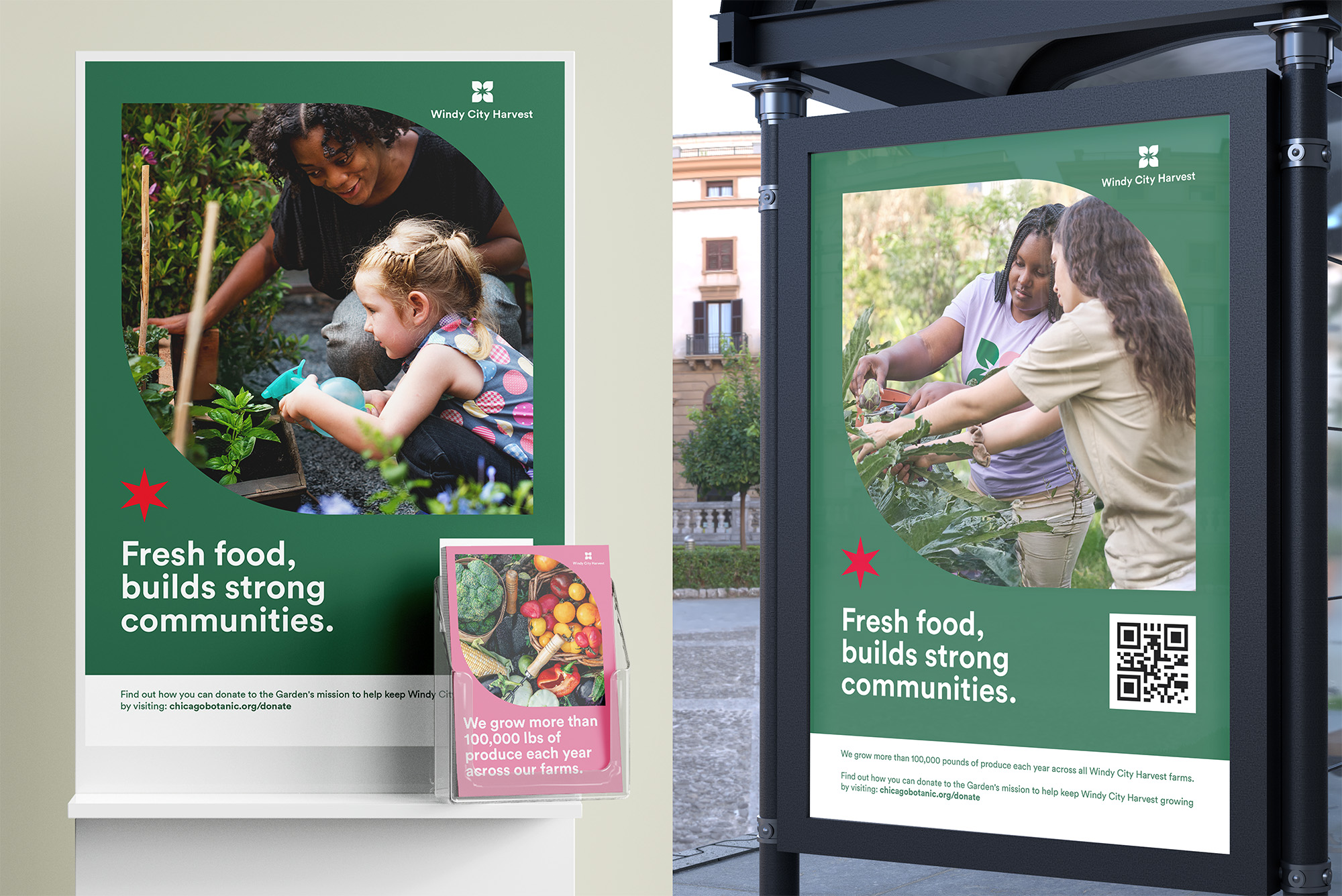
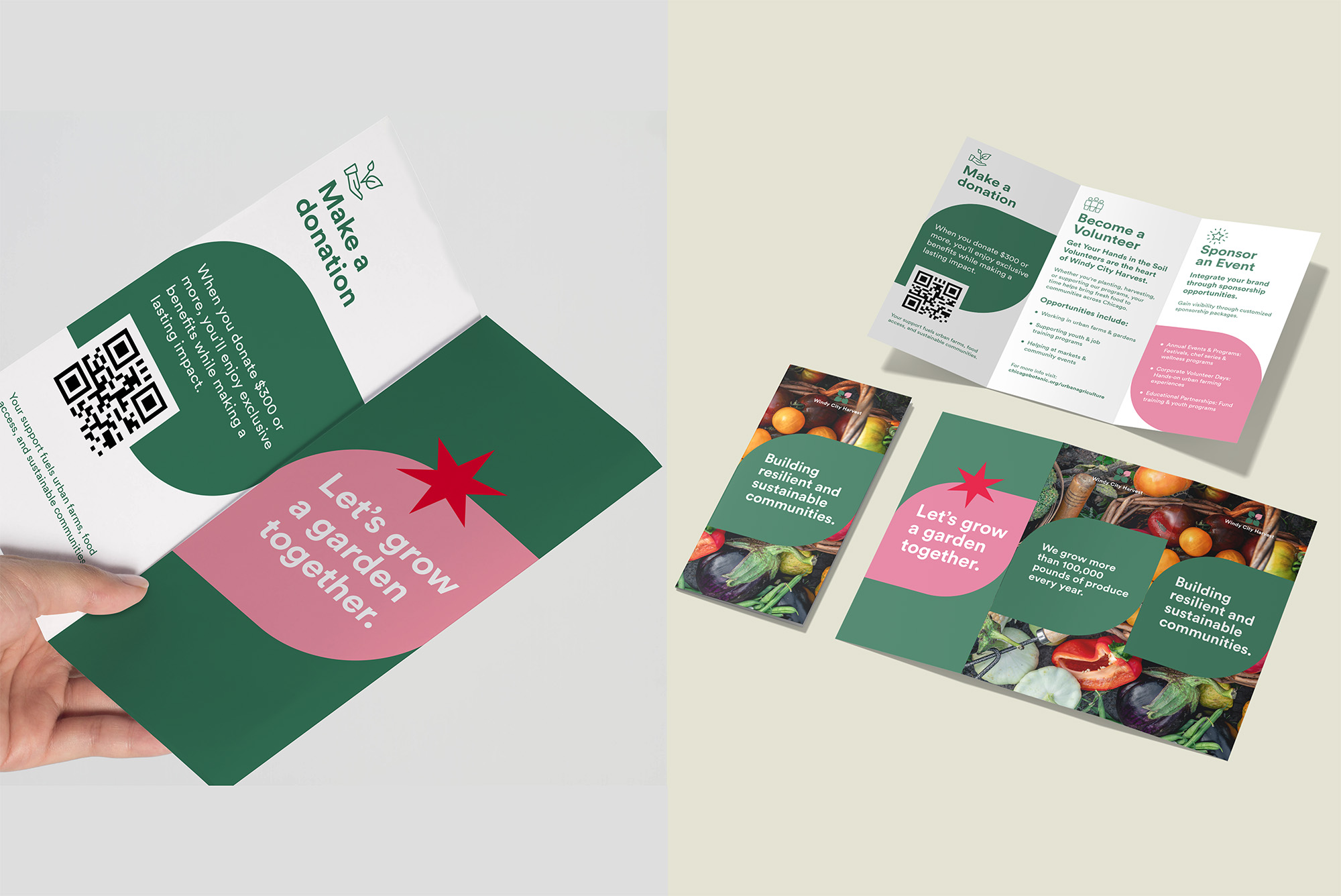
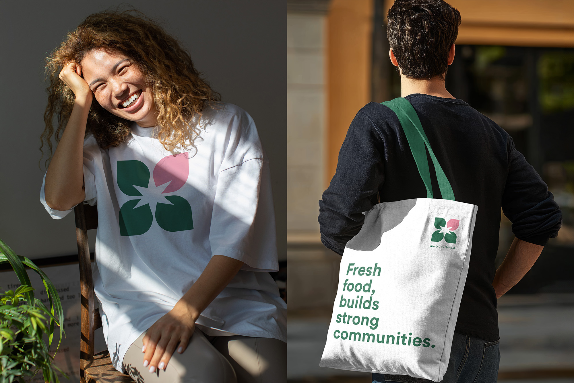
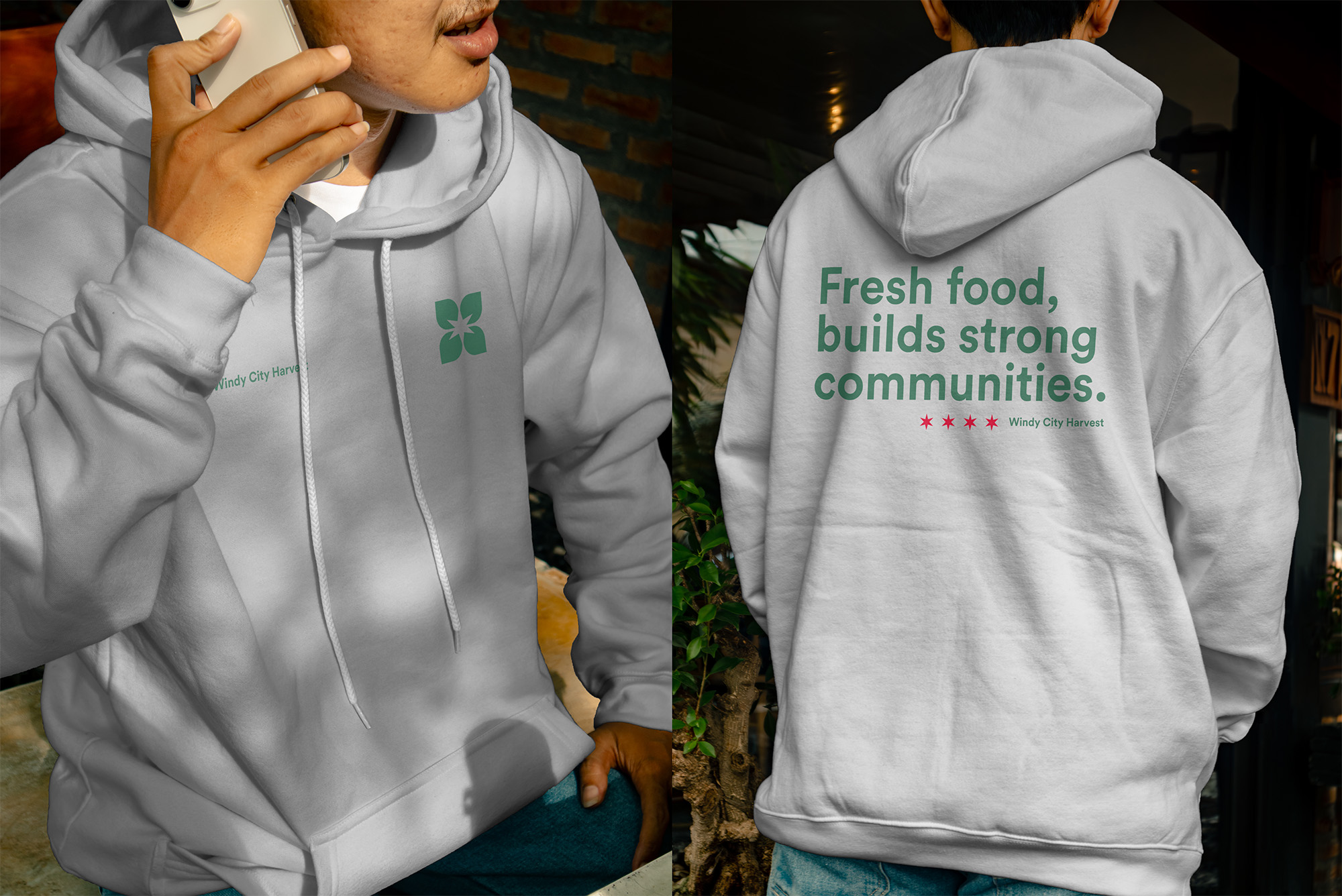
This concept rooted the identity in Chicago pride. The logo’s negative space forms the city flag’s six-pointed star, a graphic anchor for OOH campaigns and volunteer gear. I paired a conversational, “corporate-casual” voice with a modular layout system designed for internal staff to execute independently using stock photography and simple templates.
MY ROLE
As Brand Identity Designer:
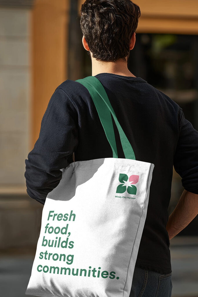
✔ Developed brand identity with Chicago star negative space, extracted as campaign element
✔ Designed typography system and messaging framework built for broad appeal
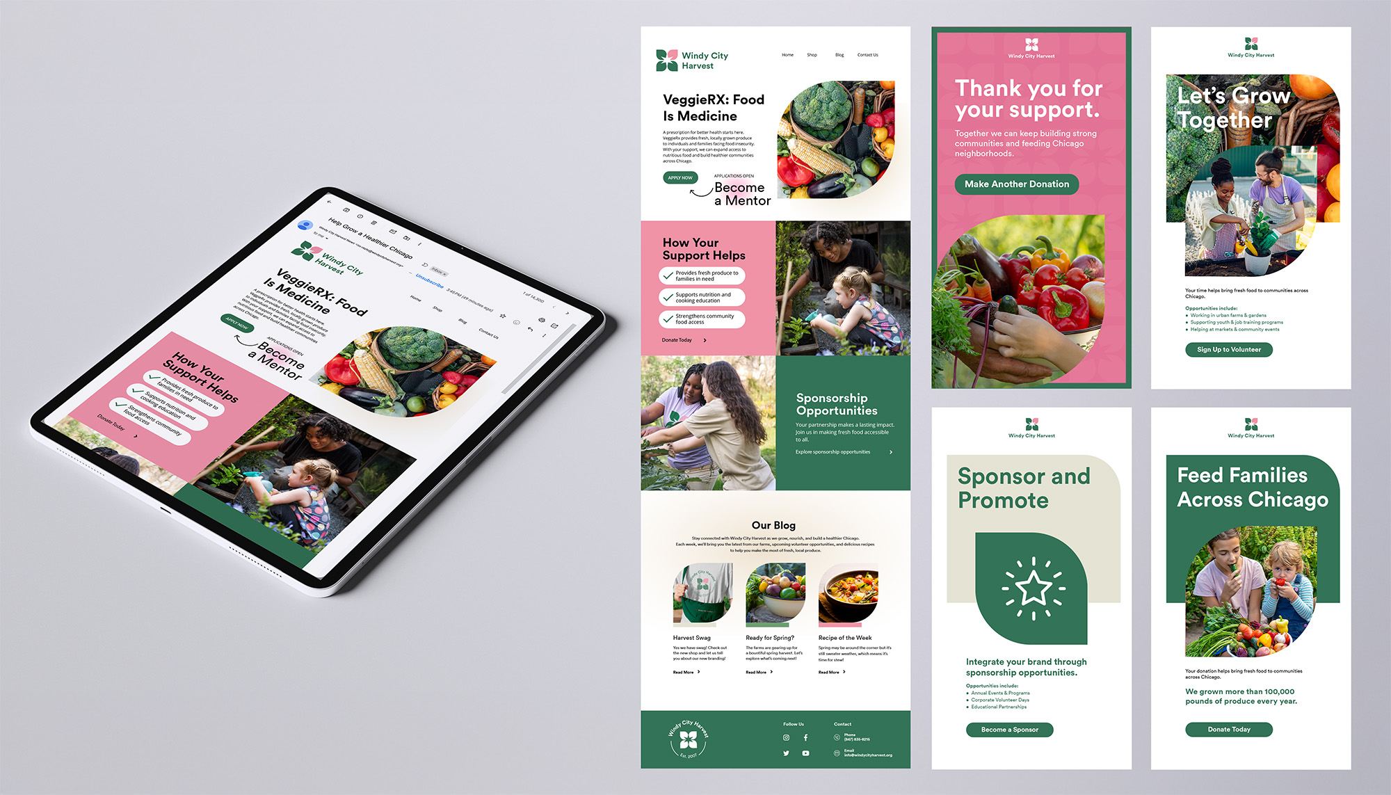
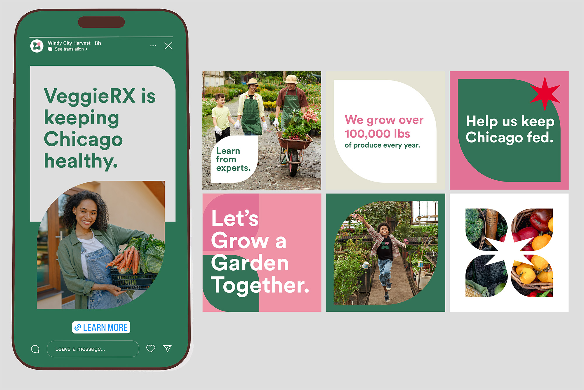
✔ Created template library for flyers, posters, social, email—built for non-designer use
✔ Built stock photo-friendly layouts enabling consistency without design support
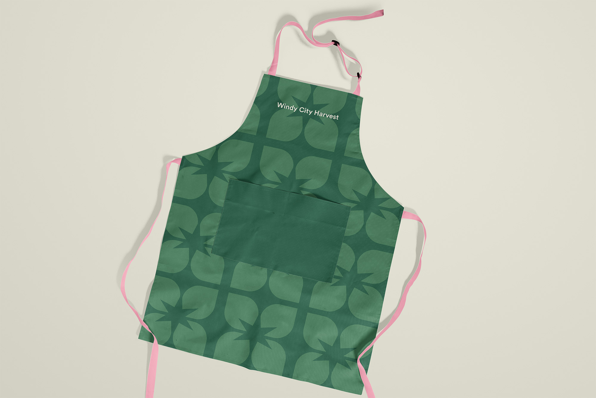
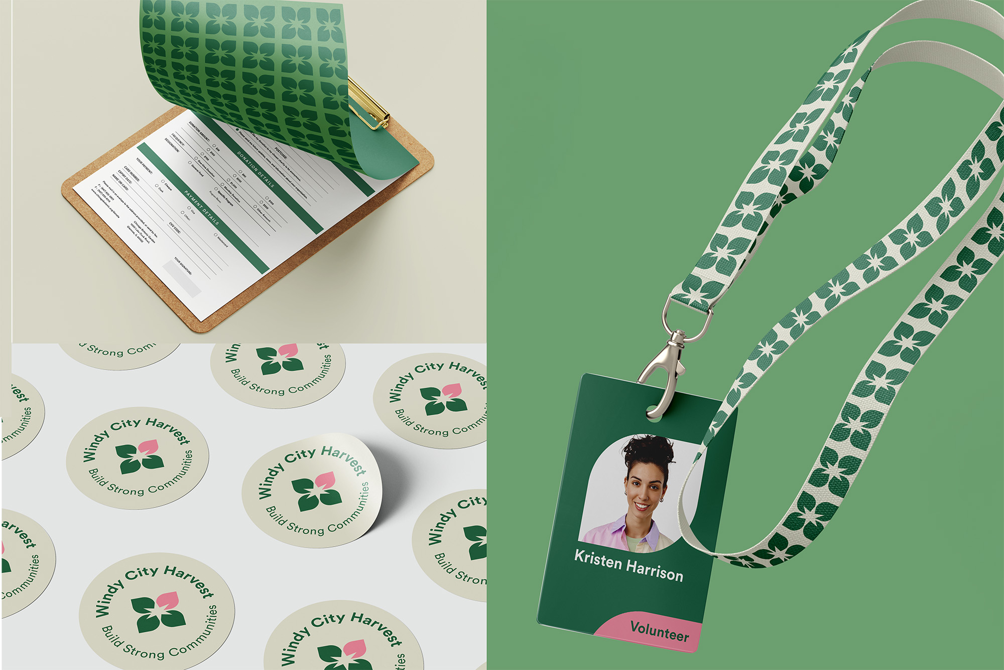
✔ Designed merch system, volunteer materials, signage standards, website, social templates
THE OUTCOME
While the Chicago Botanic Garden ultimately decided to maintain a unified brand architecture under their primary identity, this project remains a masterclass in building a scalable, civic-minded sub-brand. It was designed to transition the organization from “fringe” to “essential,” signaling maturity to major donors while remaining accessible at neighborhood farmers markets.
Operational Efficiency: This system was designed to empower non-designers, using stock-photo-friendly layouts to maintain high quality on lean budgets.
Civic Positioning: The concept utilized the Chicago star to frame Windy City Harvest as vital urban infrastructure. This direction aimed to build the civic pride necessary to secure city partnerships and funder credibility.
Scalable Growth: The visual system was built to signal organizational maturity, creating a recognizable brand across neighborhoods to attract major donors and support citywide expansion.