Your Brand Needs a Mood Board

[ June 5, 2024 ]

“WTF IS A MOODBOARD?”

First of all, calm down. lol

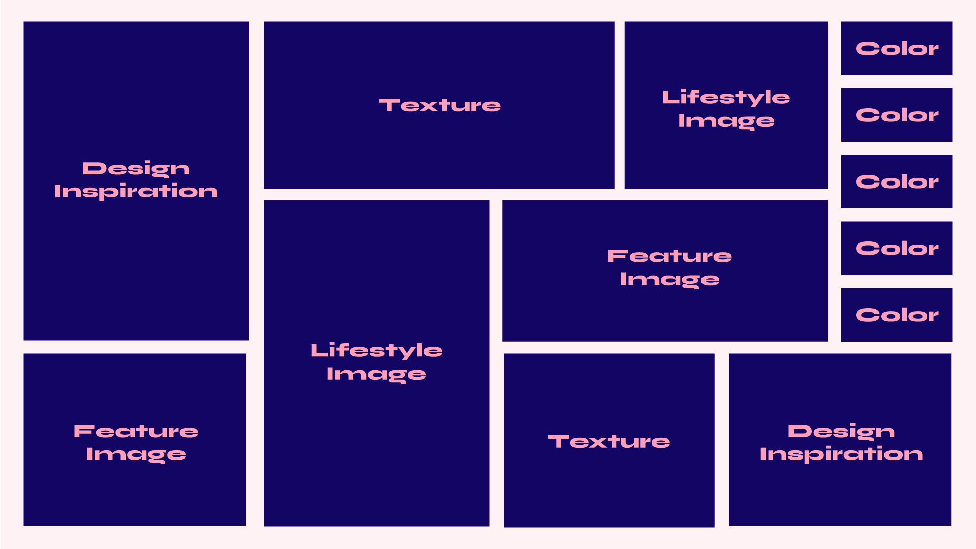
Second of all, I got you: a moodboard a bunch of images, stuff like colors, photos, fonts, or textures, that show the vibe you’re going for. You pull them from the internet, magazines, whatever. It helps everyone see the same vision.

It’s not the brand yet, but it’s the feeling of it.

It doesn’t just set the tone; it captures the look, feel, and energy you want people to connect with.

Too many brands skip this step and rush into logos and colors. But without a curated foundation, nothing sticks.

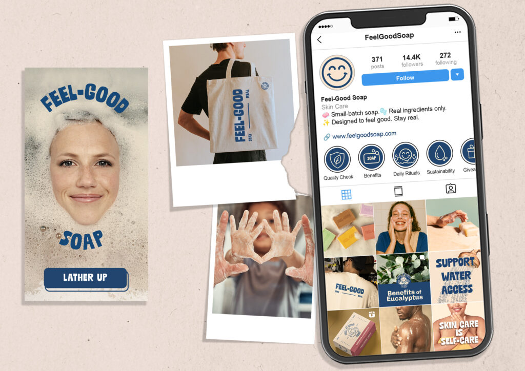
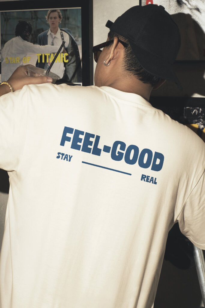
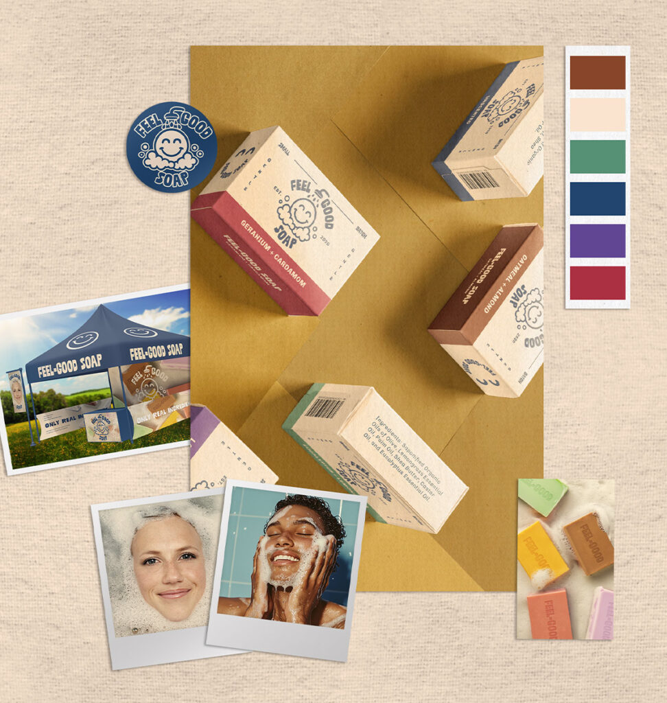
A mood board isn’t just a collage, it’s a curated collection of swatches, inspo, textures, typography, and/or imagery that defines your brand’s tone. It aligns your vision and keeps your team, designers, marketers, content creators all moving in the same direction.

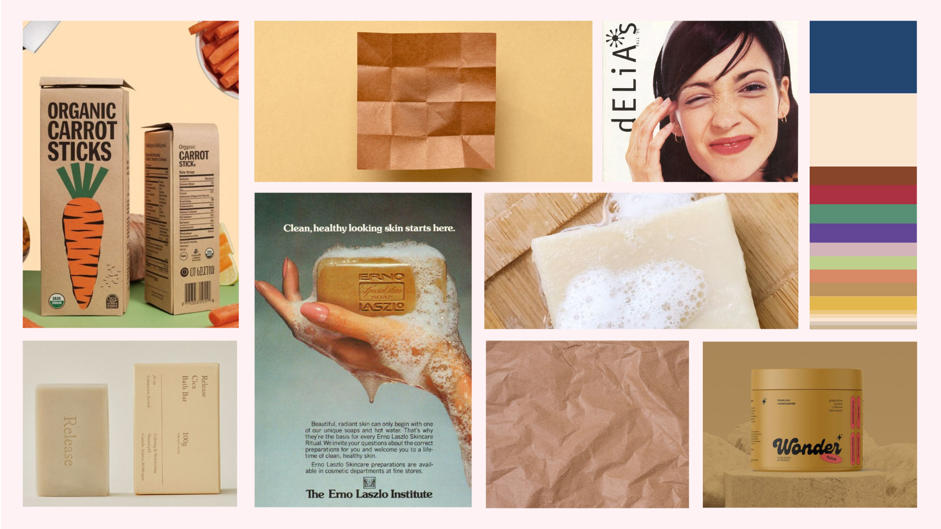
How a Mood Board Shapes a Brand

A strong brand identity isn’t just about picking the right colors or a trendy font. It’s about creating a visual language that speaks to the right people in the right way. A mood board helps you:

Define your brand’s vibe – Is your brand sleek and modern or earthy and handmade? A mood board locks in the feeling before you design a single asset.

Create consistency – It acts as a reference point, so every design choice: website, social media, packaging, feels intentional and cohesive.

Refine before committing – Instead of designing blindly, a mood board helps you explore visual directions before locking into final decisions.

Sell the vision – If you’re working with stakeholders, collaborators, or even just trying to clarify your own ideas, a mood board helps articulate your vision without endless back-and-forth.

Moodboards Are Useless Without a Story

Moodboards aren’t just about what looks nice. They’re about what feels right for the story you’re trying to tell. A good moodboard doesn’t just collect pretty pictures, it curates a vision. It translates strategy into design language: form, color, material, texture, and tone. Without that, you’re just making a collage.

Take Feel-Good Soap.

This wasn’t a brand chasing trends or trying to look fancy. The story we needed to tell was about trust, ritual, and realness. The kind of realness you feel when you read the back of a package and know exactly what you’re putting on your skin. The simplicity of a daily routine that doesn’t try to perform, just works.

We built the moodboard around:

  • Textures that felt raw, crumpled, and organic—like recycled paper or something handmade.

  • Typography that pulled from nostalgic product packaging—bold, legible, and low-fuss.

  • Colors that were ingredient-coded and grounded—earthy reds, oat-like creams, soft greens and purples. No neon, no trend-chasing. Just quiet confidence and clear distinction between scents.

  • Photography inspired by the warm, slightly imperfect feel of 90s product ads—filtered just enough to trigger familiarity and memory. That warmth added emotional weight and made the visuals feel lived-in, not clinical.

  • Lifestyle imagery focused on those little feel-good moments—washing your face, caring for your skin, doing something kind for yourself. Less about glossy perfection, more about connection and comfort.

The result? A moodboard that didn’t just look cohesive, it felt like the brand. Honest, tactile, and intentionally unpolished. Because when the story is clear, the design has something to hold onto.

Curated Direction with Real Assets

Feel-Good Soap is a brand that proves just how far a curated vibe can take you.

It started with a mood board, but not a polished one. This was a messy, inspired, feeling-first collection of lifestyle moments, vintage ads, natural textures, and nostalgic packaging. It wasn’t about locking anything in. It was about capturing energy: warm, cheeky, handmade, and unmistakably real.

From there, we built out a brand direction board, replacing references with early assets. Soap bars in brand colors. Type choices locked in. Packaging mockups that played nice with the tone. It was still evolving, but it already felt like Feel-Good.

Eventually, we stepped into a full visual territory, a defined system with structure and soul. Packaging, photography, merch, social assets, even the booth tent; all rooted in that original vibe, now executed with intention.

It’s proof that even a scrappy mood board can become the blueprint for a full brand world. You just have to know how to build from it.

Related posts