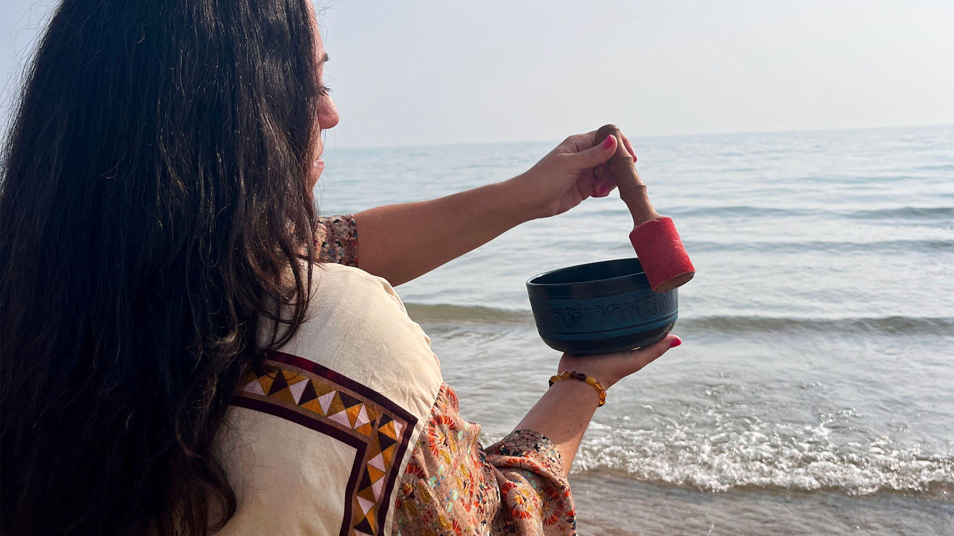
THE CHALLENGE
Zendegi Alchemy was expanding from intimate 1:1 healing practice rooted in Persian mysticism into a scalable wellness brand offering high-end products and corporate partnerships. The founder wanted to honor her father’s legacy by integrating his original Persian calligraphy directly into the brand identity. The challenge: create a system elevated enough for corporate wellness spaces and product retail while maintaining the spiritual authenticity and personal touch that made the practice special.
THE SOLUTION
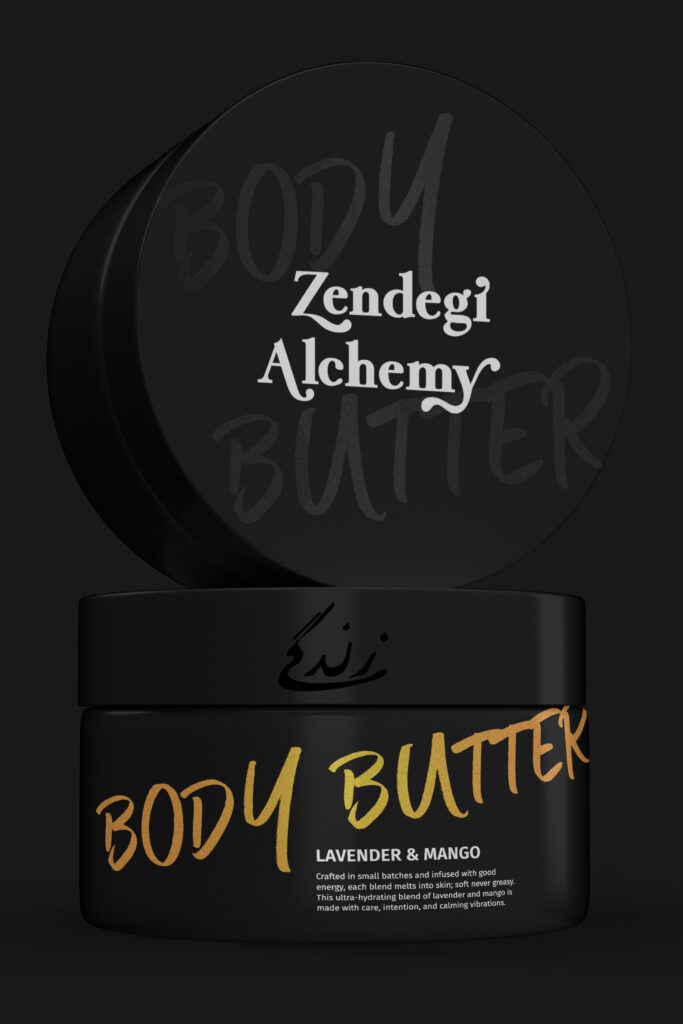
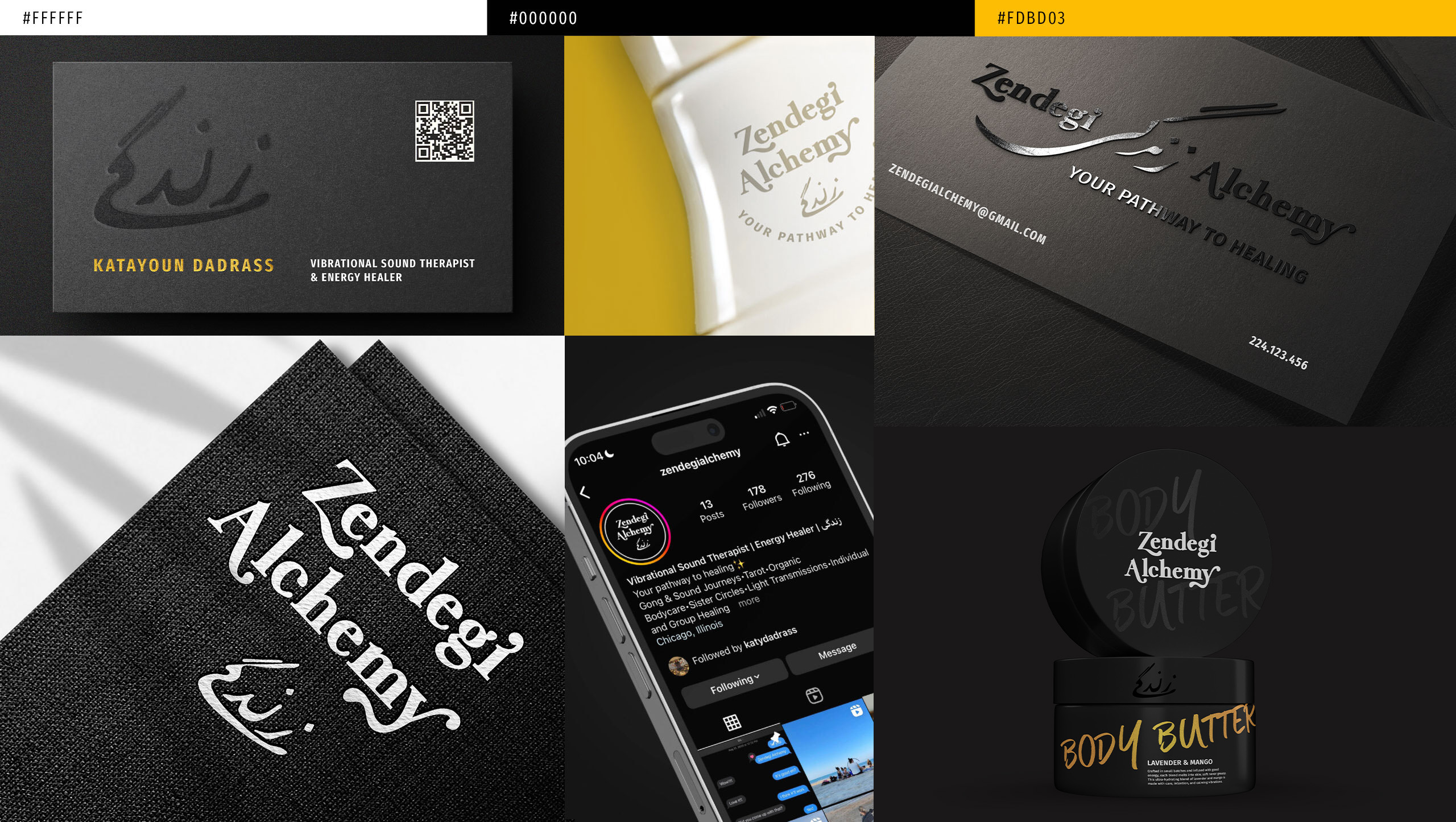
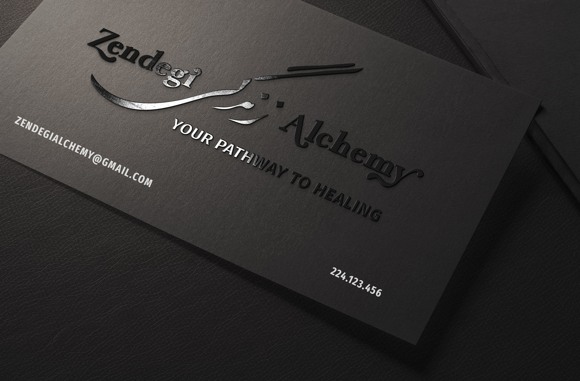
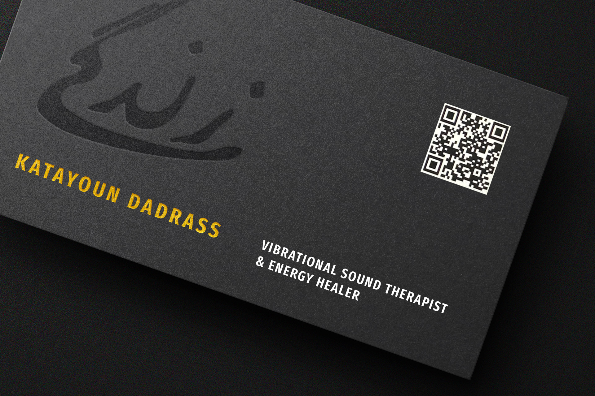
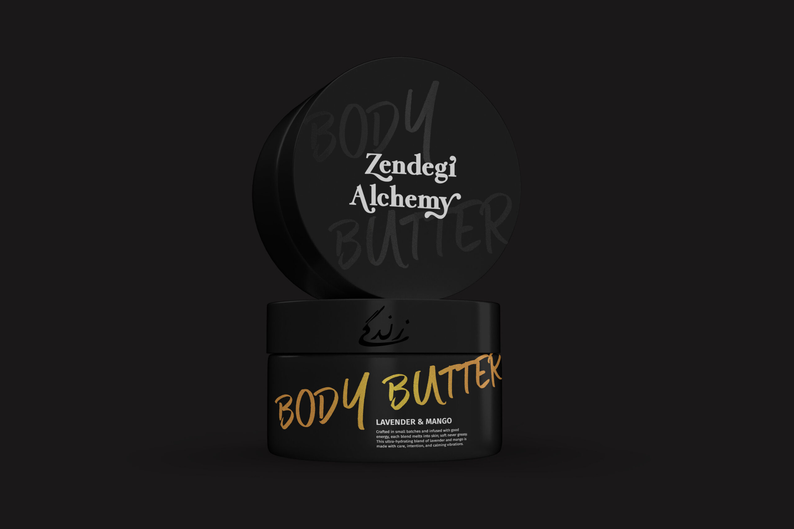
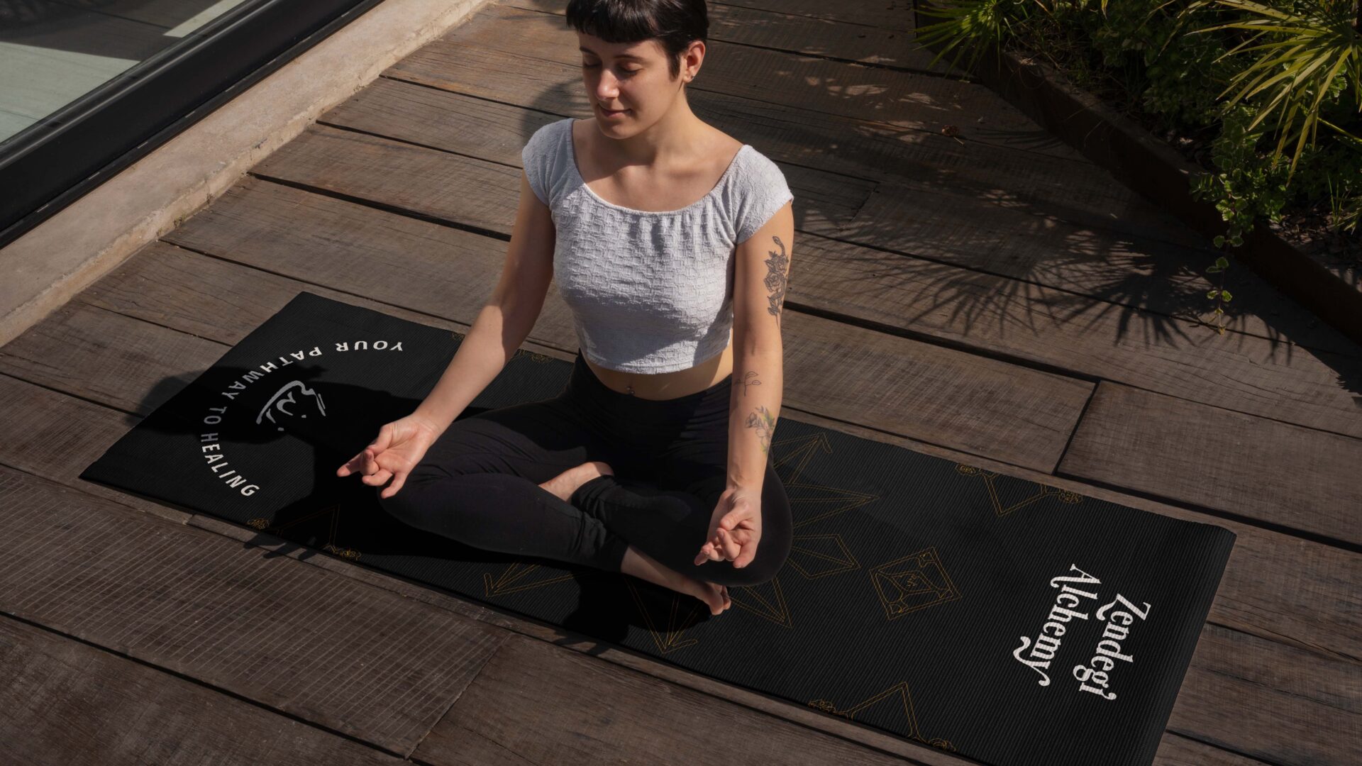
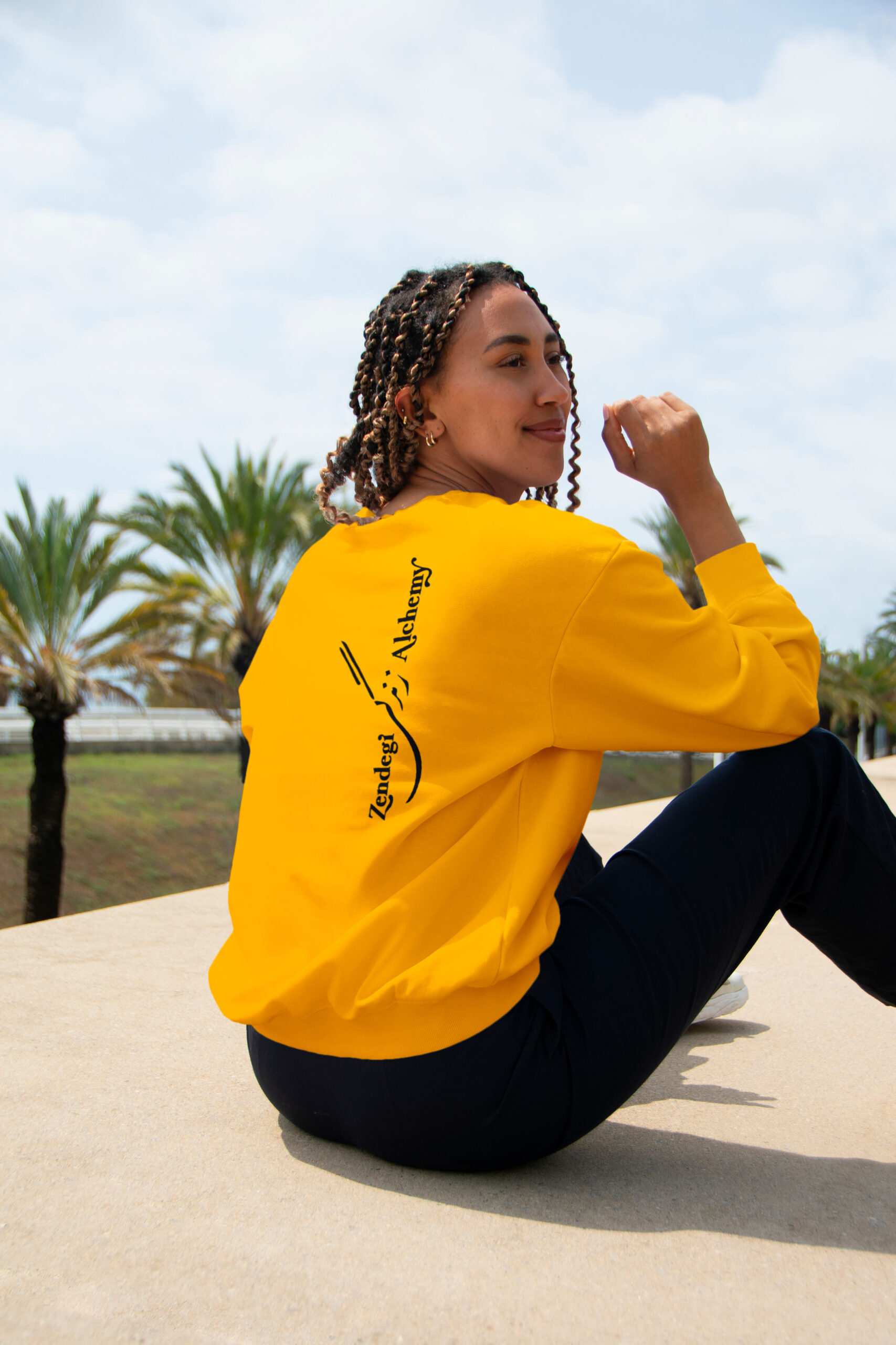
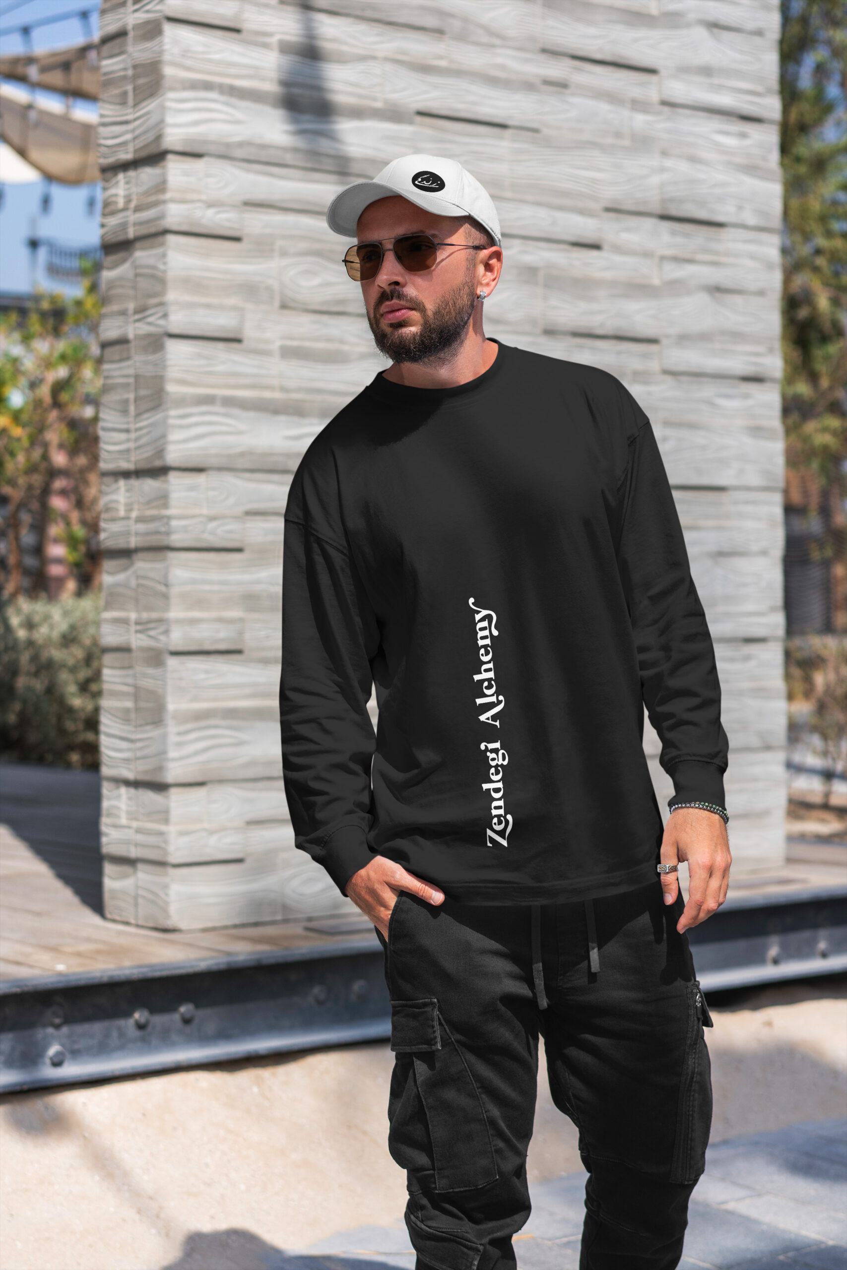
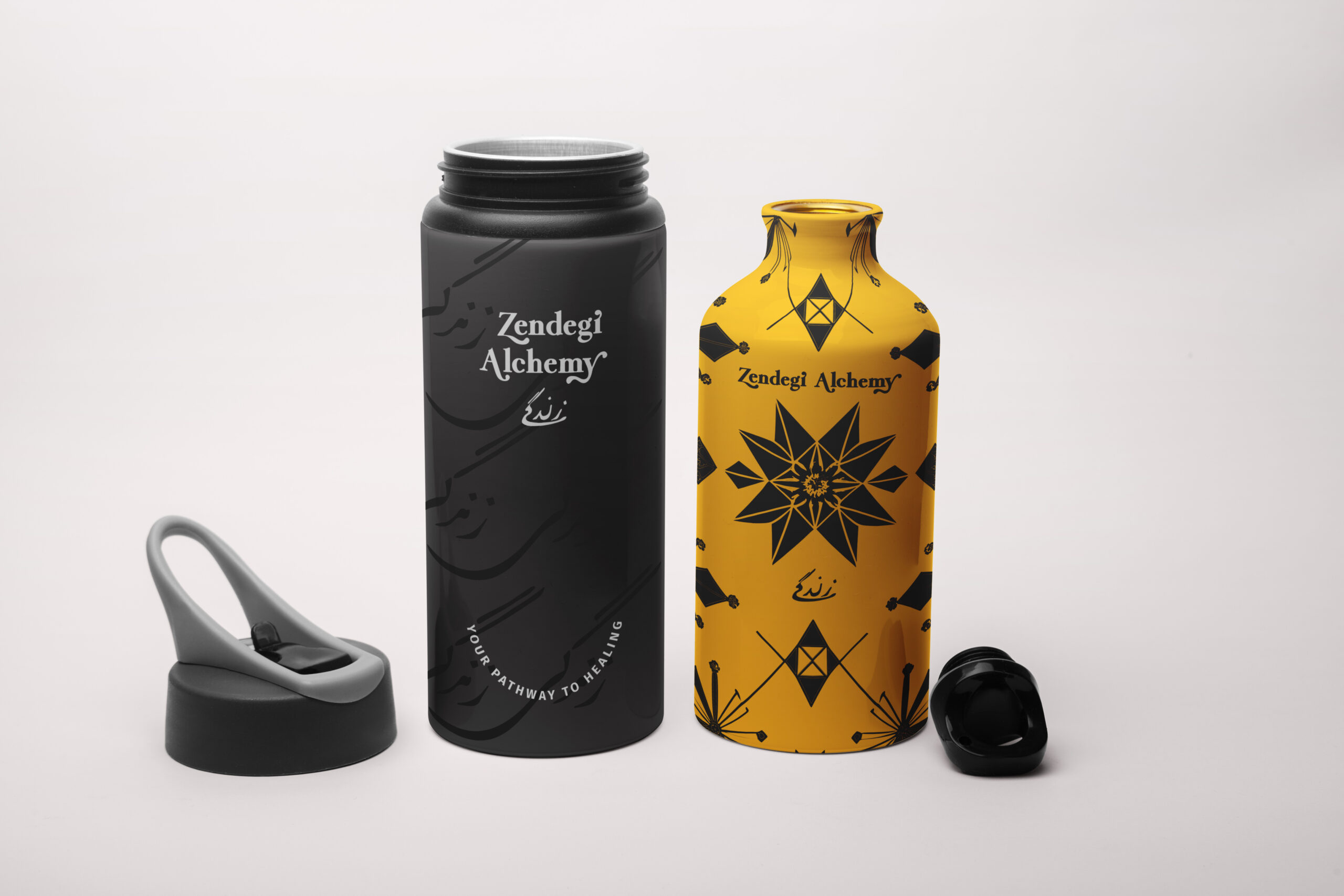
We crafted a brand identity fusing spiritual heritage with modern refinement. At the center is a logo system built around the founder’s father’s handwritten “Zendegi” (زندگی – meaning “life”). We refined his original calligraphy into a custom wordmark serving as both symbol and signature, honoring the personal history while creating a scalable brand asset. The visual language is minimal yet rich: black, gold, and white ground the brand in timeless luxury, while hand-drawn calligraphic patterns offer soul and softness.
The system works everywhere – body butter packaging, apparel, yoga mats, business cards, water bottles, digital platforms. We paired the custom Persian calligraphy with clean typography (Fira Sans, Better Times) creating hierarchy and legibility across touchpoints. Designed for growth with scalable templates and usage guides enabling the brand to move from local wellness circles into product launches, branded environments, and corporate offerings.
MY ROLE
As Creative Director and Brand Designer:
✔ Refined founder’s father’s original Persian calligraphy into custom brand wordmark
✔ Developed complete brand identity system: logo suite, typography hierarchy, color palette, pattern library
✔ Designed product packaging (body butters, wellness kits), apparel, yoga mats, water bottles
✔ Created business collateral with premium finishes (embossed cards, foil stamping)
✔ Established scalable visual system with brand guidelines and templates
✔ Balanced emotional storytelling with premium design standards reflecting trust, depth, heritage
THE IMPACT
Heritage Preservation: The custom calligraphy work transformed a personal family artifact into a scalable brand asset. By refining the father’s original زندگی while maintaining its authentic hand, the identity honors Persian heritage without exoticizing it. The calligraphy serves dual purposes – primary logo and decorative pattern element across products.
Market Positioning: The black/gold/white palette and premium execution positioned Zendegi Alchemy to compete in high-end wellness markets. The brand bridges intimate healing practice and luxury product line, attracting both individual clients seeking alternatives to burnout and corporate wellness partnerships.
Operational Scalability: The comprehensive system (templates, guidelines, pattern library) enables product expansion and partnership growth without constant design support. From yoga studio to boardroom, the identity maintains consistency and premium feel across vastly different contexts and applications.
