THE CHALLENGE
Café Palma needed a brand system that could work everywhere, from in-store experience to retail shelves. They were launching cold brew cans and expanding into CPG. The brand had to capture their jungle-in-the-city positioning while staying flexible enough to scale across packaging, merchandise, digital, and physical spaces. It needed to feel like a destination, not just another coffee shop.
THE SOLUTION
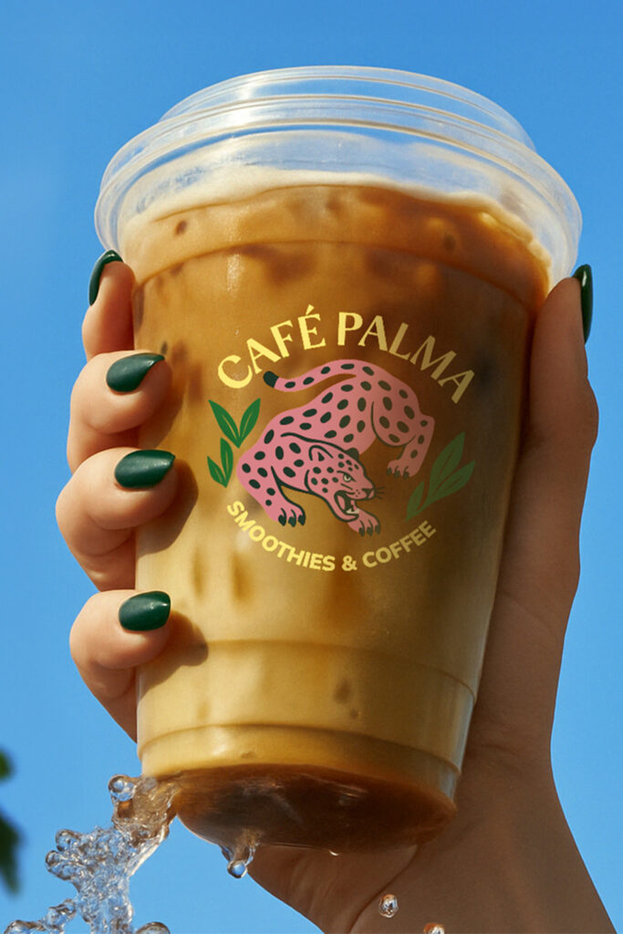
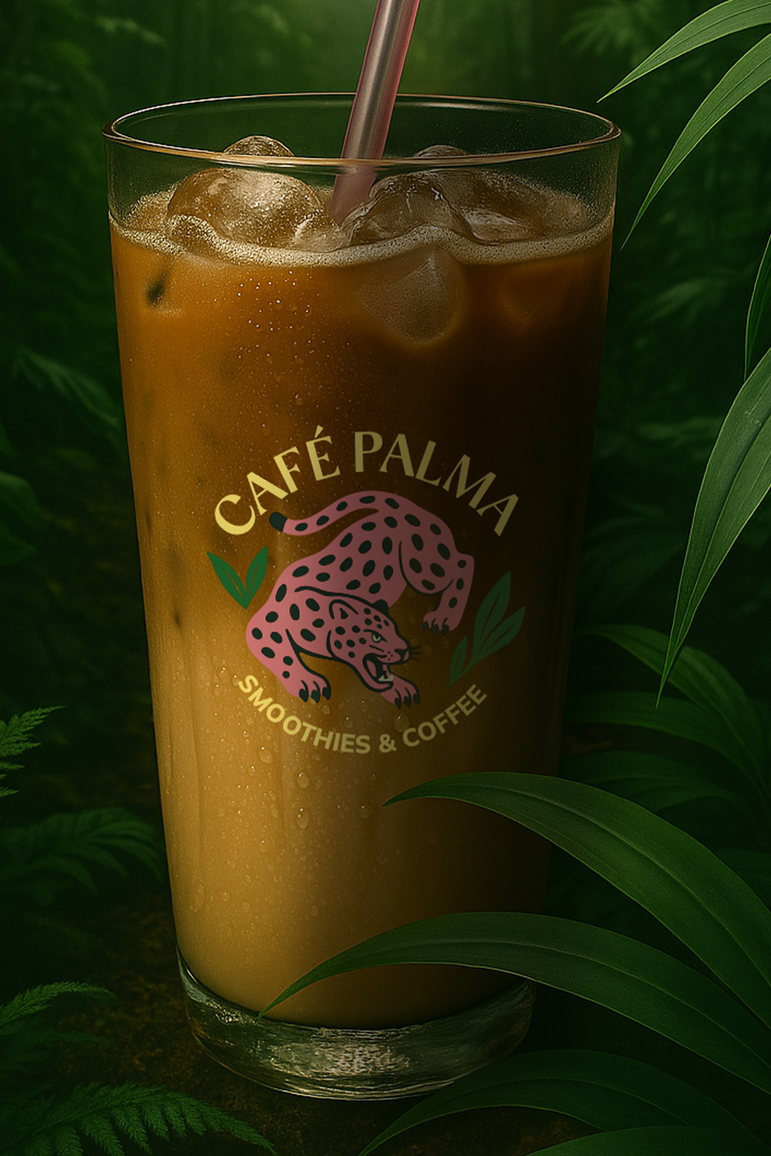
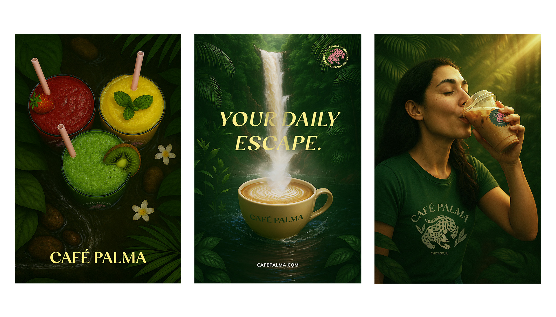
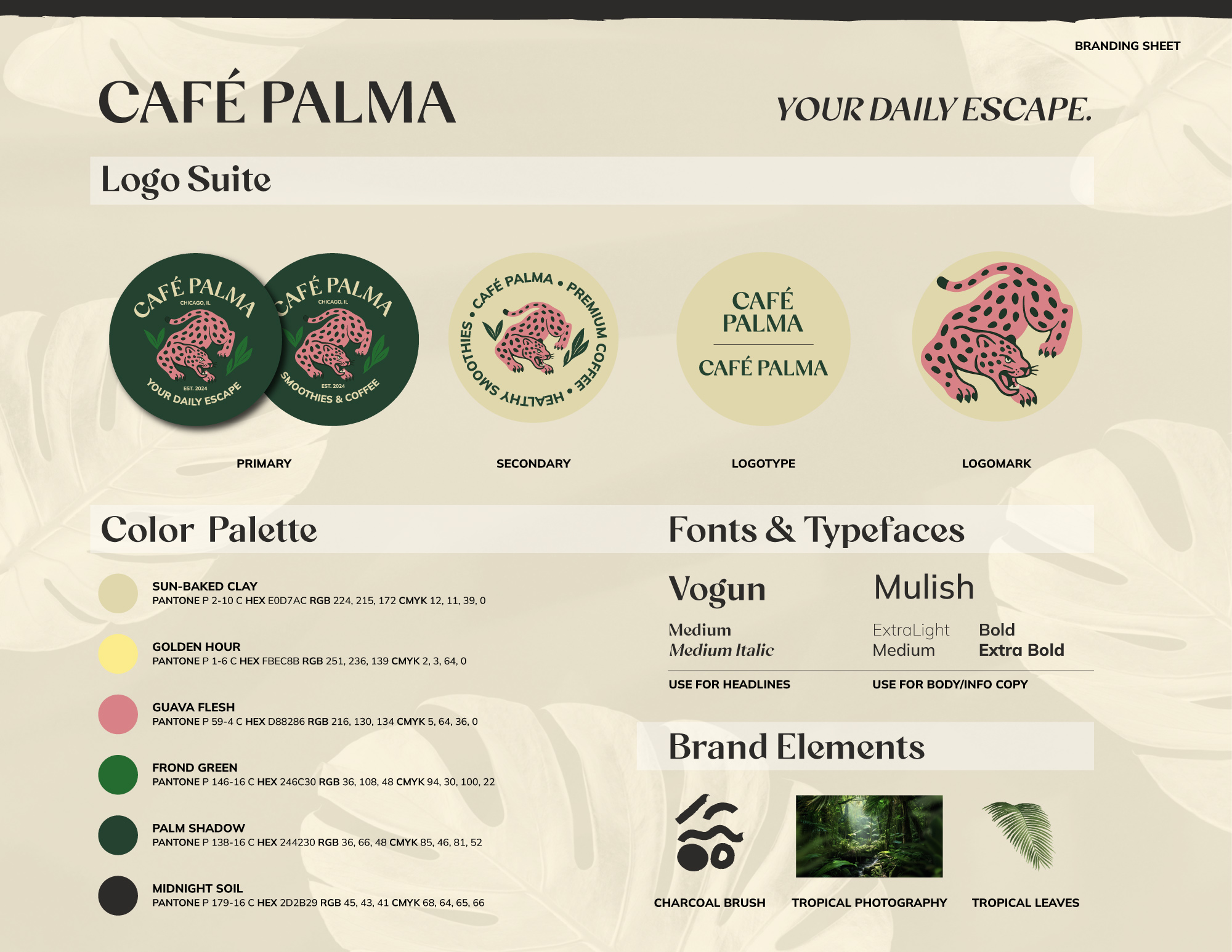
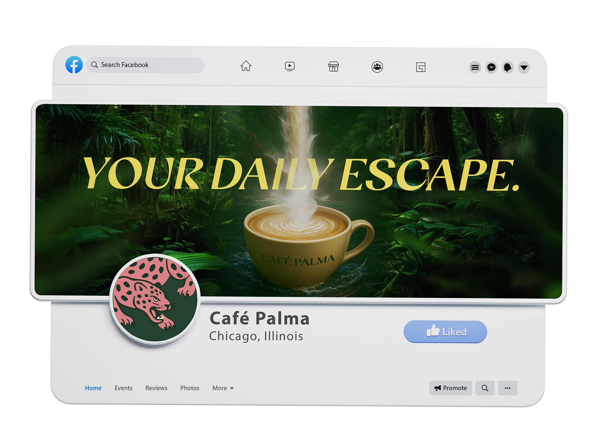
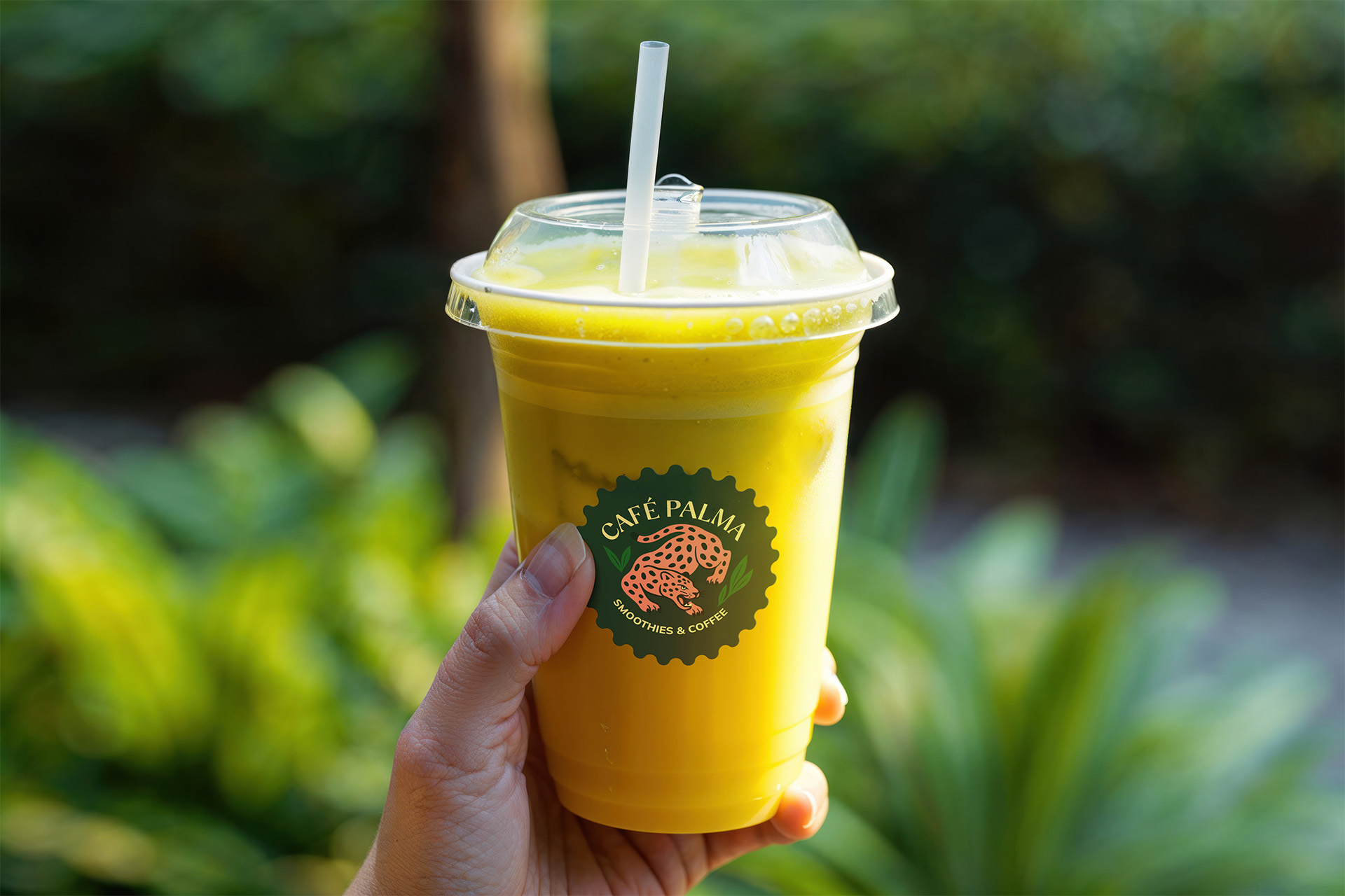
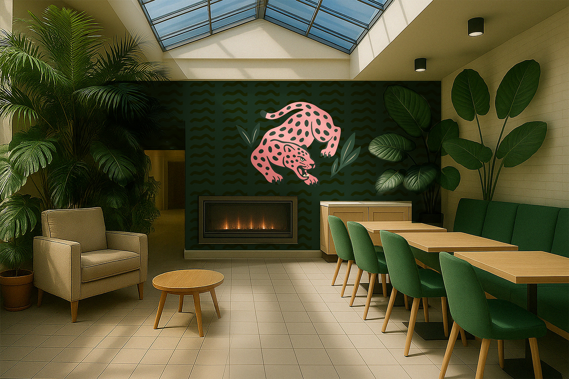
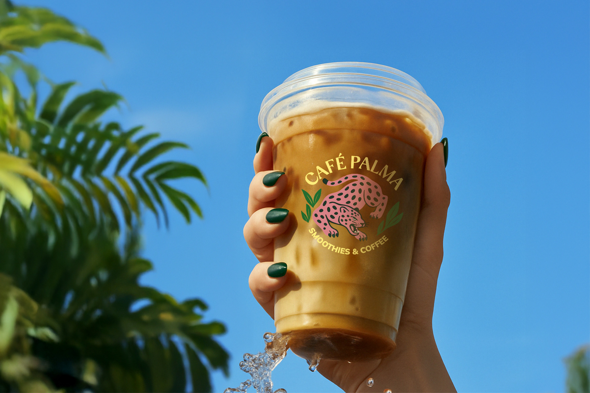
Developed a complete brand identity system built around escape and ritual. Positioned Café Palma as a place people return to, not just pass through. The visual language leaned into tropical elements like, jungle greens, sensory color palette, and a pink jaguar logomark that gave the brand instant recognition. Messaging stayed direct and sensory-focused: what it feels like to take that first sip, not just what’s in the cup.
Green borrows equity from Starbucks, then differentiates immediately. Café Palma’s greens are close enough to trigger quality association and catch the eye of someone scanning for their usual coffee spot. But that’s where the similarity ends. The pink jaguar logomark, tropical palette, and sensory imagery immediately signal this is something different. Visual familiarity opens the door, then the brand world surprises them once they’re inside.
MY ROLE
Led brand development as Creative Director. Focused on building a system that could scale without losing its core identity.
✔ Brand Identity System: Logo suite (4 variations), 6-color palette, typography hierarchy (Vogun for headlines, Mulish for body), brand photography direction, illustration system including charcoal brush strokes and tropical leaves
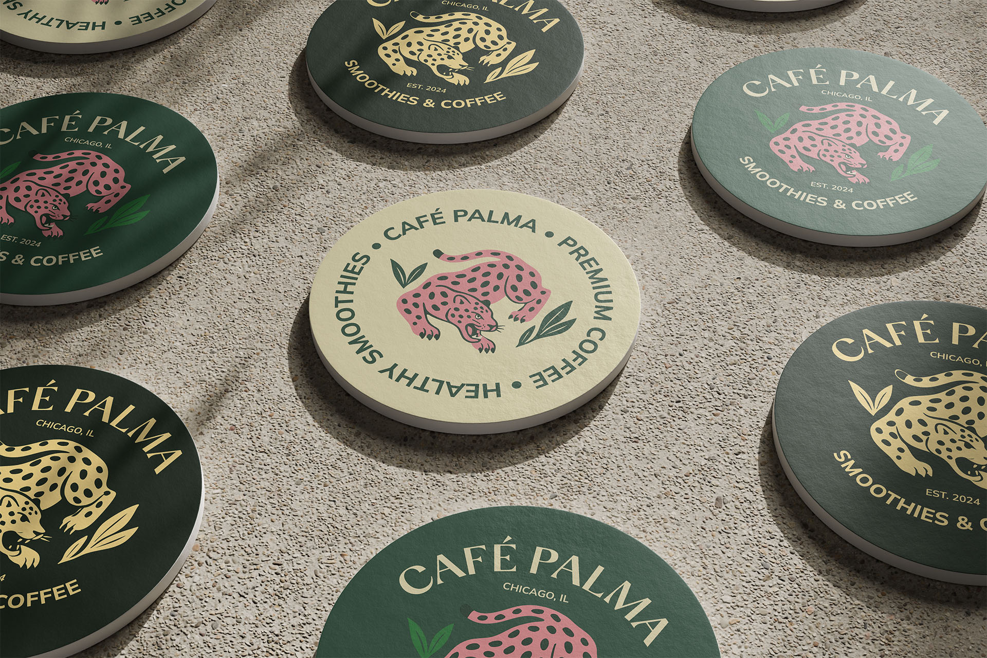
✔ Packaging Design: Cold brew cans, coffee bags, cups, coasters, merchandise
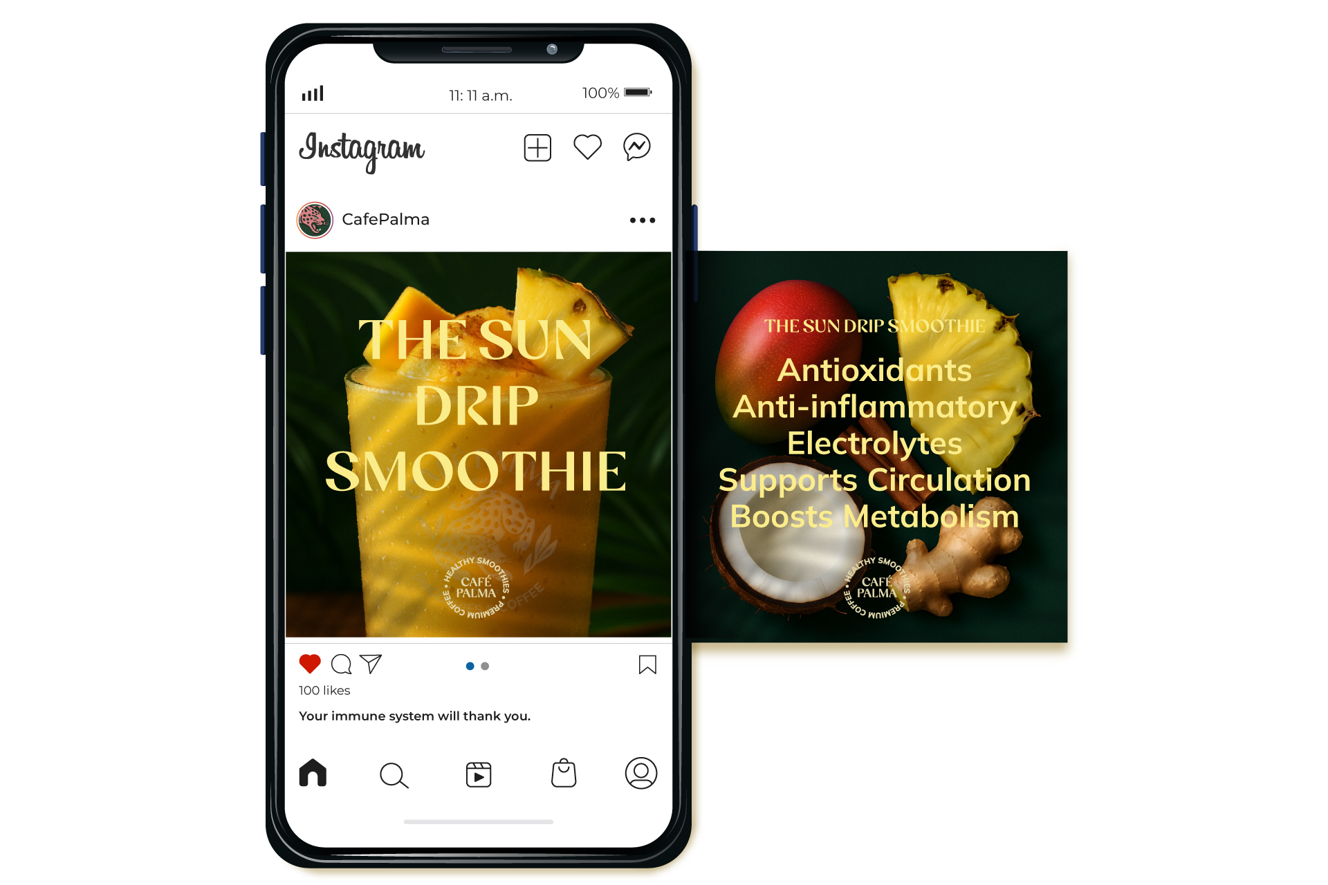
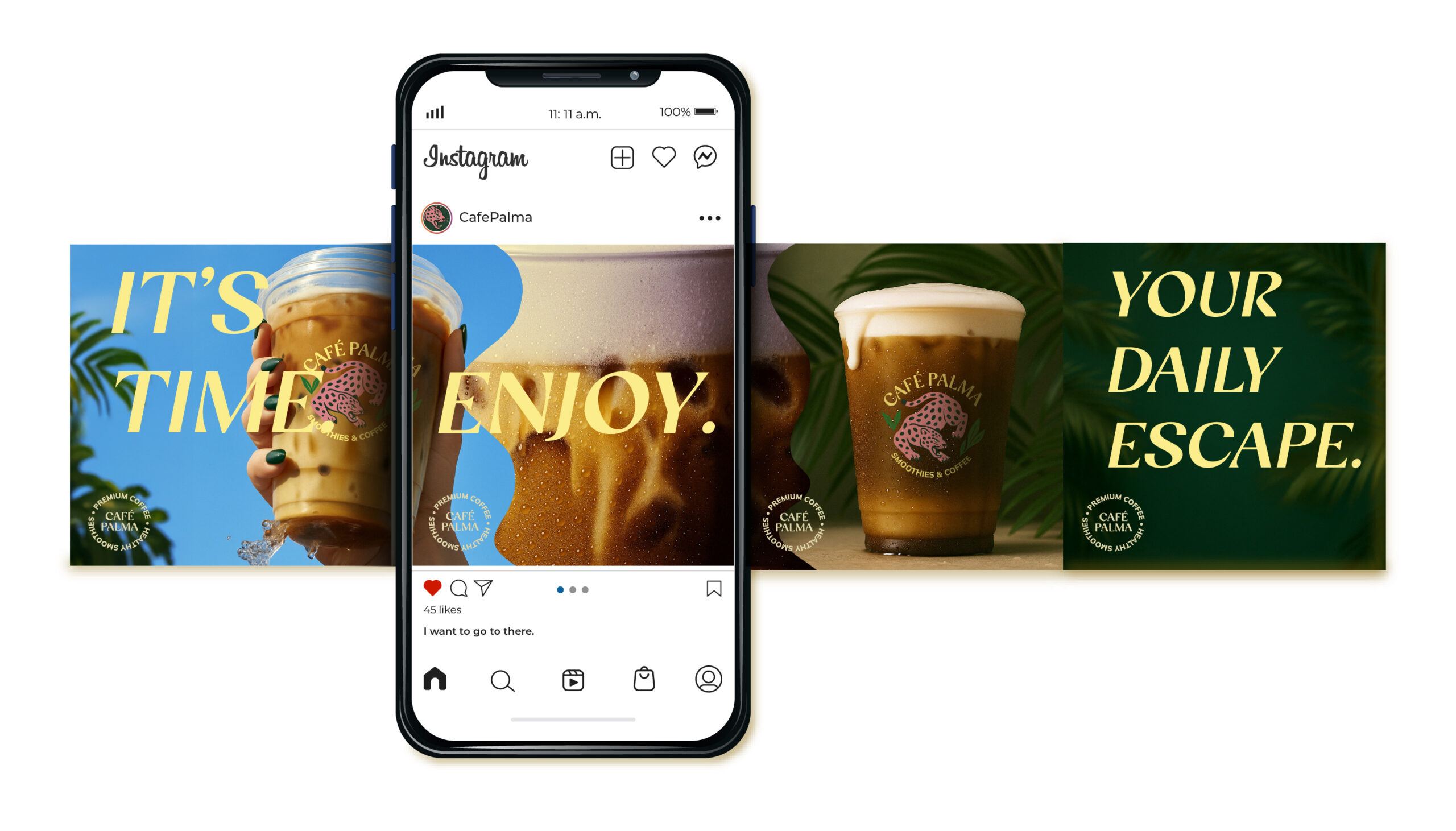
✔ Visual Execution: Posters, menus, social templates, in-store collateral. Applied tropical-meets-modern aesthetic across all touchpoints.
✔ Messaging Framework: Built tone of voice around sensory language: escape, ritual, refreshmen
✔ Brand Psychology Application: Used peak-end rule to center branding around the first-sip moment. Focused on emotional recall.
THE IMPACT
Dynamic Branding Delivered: Complete identity system with logo suite, 6-color palette, typography system, photography guidelines, packaging templates for 8+ product types, social content framework, and in-store collateral system. Built a flexible visual language that works from cafe to shelf to screen.
Strategic Positioning: Shifted Café Palma from convenience stop to ritual destination. Differentiated through sensory-first branding that prioritizes experience over transaction. Enabled CPG expansion while keeping brand integrity across all channels.
System Scalability: Designed identity to support growth from single location to multi-channel brand. Created templates and guidelines for consistent execution across retail, in-store, digital, and merchandise without needing creative oversight for every application.
