THE CHALLENGE
ENTERING HELLSPACE isn’t just sci-fi horror. It’s psychological story about losing and reclaiming trust in your own mind. Protagonist, woman on deep-space mission, starts sensing something stalking her. But is it real? Or is she spiraling? Film is metaphor for bipolar disorder and psychosis, exploring paranoia, medication, staying grounded when reality cracks. Twist: she’s right. There is monster. But she’s also fighting her mind while trusting her instincts. Visuals had to hold all that tension, feeling cinematic and emotionally real.
THE SOLUTION
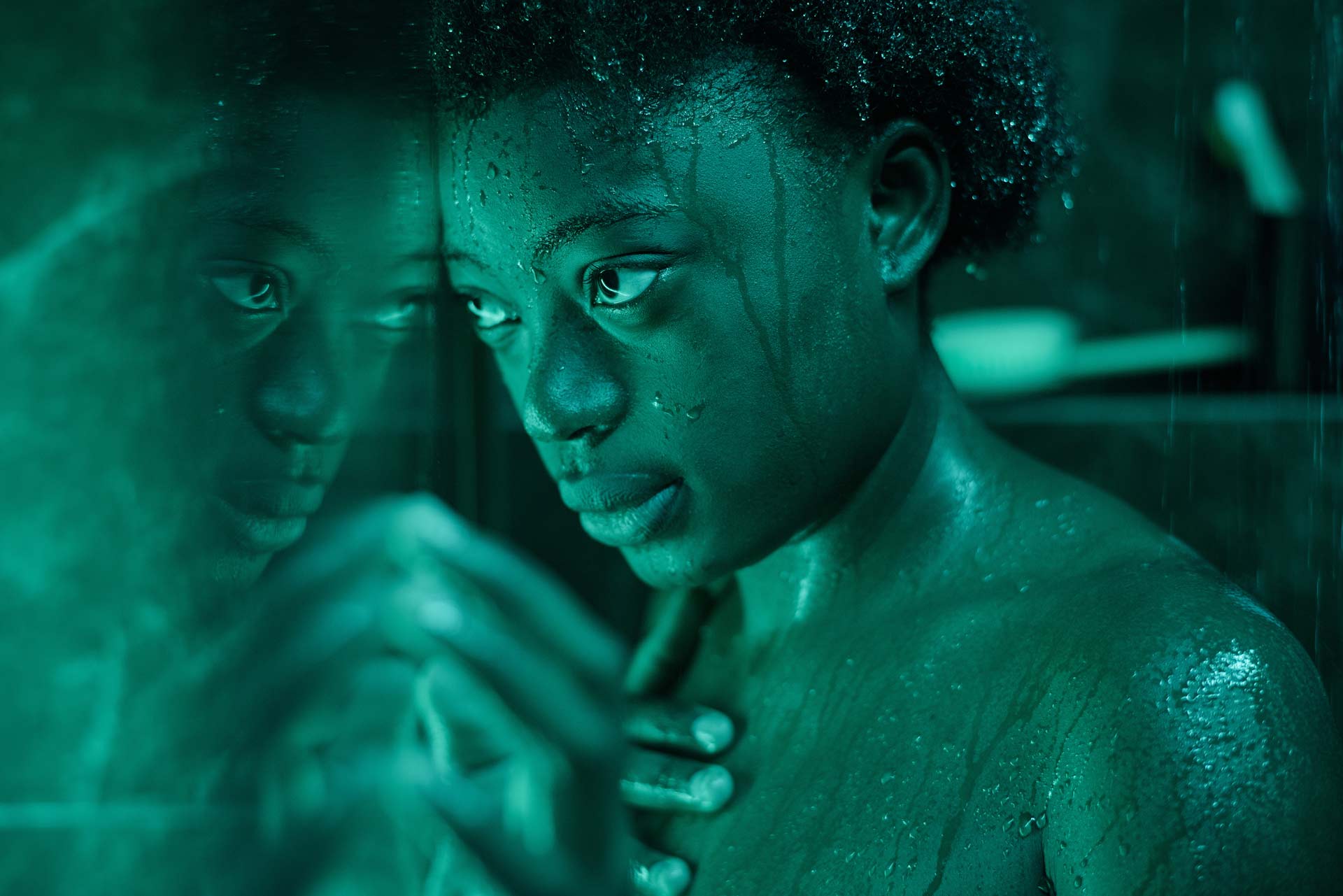
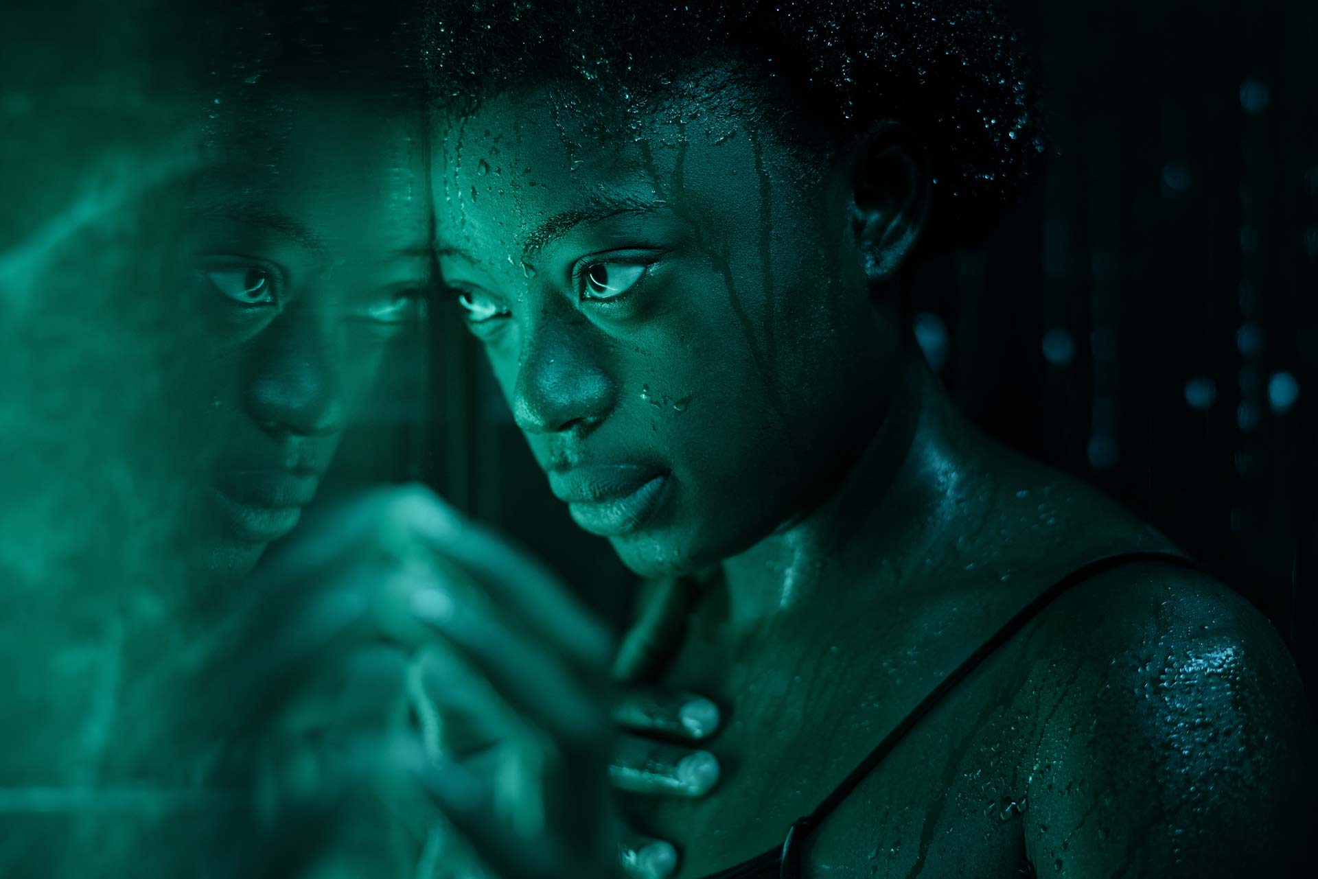
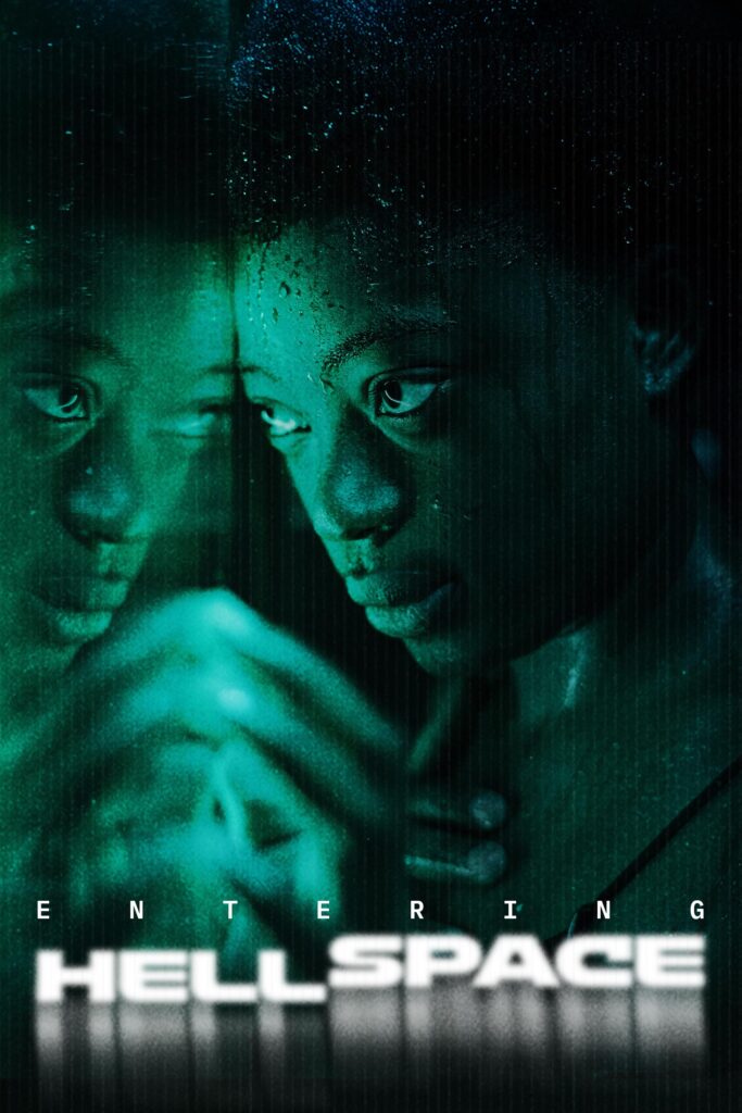
Created title treatment with clean type and ghosted distortion, like static, like dissociation. Poster shows mirrored protagonist with hidden creature just behind her. You don’t see threat at first. Then you do. Color palette leans hard into phosphor green: glitch, surveillance, digital unease, signaling breakdown of reality, identity, safety. Visual language mirrors psychological experience of questioning what’s real while surviving actual threat.
MY ROLE
Led complete creative development as Creative Director, Title Designer, and Creative Writing Partner.
✔ Helped shape narrative arc clarifying protagonist’s POV as metaphor for mental illness, ensuring story stayed grounded in emotional truth rather than exploitative horror tropes
✔ Collaborated on script revisions and thematic positioning maintaining balance between psychological thriller and creature horror
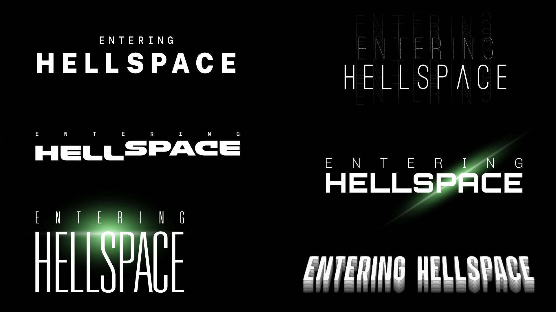
✔ Explored 6 typographic directions representing different psychological states: clean bold, outline ghost, distorted glitch, blurred double-exposure, speed-warped, reflection effects – client selected final treatment balancing clarity with unsettling distortion
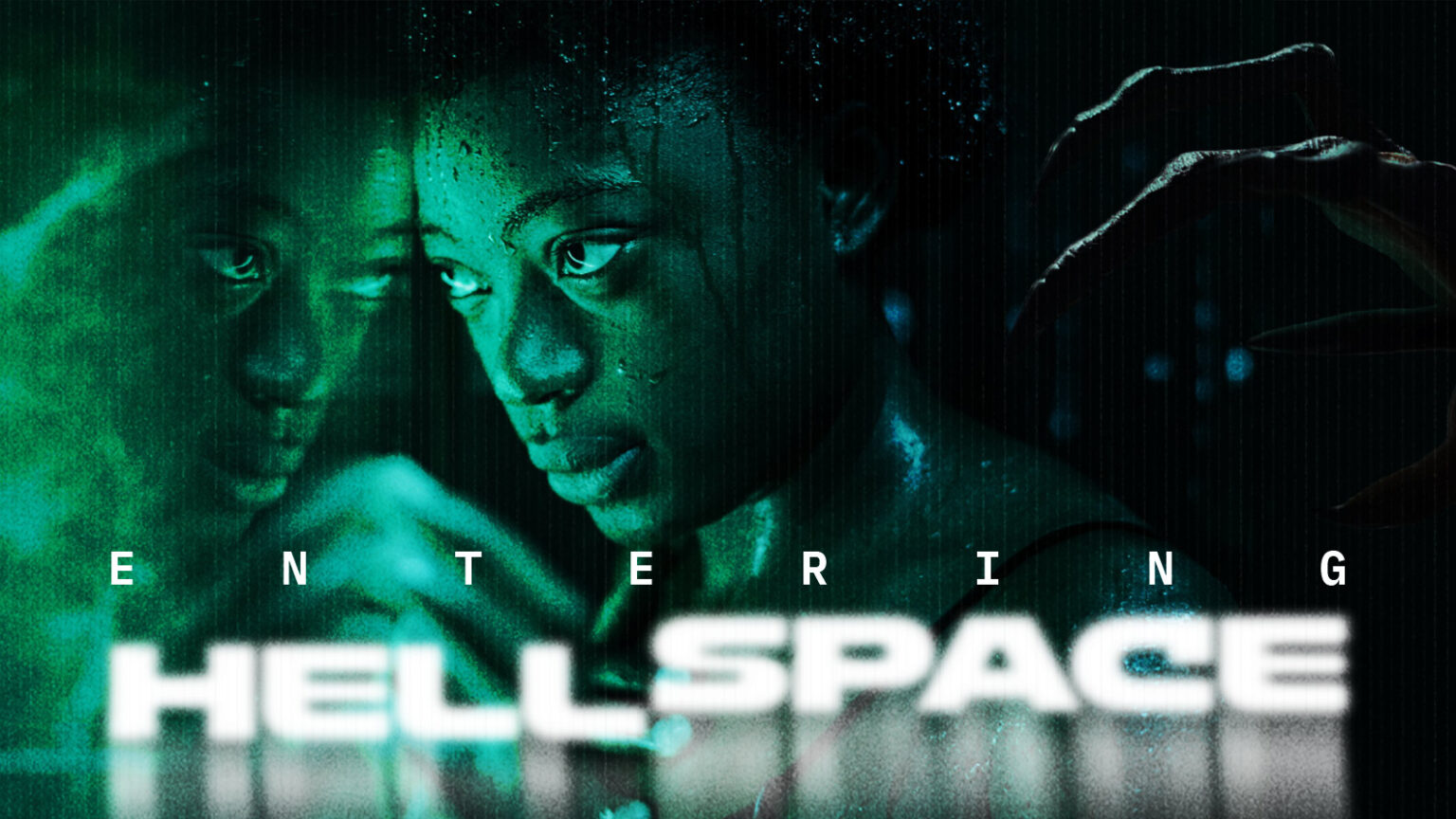
✔ Created key art balancing horror with humanity, paranoia with strength, showing protagonist doubled with creature hand emerging in landscape format
✔ Built cinematic poster compositions for portrait (solo protagonist, no visible threat) and landscape (creature hand enters frame) formats maintaining narrative tension
✔ Developed complete visual language through phosphor green color palette, glitch textures, distorted typography mirroring fear, isolation, resilience, reality breakdown
THE IMPACT
Narrative Through Design: Final campaign plays with perspective. Portrait version shows protagonist alone, no threat visible. Landscape version reveals creature’s hand entering frame, reframing everything. Duality reflects core tension: is danger real or imagined? Answer: both.
Mental Health Representation: Visual identity doesn’t just capture genre tropes. It captures truth about living with conditions that make you question reality while still needing to trust your instincts. Phosphor green palette references medical monitors, surveillance, digital breakdowns without stigmatizing mental illness.
Design Process: Presented 6 typographic explorations, each representing different aspect of psychological horror: dissociation, paranoia, reality breakdown, duality. Final selected treatment balanced cinematic clarity with psychological tension, working across festival submissions, streaming platforms, promotional materials.