THE CHALLENGE
Set in 1919, Feral is film about what hunts you when you’re lost in woods: something primal, violent, close. Title treatment had to feel the same, unsettling audiences before first scene rolled. Sharp but readable, eerie without horror clichés. Needed to work across every format without losing edge, from theatrical posters to streaming thumbnails.
THE SOLUTION
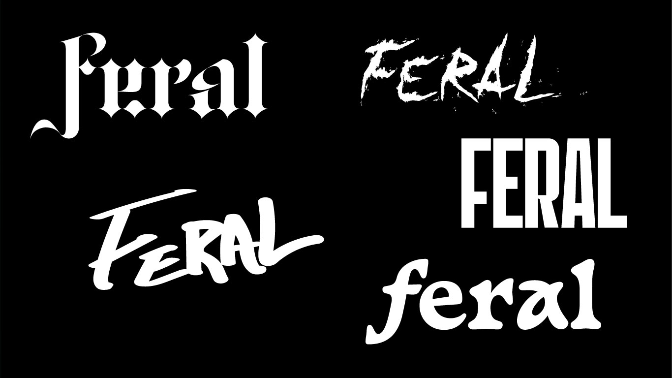
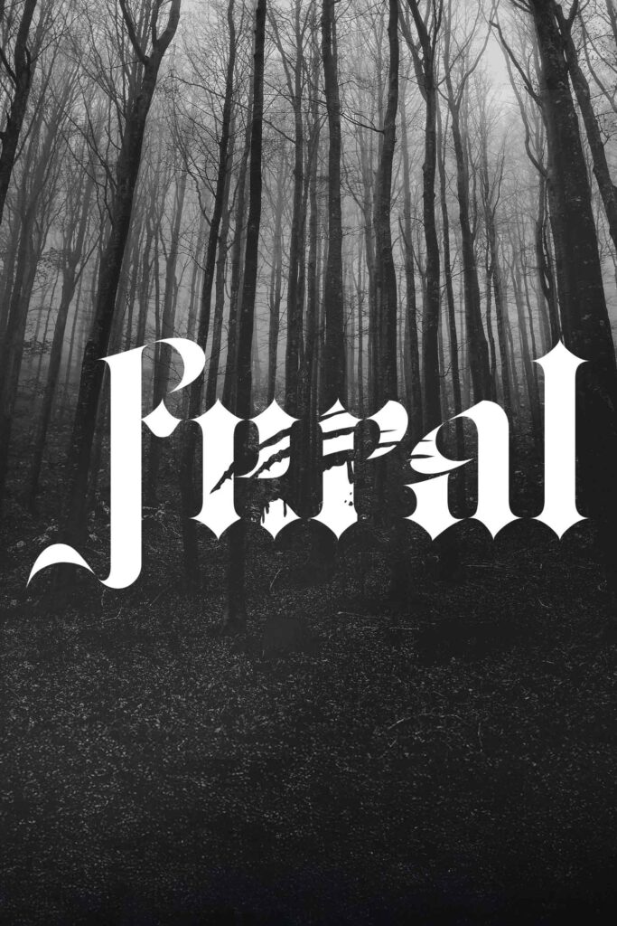
Explored multiple typographic directions: clawed-up gothic letterforms, frantic hand-drawn scrawls, distressed blackletter, brutalist sans, hybrid treatments. Final treatment used modern gothic typeface torn through with claw marks. Visually aggressive but cinematic. Sourced and licensed professional font, adding narrative-driven distortions giving title unshakable presence. Design held ground across theatrical posters, thumbnails, streaming banners without losing impact. Title doesn’t scream. It creeps in, like woods closing behind you, like something that’s been waiting.
MY ROLE
Led complete title design as Creative Director and Designer.
✔ Developed 5 distinct treatment directions exploring different emotional territories: ornate gothic blackletter, brutal hand-torn lettering, distressed serif, angular sans, hybrid experimental
✔ Selected and licensed period-accurate gothic typeface feeling both 1919 historical and cinematically timeless
✔ Designed claw-mark distortions feeling visceral, not decorative – placed intentionally disrupting letterforms suggesting attack pattern rather than random damage
✔ Built title system adapting seamlessly across formats: theatrical one-sheets, streaming thumbnails (16:9), social media squares, maintaining readability and tension at every size
✔ Balanced legibility with psychological tension, keeping title readable but raw, avoiding illegibility trap many horror titles fall into
✔ Aligned visual direction with film’s tone (period horror), story (primal threat), pacing (slow-building dread), ensuring typography reflected narrative not just genreg
THE IMPACT
Campaign Foundation: Title treatment became anchor for entire marketing campaign, setting tone before audiences hit play. Created immediate tension and curiosity translating across every touchpoint, from festival screenings to streaming platforms.
Format Versatility: Gothic treatment with intentional distortion maintained impact across sizes. Readable at thumbnail scale for streaming platforms while retaining cinematic presence on theatrical posters. Proved that horror typography doesn’t require illegibility to create unease.
Typographic Storytelling: Claw marks weren’t decoration – they told story. Each distortion placed deliberately suggesting something violent, something that leaves marks. Typography became narrative device communicating threat before single frame played.