THE CHALLENGE
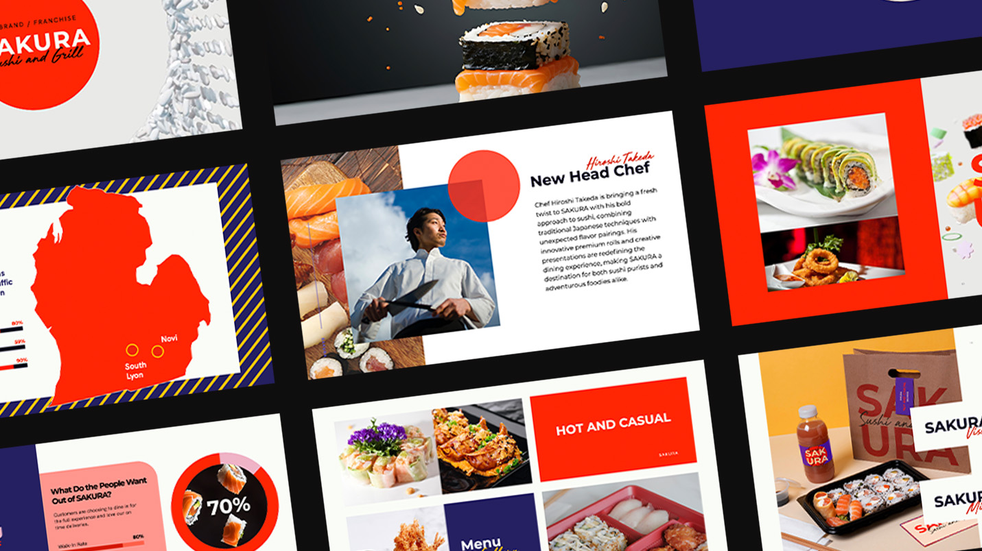
This conceptual brand refresh explores how Sakura Sushi & Grill could evolve from a neighborhood favorite into a scalable regional brand. The challenge: create a visual system that could expand across signage, interiors, packaging, digital, and future locations without losing Sakura’s approachable feel.
THE SOLUTION
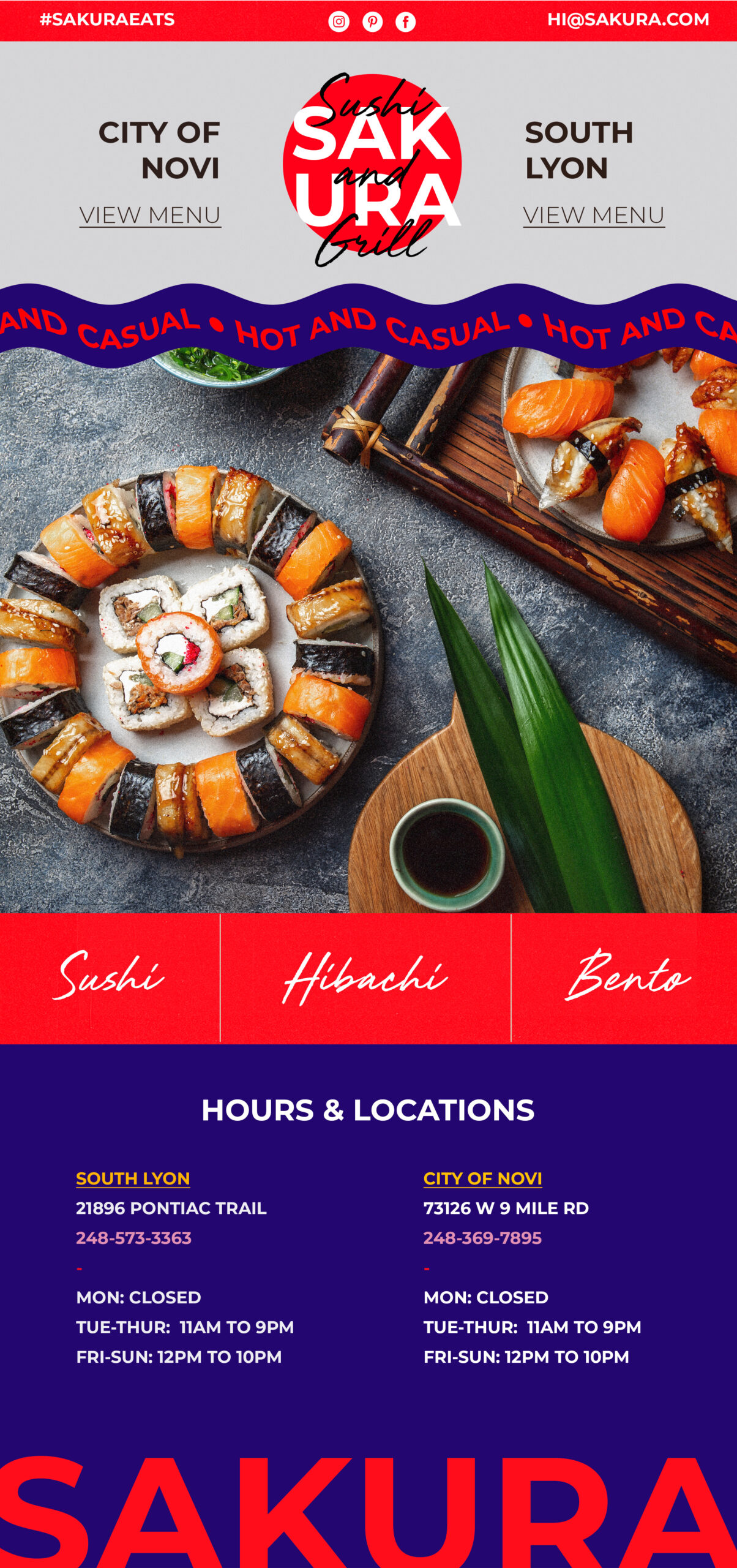
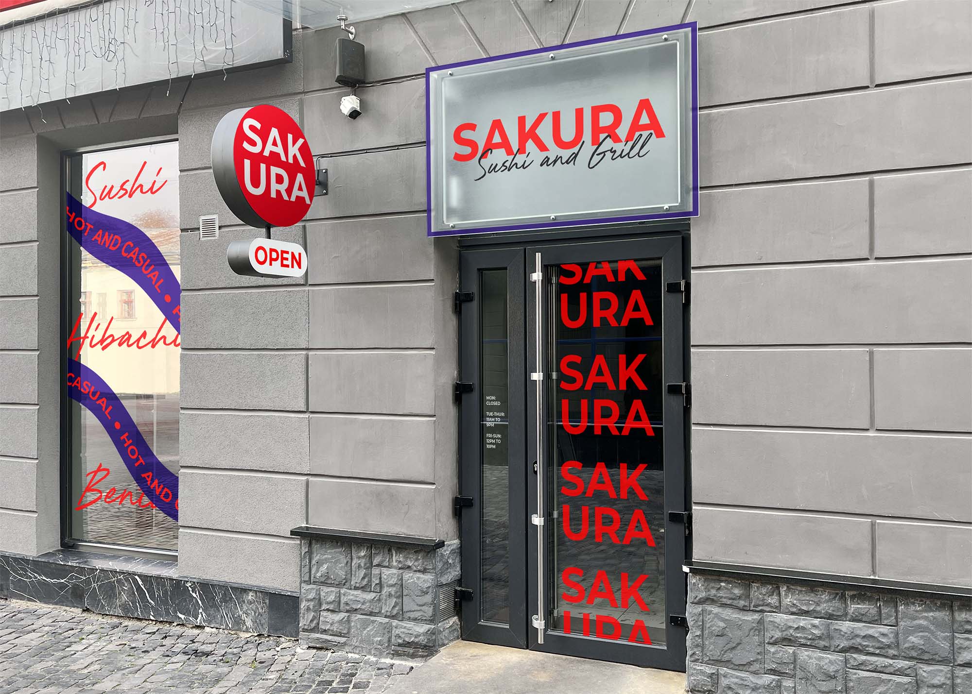
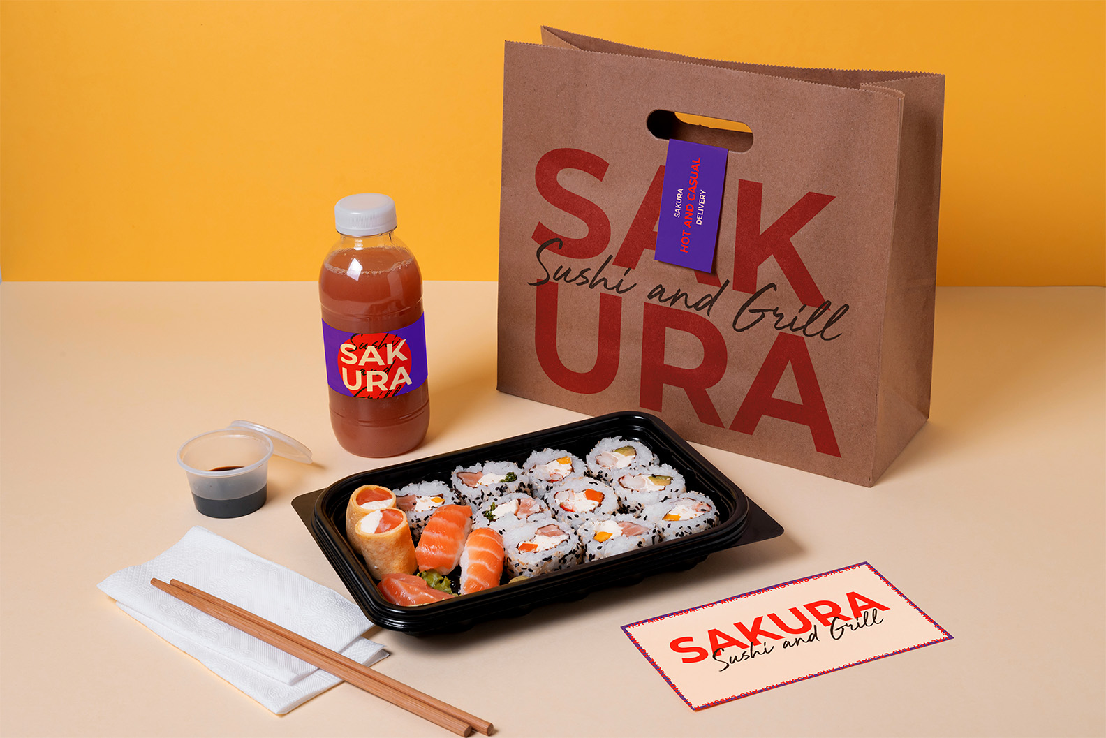
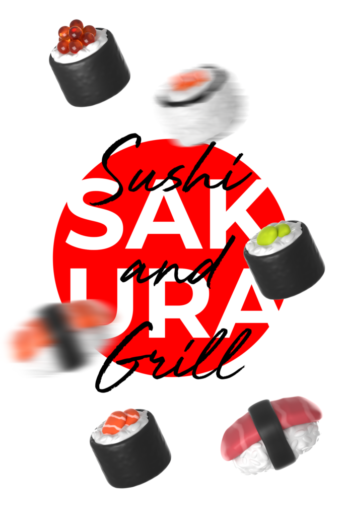
A bold identity system pairs vibrant red with deep purple, anchored by a brushstroke-inspired logomark. The system was designed to flex from storefront signage and interiors to packaging and digital, while the “Hot and Casual” positioning strikes a balance between quality and approachability.
MY ROLE
As Creative Director, I developed the concept from strategy through visual execution:
✔ Visual identity, typography, color, photography, and illustration direction
✔ Storefront signage and environmental graphics
✔ Takeout packaging and branded touchpoints
✔ Menus, marketing collateral, and templates
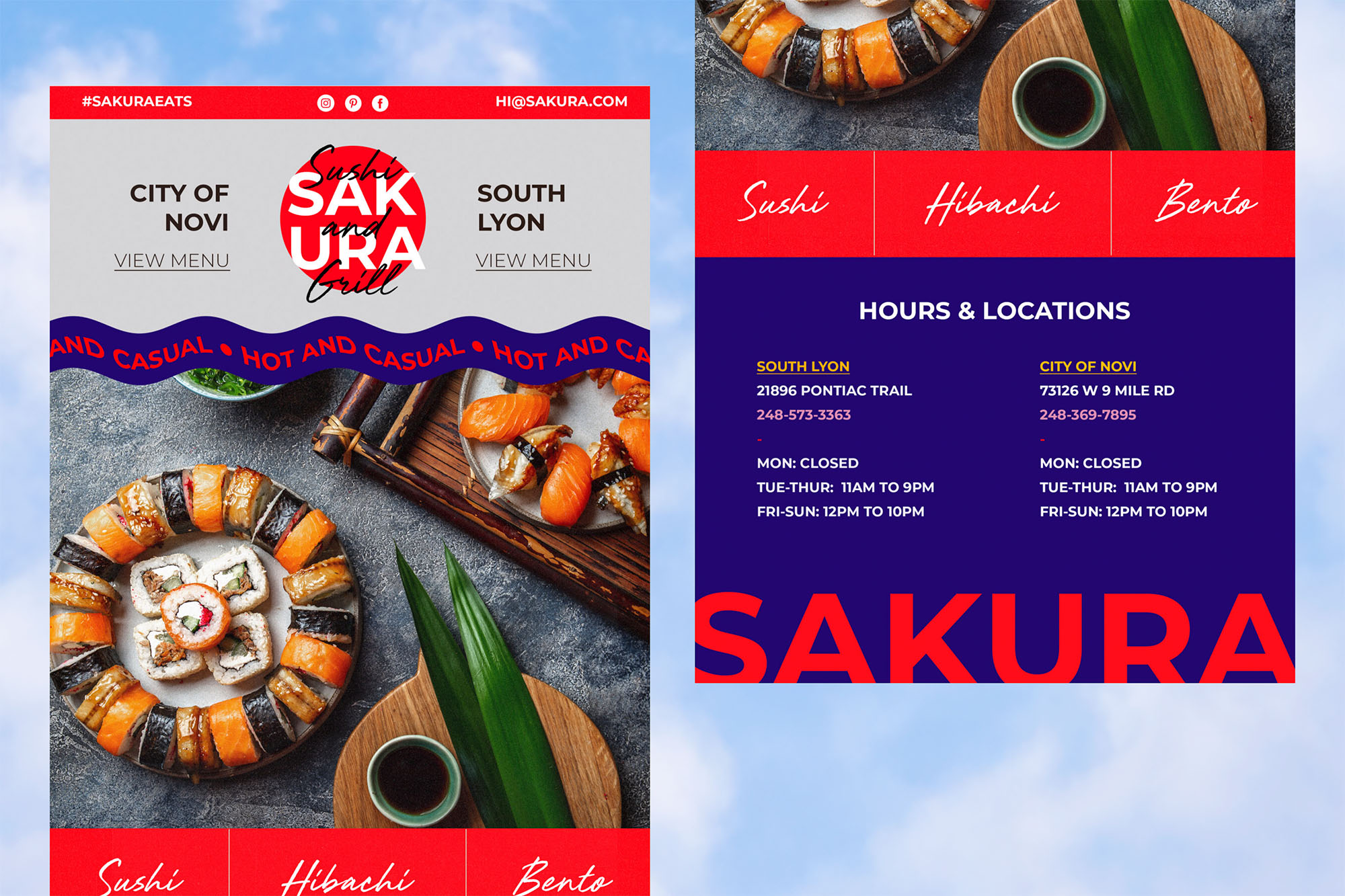
✔ Website and social media art direction
THE IMPACT
Scalable Identity:
A cohesive visual language designed to work across physical, digital, and environmental applications.
Strategic Positioning:
A premium-but-approachable identity that differentiates Sakura from both fast-casual chains and traditional fine dining.
Built for Growth:
A flexible brand system demonstrating how Sakura could expand into new locations while retaining the personality of a neighborhood restaurant.