THE CHALLENGE
A nature documentary on the world’s fiercest swamp predators needed bold, adaptable key art for streaming distribution. The design had to capture raw tension and primal power while working across multiple platforms, screen sizes, and orientations without losing impact.
THE SOLUTION
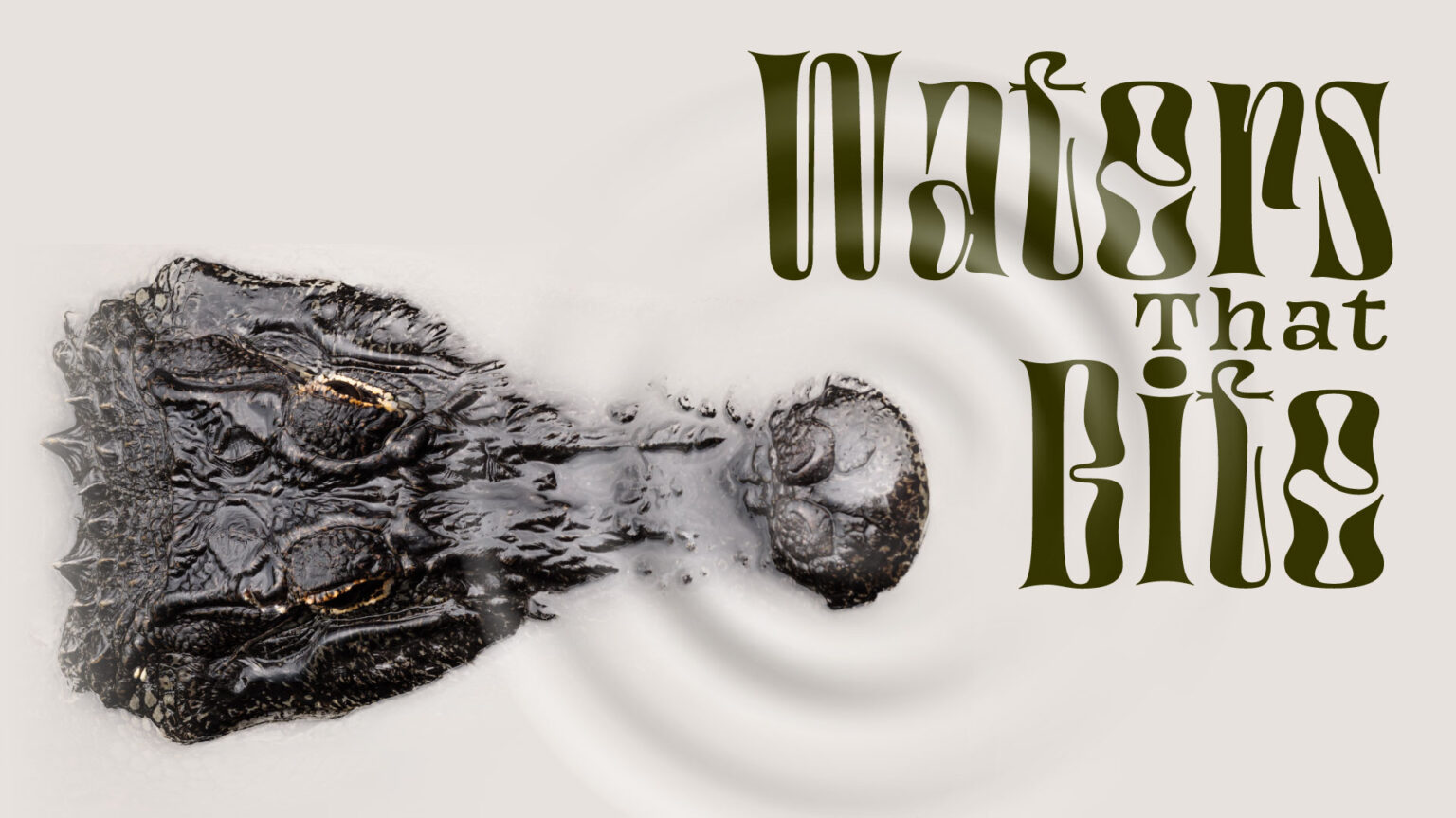
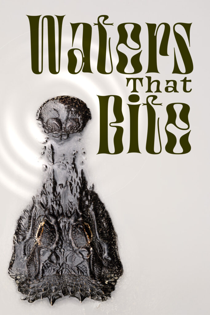
Built a cinematic title treatment using high-resolution imagery from the documentary’s photographer. Color-corrected the hero crocodile shot to enhance the moody atmosphere, then added subtle water ripple effects in post to create movement and tension.
Sourced a custom Art Nouveau-inspired typeface from a professional typesetter that felt both organic and predatory—curves echo water movement and reptilian forms while maintaining readability at any size. The olive-moss green palette tied to swamp environments without being literal.
Designed key art in vertical and horizontal orientations to optimize for different streaming platforms (mobile vs. TV, homepage banners vs. thumbnails). The treatment stays bold whether it’s a full-screen hero image or a 300px thumbnail.
MY ROLE
As Creative Director and Designer:
✔ Developed visual strategy for streaming platform distribution
✔ Color-corrected hero photography and applied water ripple effects for atmospheric depth
✔ Sourced custom typeface and built cinematic title treatment
✔ Designed dual-orientation key art system optimized for cross-platform scalability
✔ Created treatment maintaining impact from large-format displays to mobile thumbnails
THE IMPACT
Format Flexibility:
The dual-orientation system ensured Waters That Bite maintained visual impact across every streaming platform without redesign. Whether viewers encountered it on iPhone, smart TV, or desktop, the key art worked.
Visual Positioning:
The title treatment positioned Waters That Bite as premium content—sophisticated enough for documentary purists, cinematic enough to compete with scripted thrillers. The custom typography elevated it beyond standard nature doc aesthetics.
Streaming Optimization:
Designed for thumb-stopping power in endless scroll. Bold typography and high-contrast imagery stood out in crowded content grids at any size, critical for streaming platform discovery.