THE CHALLENGE
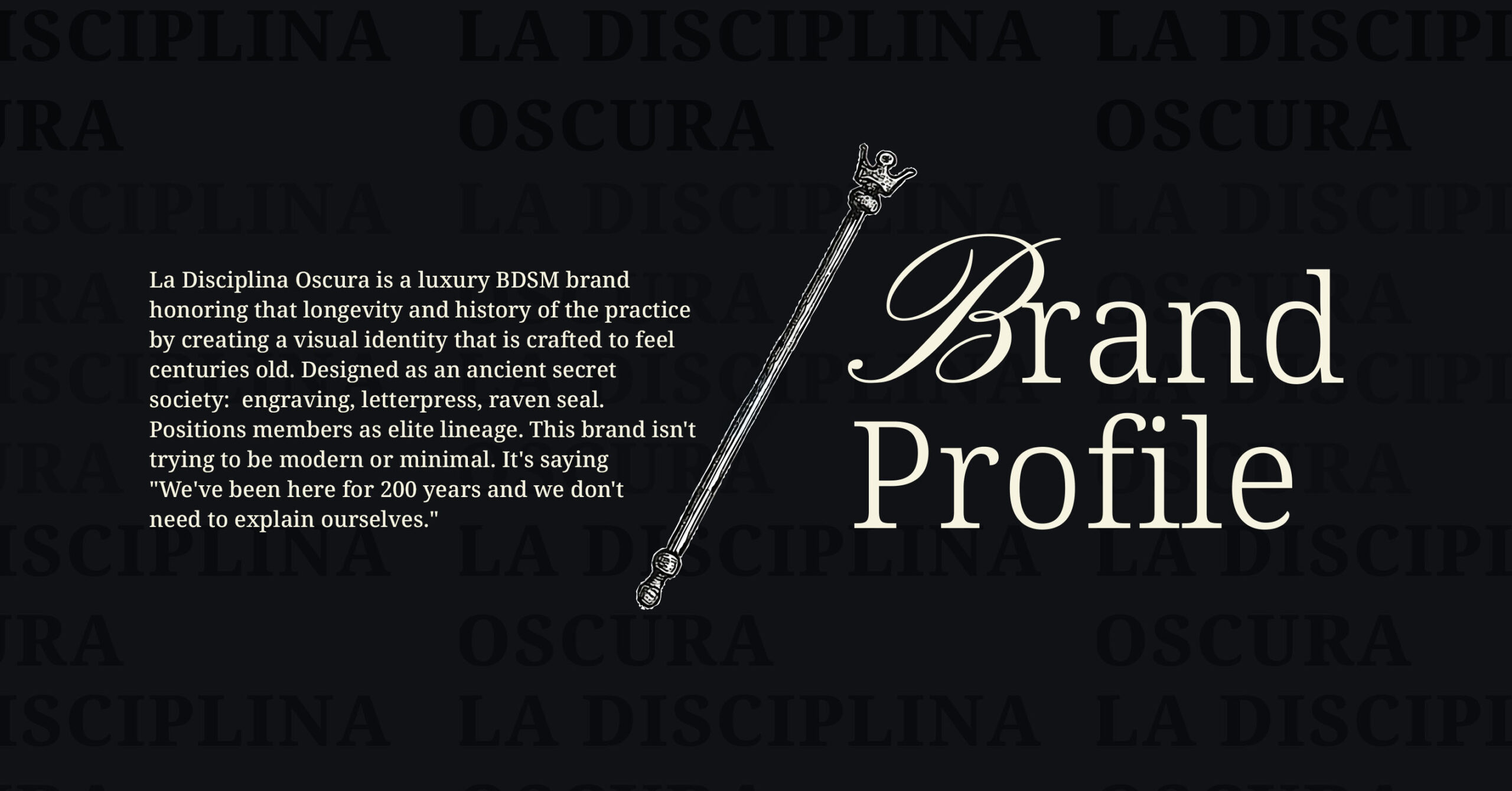
A luxury BDSM lifestyle brand needed a visual identity honoring the practice’s centuries-old history. BDSM has existed since the Middle Ages, passed quietly through generations among those who understood power and submission. The brand needed to position its audience as part of an elite lineage with specific interests spanning time. Challenge: create an identity that felt ancient, exclusive, and unapologetically non-modern.
THE SOLUTION
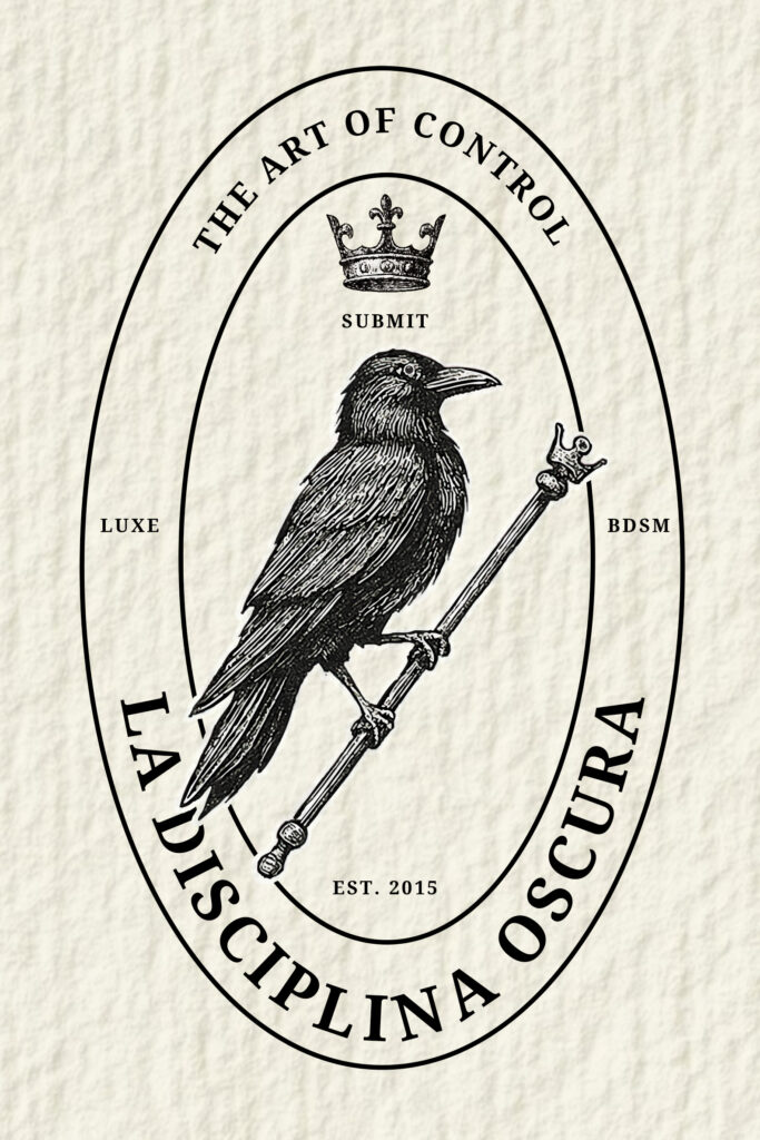
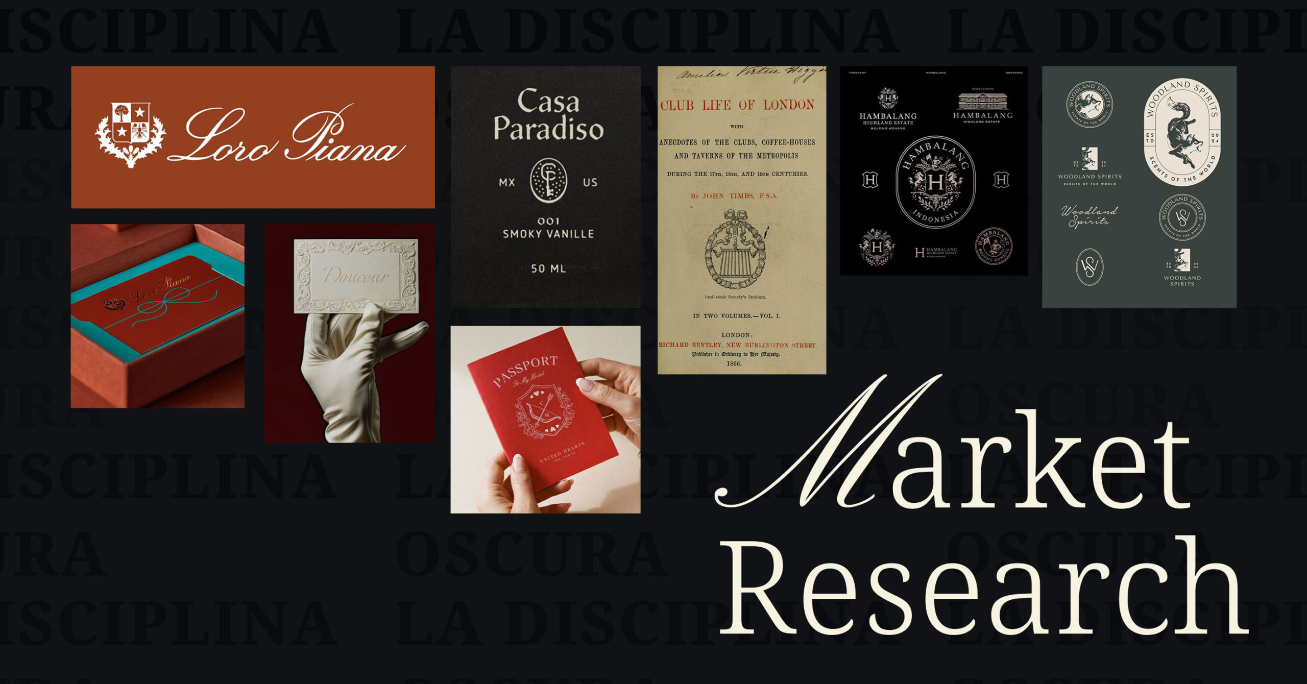
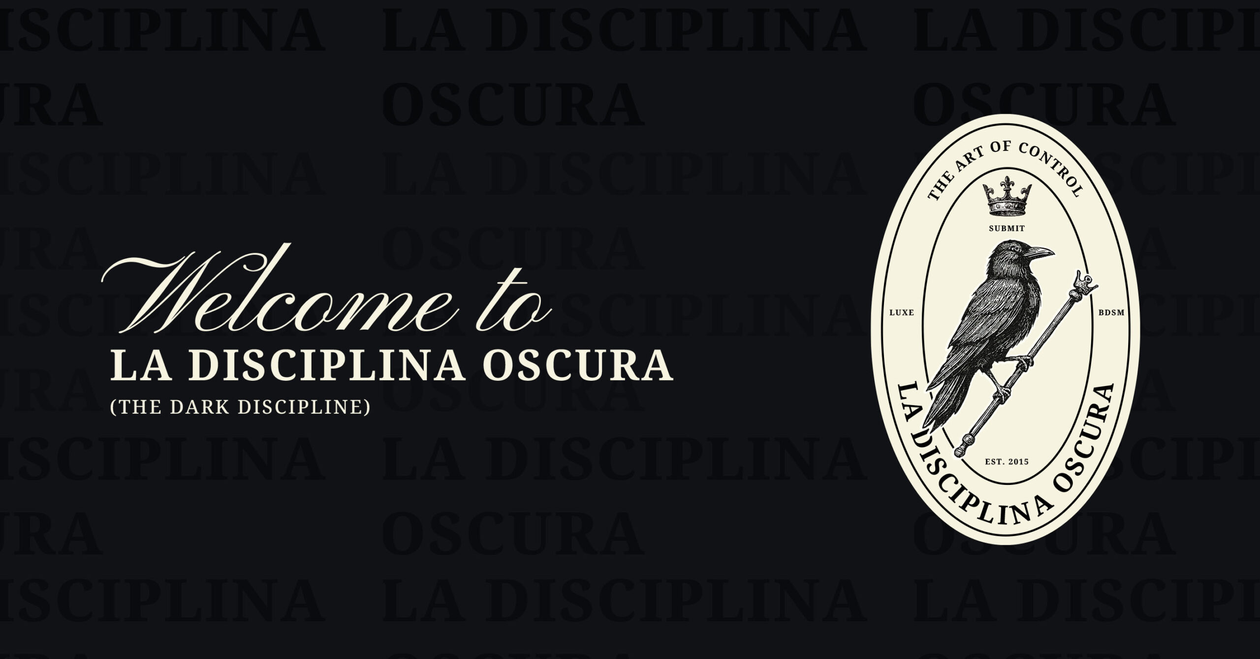
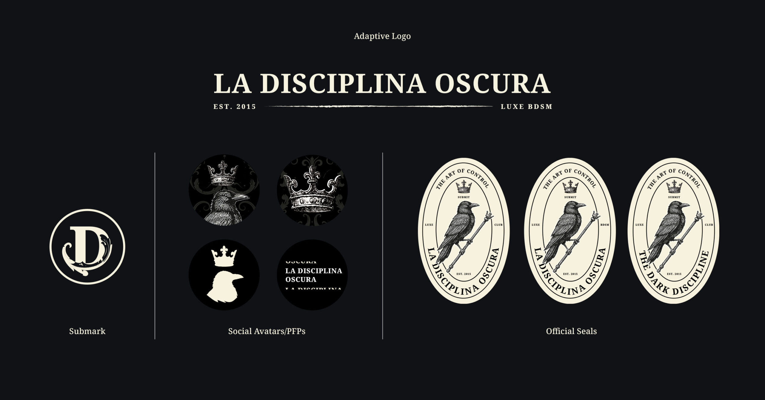
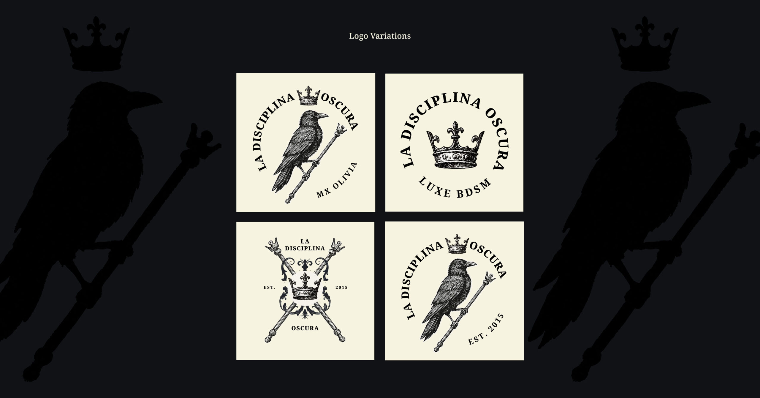
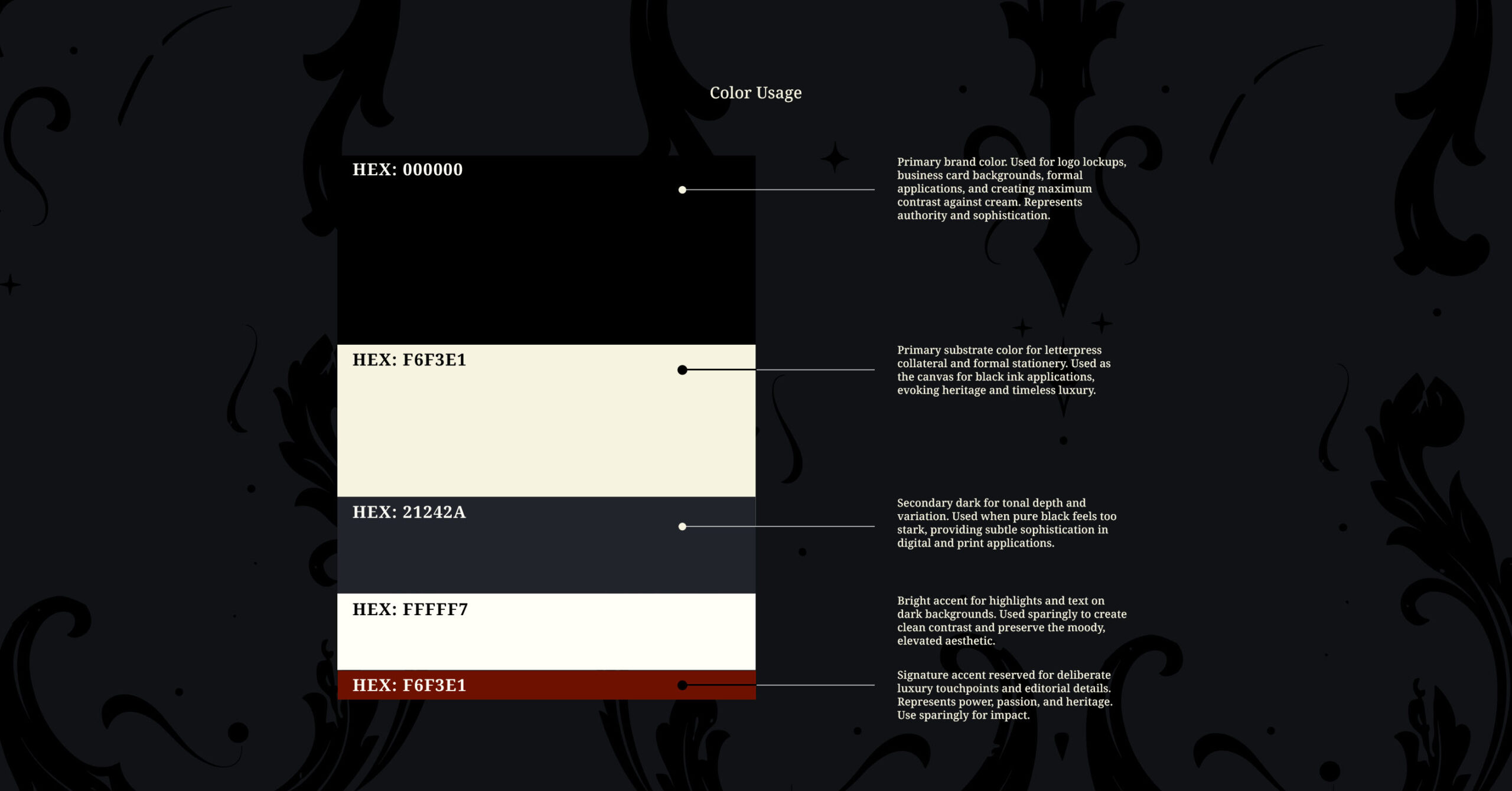
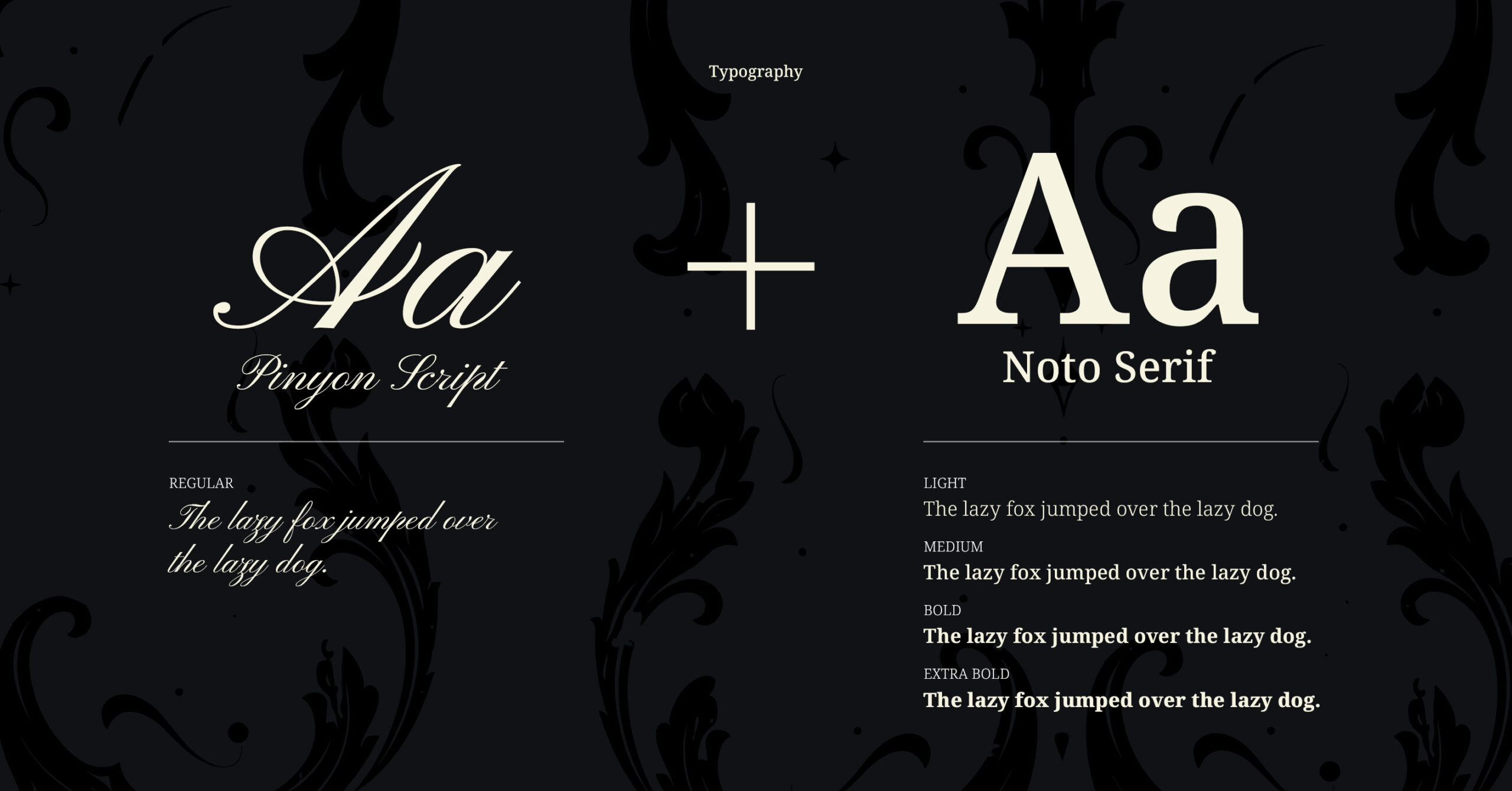
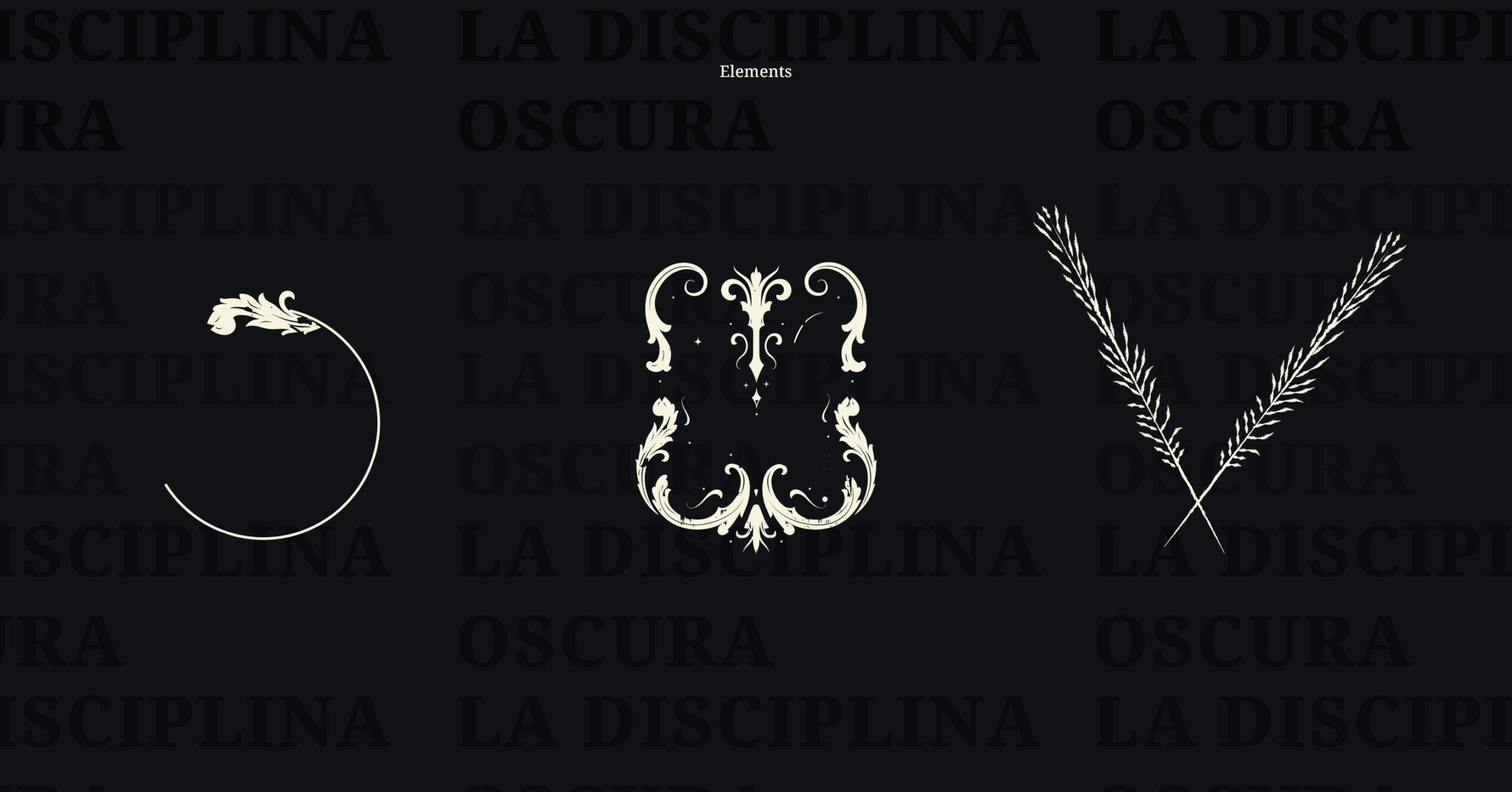
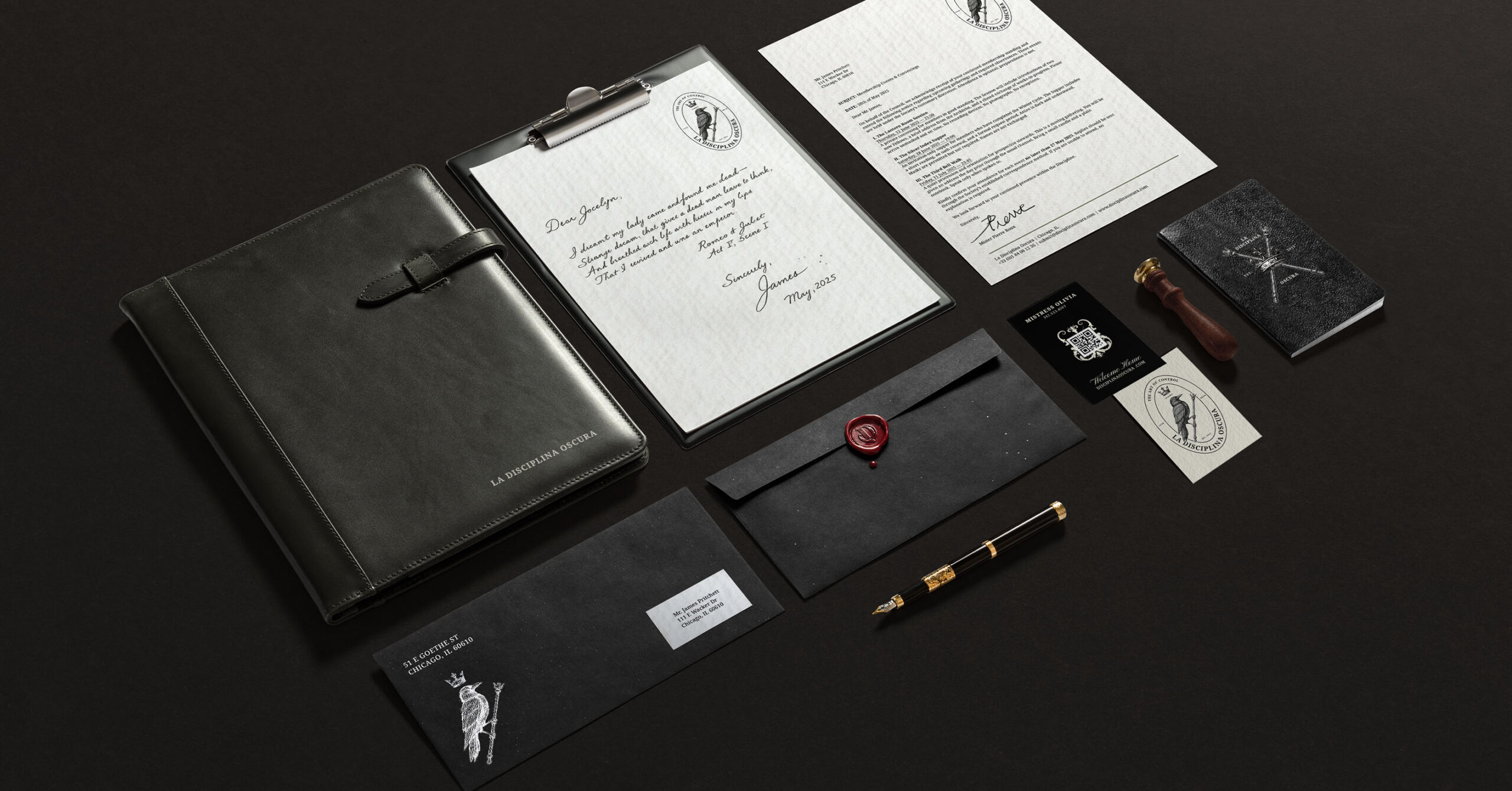
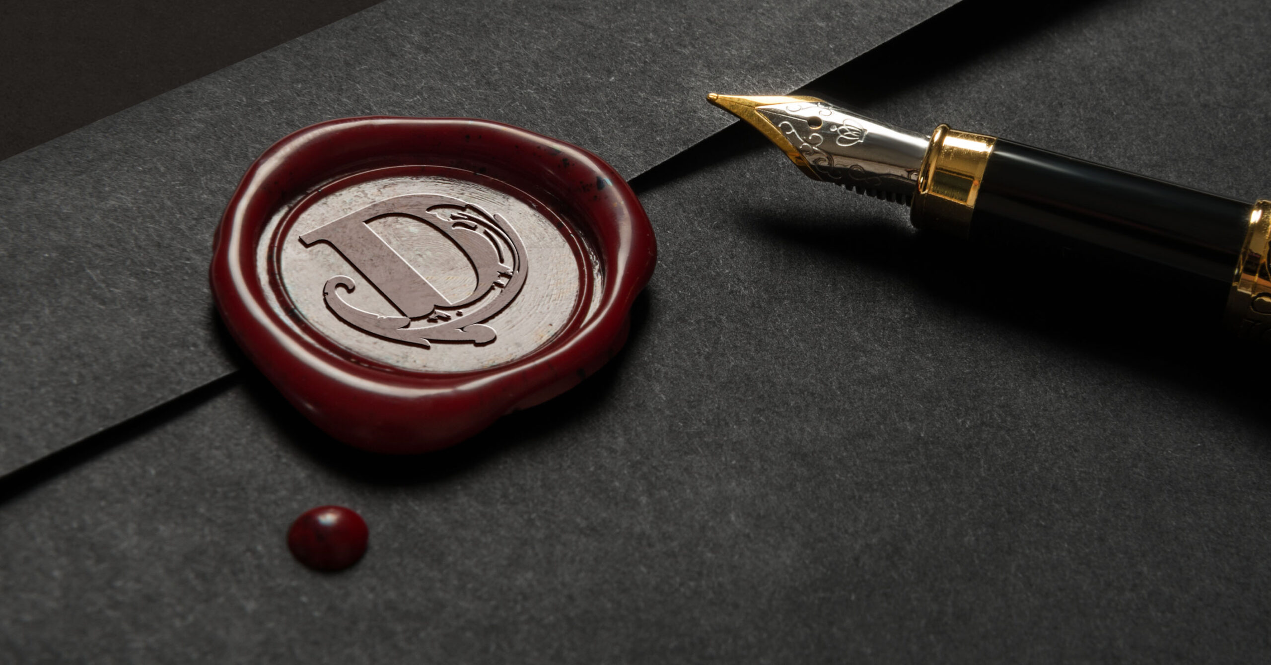
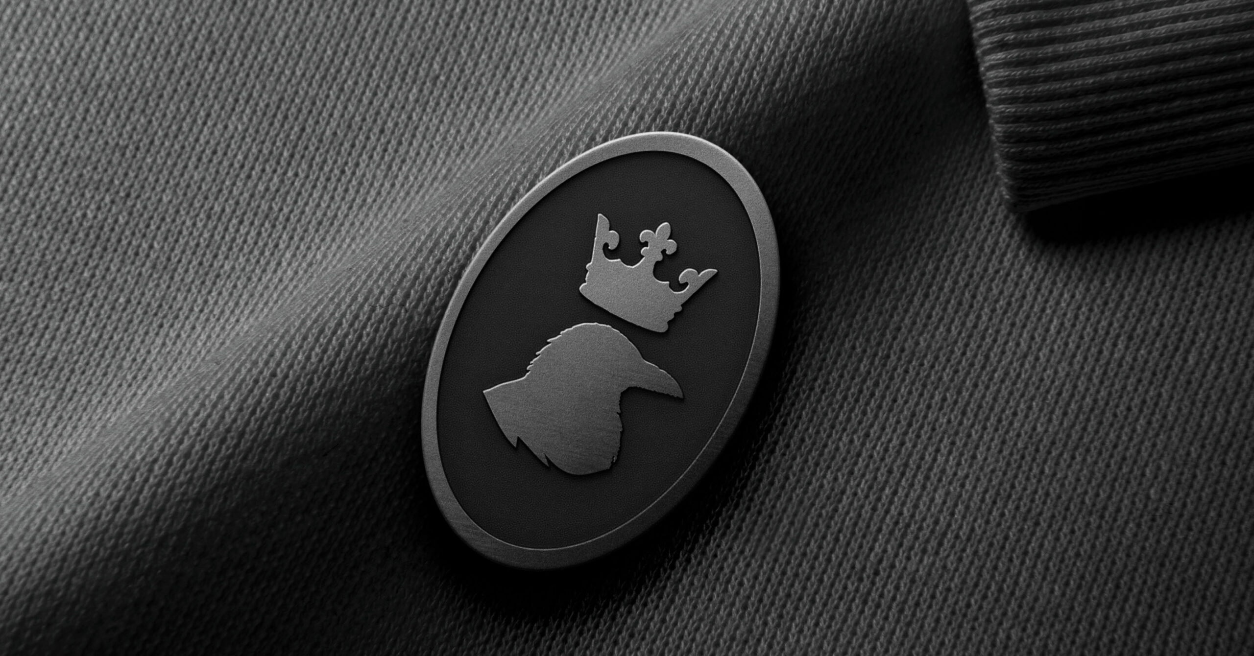
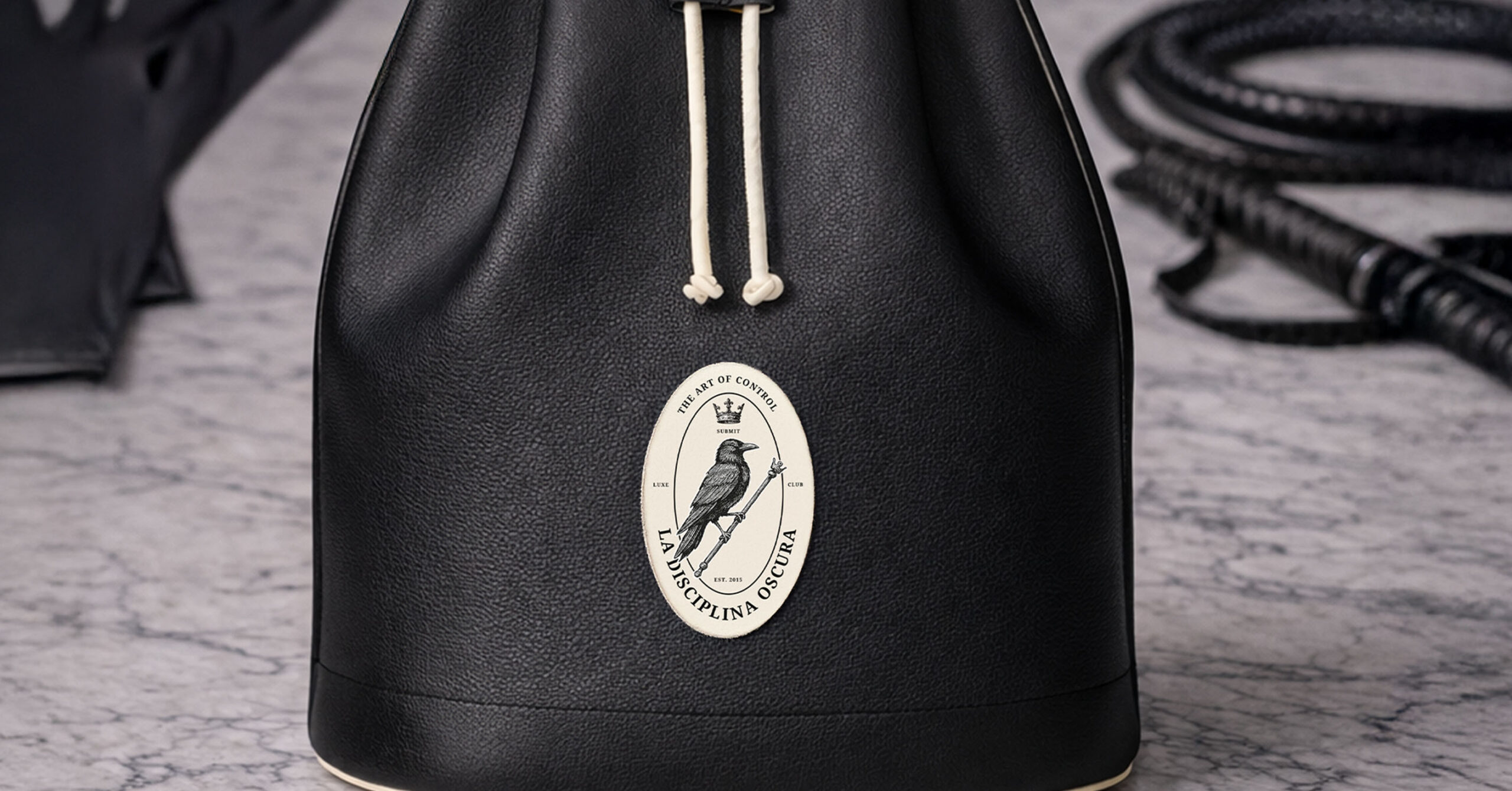
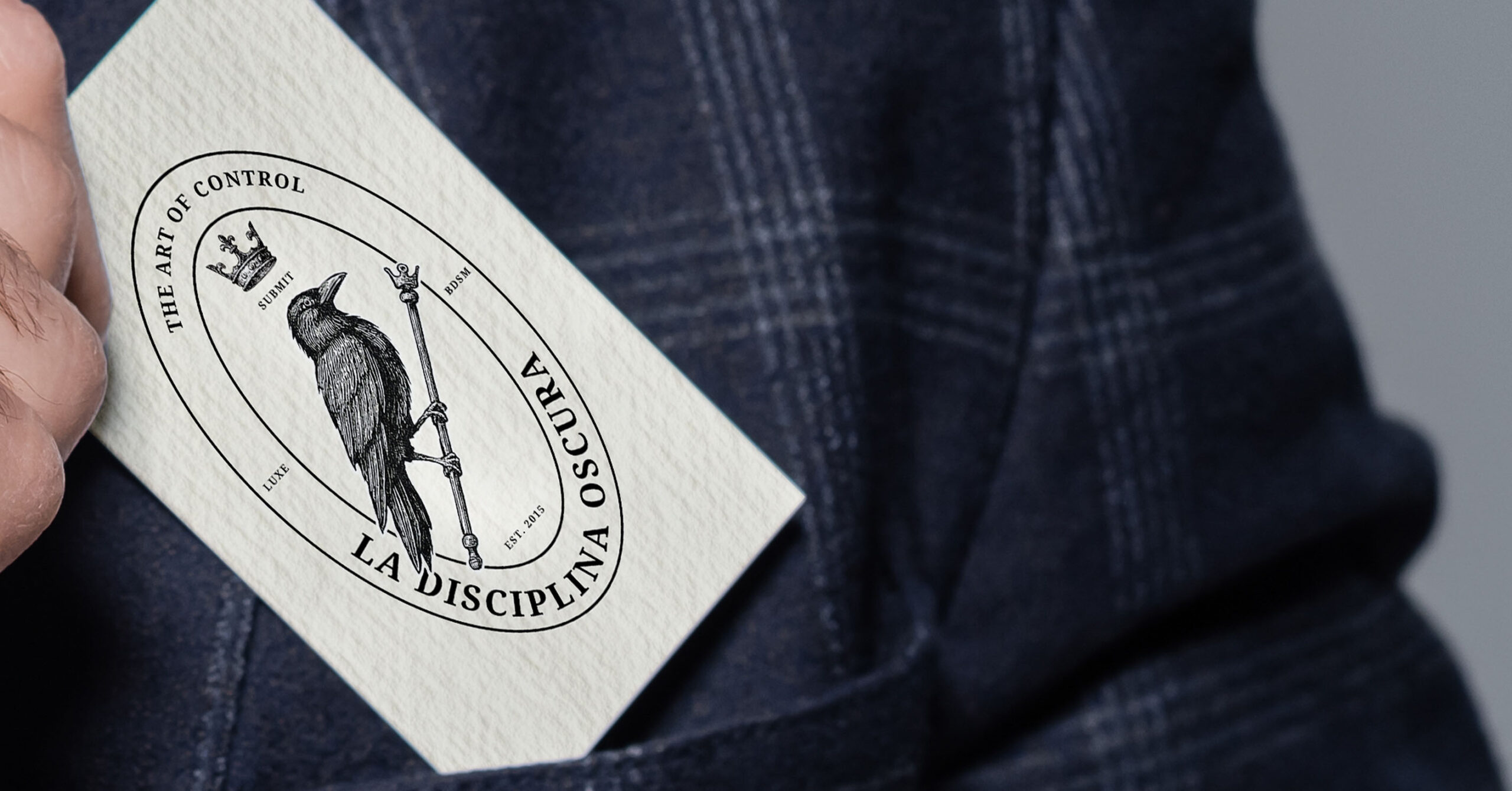
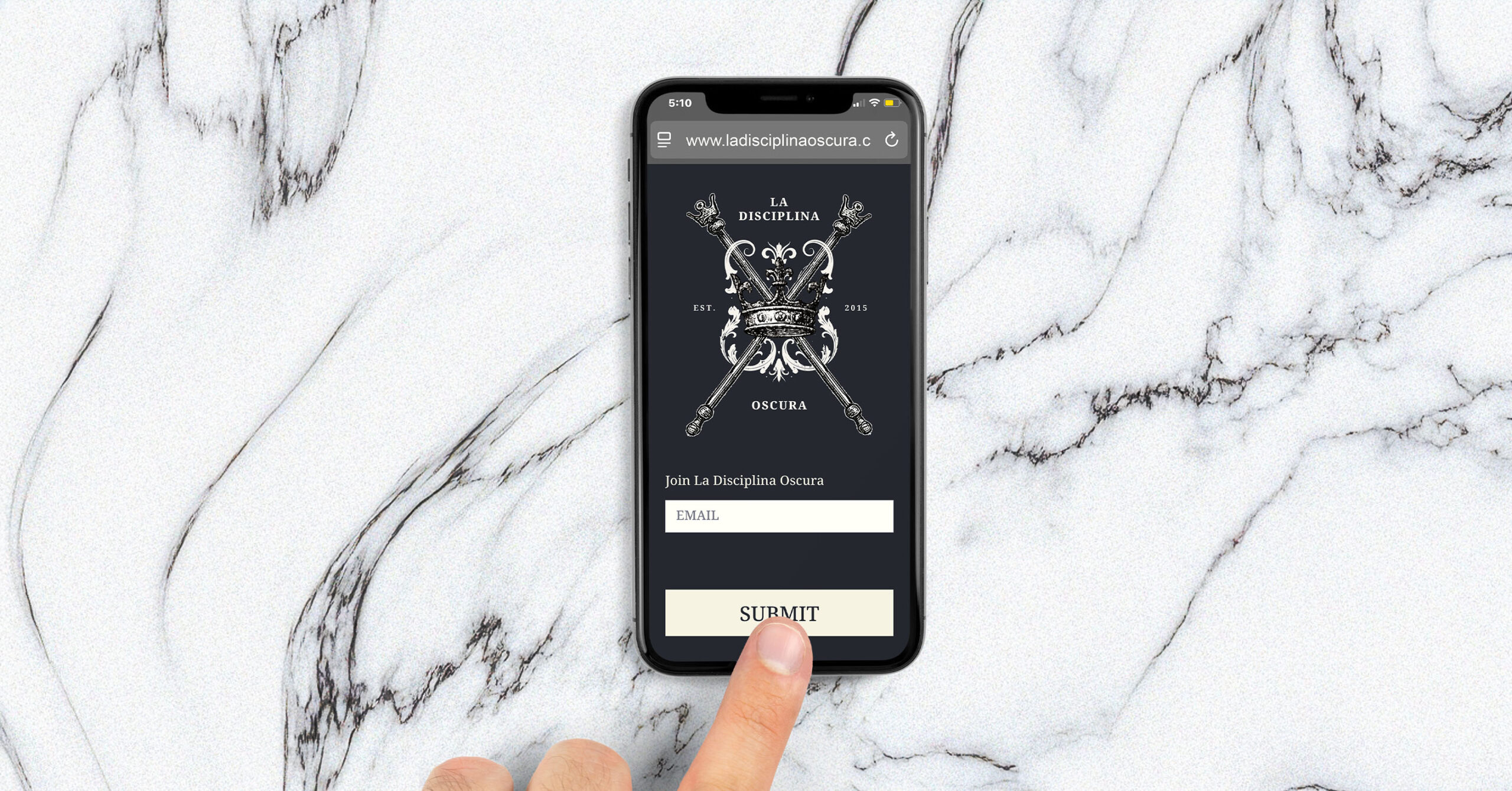
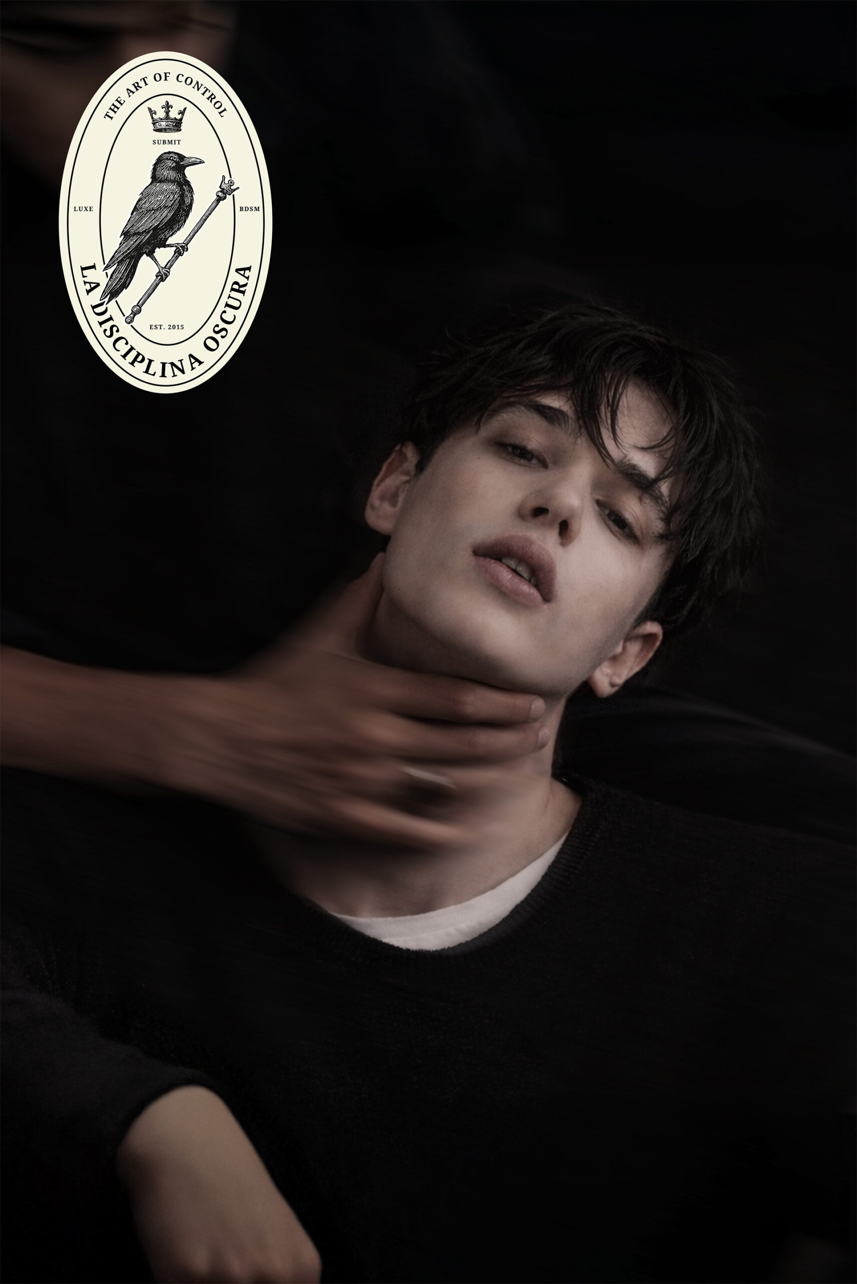
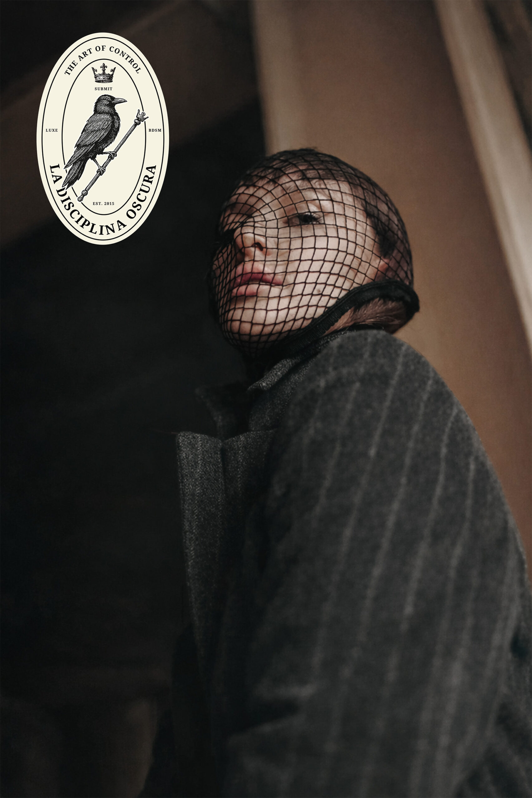
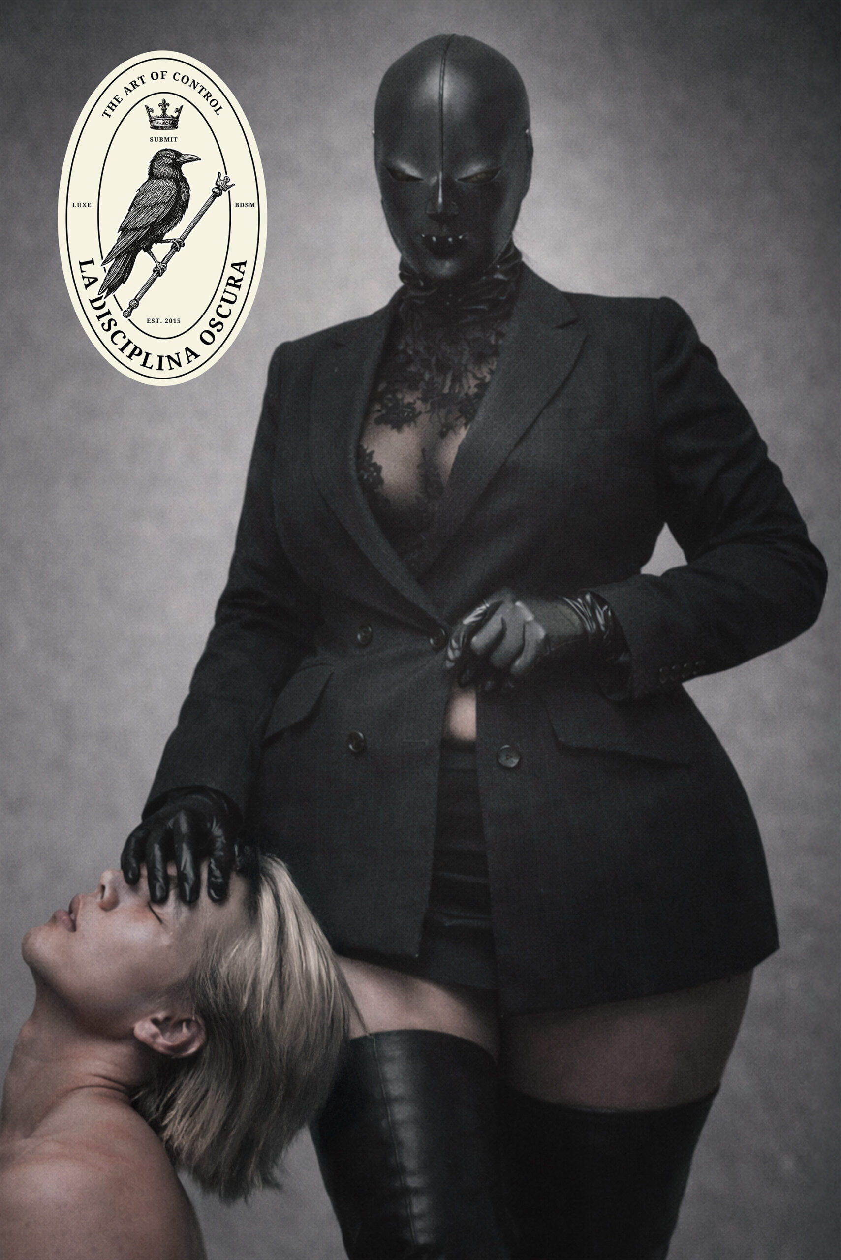
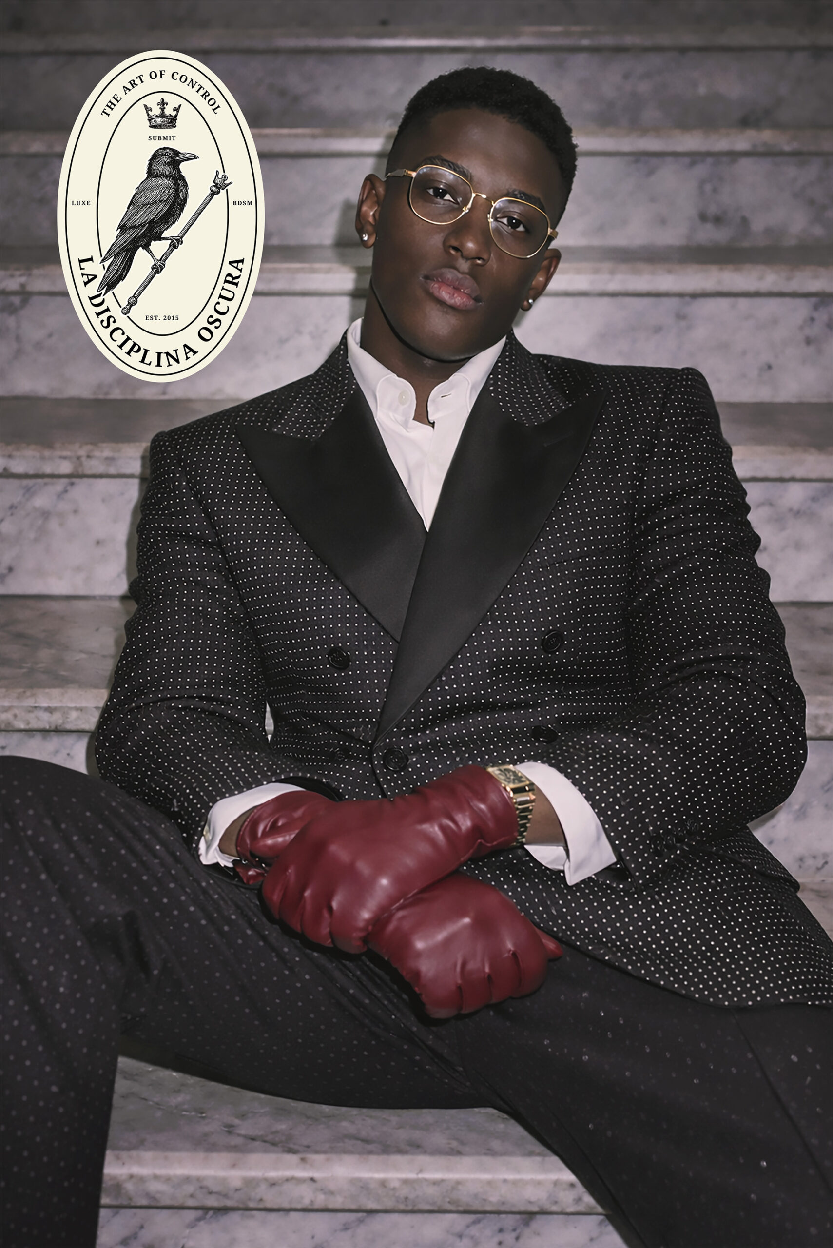
Built brand identity positioned as a secret society. The visual language borrows from 19th-century gentleman’s clubs, Masonic lodge seals, and European heritage houses. Raven-on-scepter logomark rendered in Victorian engraving style with crosshatching represents power, mystery, submission. Floating crown reinforces sovereignty and control. Letterpress on textured cream stock evokes permanence and old money. Oval seals function as membership insignias. Typography pairs Pinyon Script (elegance, formal) with Noto Serif (authority, readability). Color palette: black, cream, navy, oxblood burgundy reserved for luxury touchpoints like wax seals and leather goods. Website landing page reduced to email input and SUBMIT button.
MY ROLE
As Creative Director and Brand Designer:
✔ Developed complete brand identity: raven-on-scepter logomark, floating crown, Victorian engraving aesthetic
✔ Created adaptive logo system: submark, social avatars, official seals in three variations
✔ Designed typography system (Pinyon Script + Noto Serif) and ornamental elements (flourishes, frames, crossed feathers)
✔ Built color palette with usage guidelines
✔ Designed stationery suite: letterpress business cards, letterhead, envelopes, wax seal, leather portfolio
✔ Created minimal website landing page
THE IMPACT
Market Positioning: La Disciplina Oscura positioned itself apart from modern BDSM brands. The Victorian aesthetic signaled: you’re not discovering something new, you’re joining something ancient. Brand communicates exclusivity, history, codes only members understand.
Visual Authority: Letterpress, engraving, wax seals, and heritage typography created instant credibility. The brand doesn’t explain itself. It simply is.
System Scalability: Adaptive logo system works across digital (social avatars, website) and physical (stationery, seals, leather goods) without losing centuries-old aesthetic. Brand stayed cohesive across all touchpoints.